don’t we all deserve the best?
Before Bill’s two posts on self-guided trails (SGT) become a distant memory, I want to share a couple of experiences I think exemplify best practices on a trail. One SGT is in Cloudcroft, New Mexico at the Sleepy Grass Campground, contains some typical trail designs, and is created to encourage use by visually impaired individuals. The other experience takes place at the Palo Alto Junior Museum & Zoo (JMZ) in California. You may think this latter experience an odd choice for a SGT, but recently I realized that all zoos are self-guided for most visitors.
After experiencing the New Mexico trail in person, and attending a webinar describing what happens at the Palo Alto JMZ, I wondered why all SGTs don’t employ the best practices these two experiences offer? Do we interpreters think adults or “regular” folks don’t need or want the same kind of experiences on a trail offered to people with “disabilities” or for younger visitors? And perhaps the bigger question is…How can interpretive planners and frontline interpreters make everyone feel invited to experience what a trail can offer the visitor, especially if it offers interactions that deepen a sense of place and provide a whiff of mission?
Before getting into the trail specifics, these are the eleven (11) best practices that I took away from Bill’s posts and used when reviewing both SGT experiences. Does the SGT…
· convey something special about the place – a whiff of mission?
· offer some “doing” for a variety of visitor types?
· include sensory experiences?
· engage the Head, Heart, Hands, Hunger?
· have useful maps?
· give “Goldilocks” information on signage – not too much and not too little?
· provide places to linger?
· suggest follow-up places to visit or other resources?
· connect to everyday life or a larger context?
· ask you to evaluate the effectiveness of the experience?
· look and feel well maintained?
Sleepy Grass Campground SGT Cloudcroft, New Mexico, USA
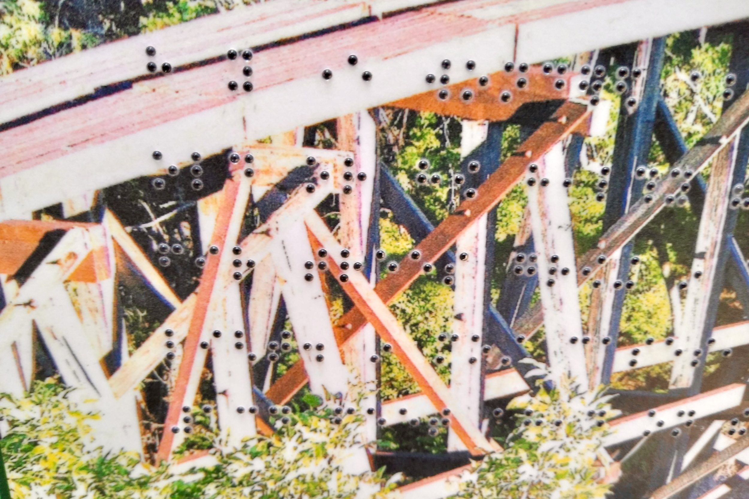
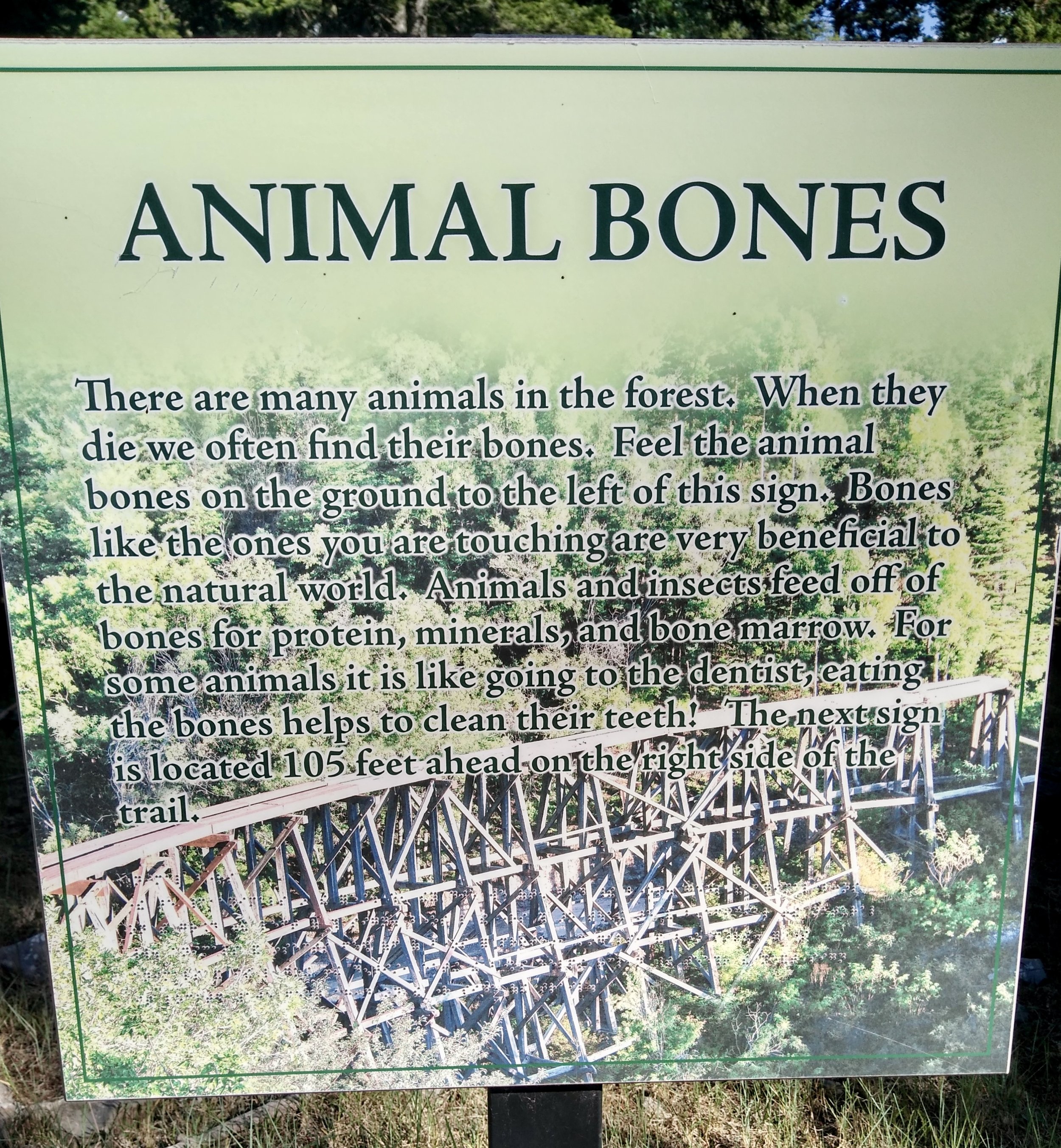
The focus for funding this trail is to provide an experience for the visually impaired. All the signs have raised printed lettering, braille, and raised symbols. Also embedded in the background of each sign is a picture of an iconic railroad trestle that is a popular nearby attraction. The iconic trestle connects to the community of Cloudcroft and the region because the trestle is part of an old rail system that removed logs from the area. The picture below is a detail of the trestle and the braille.
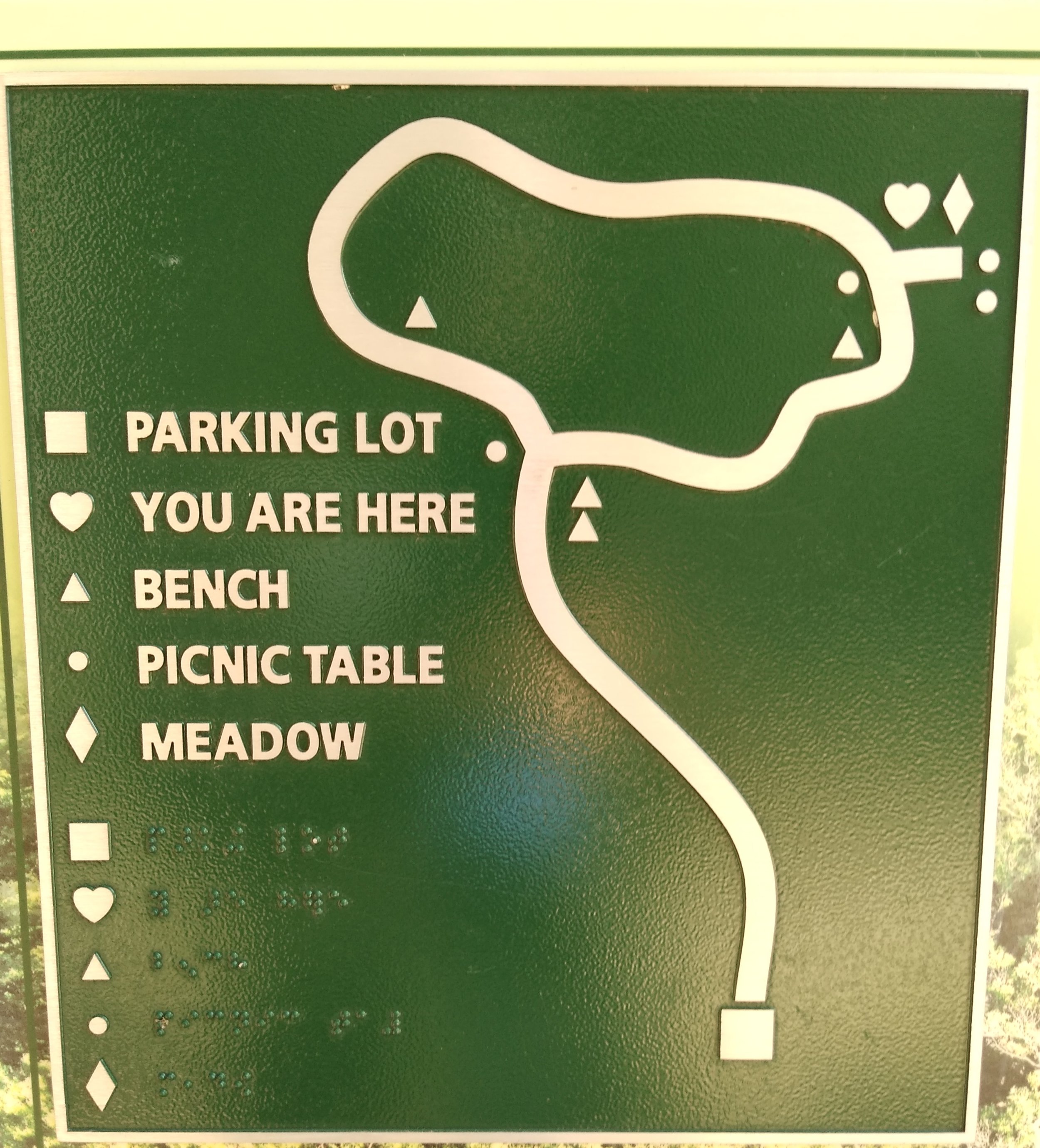
The maps are located at regular intervals along the trail and have raised icons. The map below shows the simplicity of the design. At each map location the raised “heart” symbol indicates where you are now. (Map picture)
The trail itself is well designed, not too long (1/2 mile) and wide enough for 2 or 3 people. The wooden railings on each side of the trail are a real plus for the visually impaired, are tastefully done, and add a “you are in a forest” feeling for everyone.
I especially like the sensory experience for the feet – something often missing in SGTs. For the visually impaired it indicates a nearby sign. For others it is a good visual reminder that something is going on right here. The trail cover is finely ground rough wood and the sign indicators underfoot are medium-sized stone gravel slightly embedded over a layer of fine gravel.
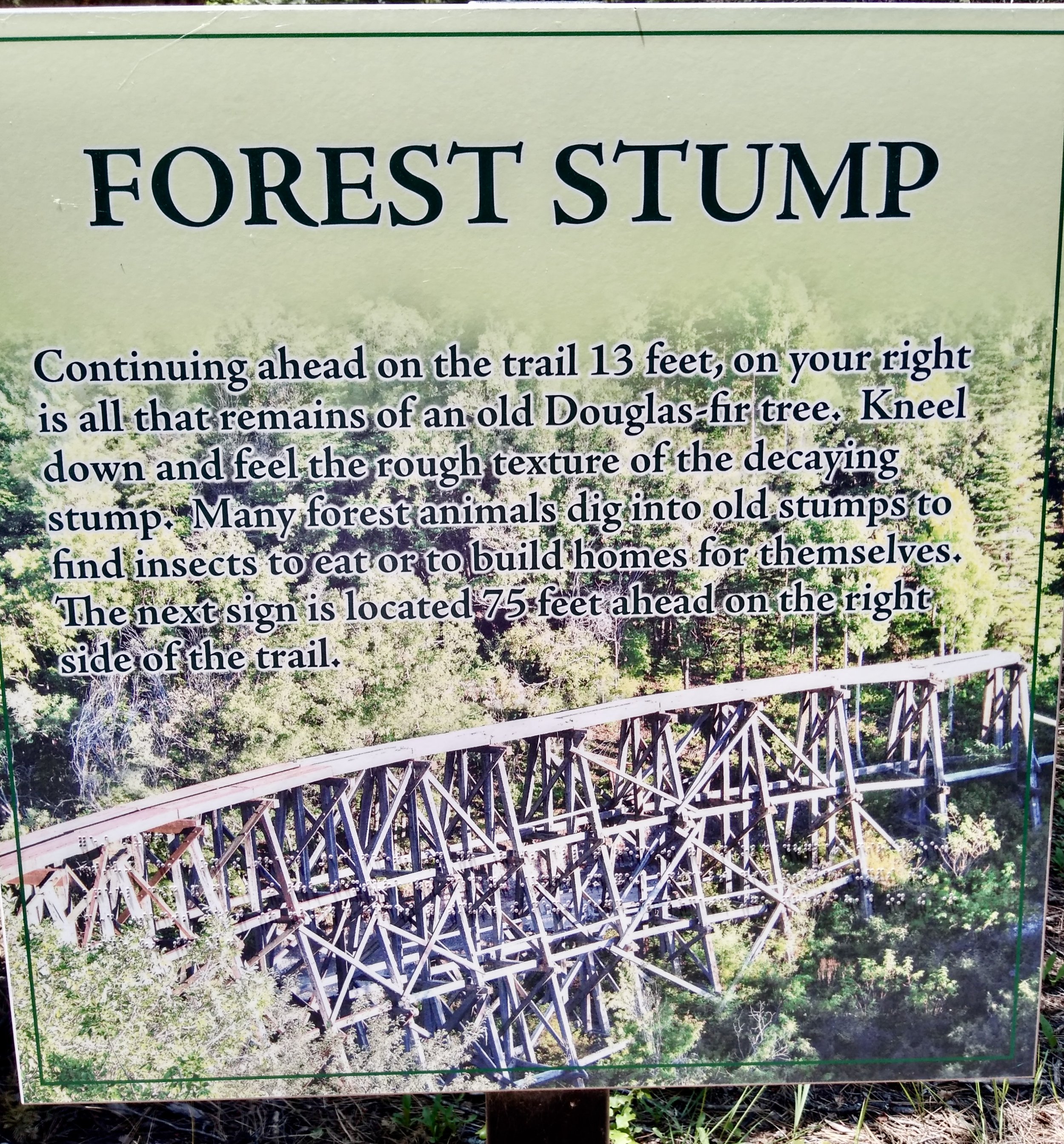
I like the amount of information on the signs -- at least for my taste (and for Goldilocks). All the signs seem well maintained (though a few had a “dot” or two of braille missing). Each sign encouraged the visitor to participate in some “doing” and they indicate distances to the next information sign.
Here is an example of one sign and the activity space very close to it…
There is also a small off-shoot trail that encourages visitors to feel the bark on different trees and one tree has no bark…
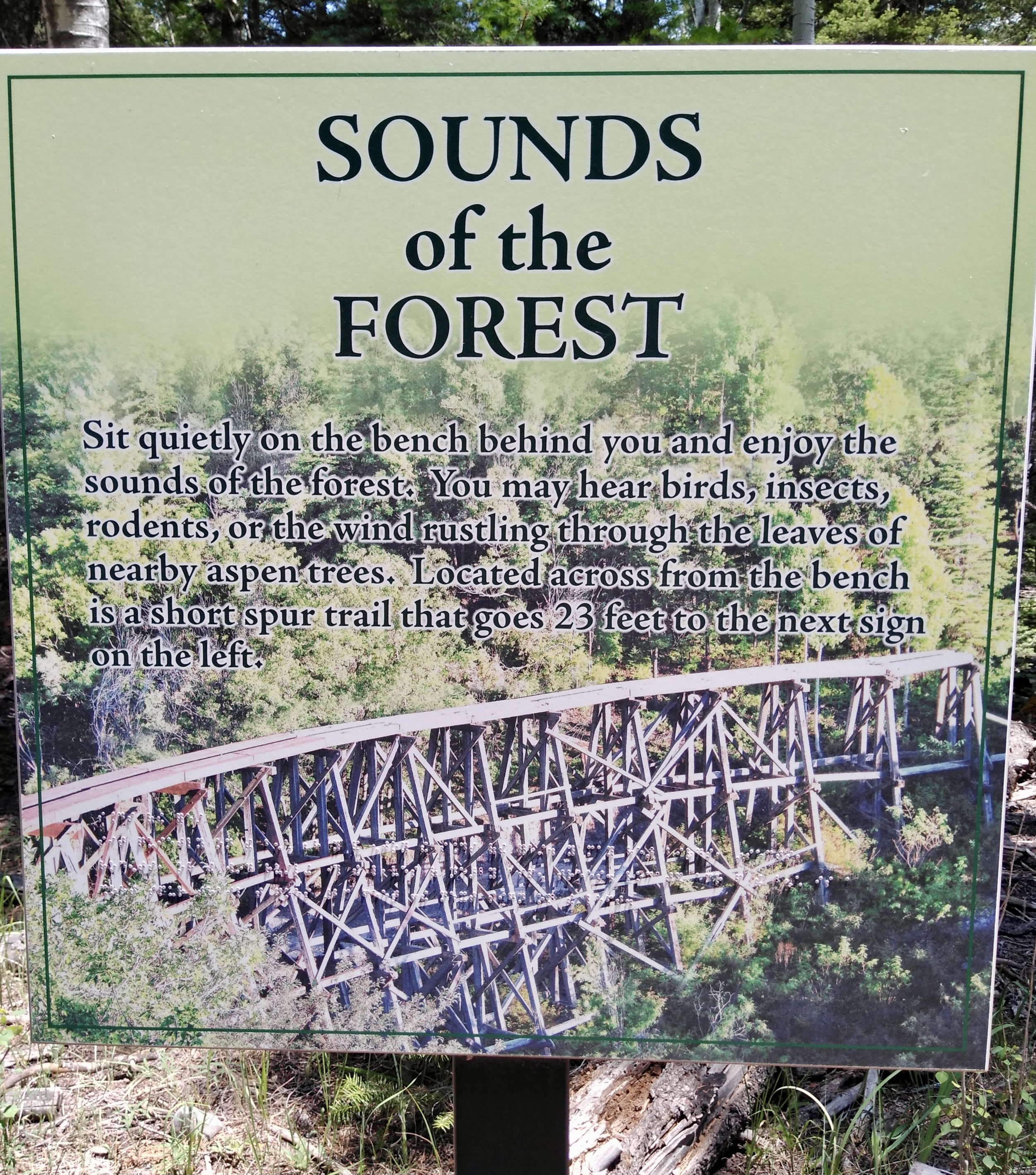
A bit further along the trail a sign and a bench encourage the visitor to linger for a while and listen to the sounds of the forest. In another location a sign and bench encourage more lingering while listening to and feeling the differences in sounds and temperature between the forest and a small meadow.
The sign and activity at the Animal Bones stop is very engaging. A variety of bones are on the railing near the sign and no samples are too alarming – no skulls, animal skins, or a stuffed animal.
It appears someone makes sure the bones are in place on a regular basis since people or wild animals could easily knock them off the railing.
I think this trail is a great example of what a self-guided trail could be and it contains most of the 11 best practices mentioned above. Here are a few things not included:
· No “Hands” opportunities (something to take away in your hand as a memory) or “Hunger” experiences (no food), but good “Head” and “Heart” experiences
· The trail does not provide other resources or suggest other places to visit
· There is no suggestion of how to apply the sensory experiences to other places or how to connect this experience to other parts of the person’s life
· I could not find any evaluation opportunities for the visitor or data on who uses the trail.
The only other concerns — a couple of signes with missing braille dots and some of the words are difficult to read against the trestle background. Otherwise, it’s a great SGT experience that pulls the visitor along without being boring.
Next time we will go to Trail #2 at the Palo Alto Junior Zoo, their strong use of evaluation and how they get visitors involved in the self-guided experience.
If you are interested in reviewing Bill’s two posts on SGTs here is the link to Part A and to Part B.


