Even if you don’t have responsibility for trail signage at your site you probably know the person who does. Even if you don’t have any trails at your interpretive place of work you probably visit places that do and could be enhanced by using some of the thoughts contained here. We encourage you to share this blog with those sites and people who do.
Some of the following Do’s & Don’ts seem pretty basic, yet I encounter the DON’TS on a regular basis, so I felt it was worthwhile to go over them as reminders. Money and time is spent on trail signage, expecting it to do its job of informing and enriching a visitor’s experience. You need to be on top of many things to ensure it accomplishes its job, because there usually isn’t money to do it over.
Be Involved in Sign Placement
Writing the sign, whether interpretive or informational, is just one element and just the beginning of the communication process. Don’t let your responsibility stop there. Do ensure visitor experience success by weighing in on where signs go and their positioning. Placement of signs is very important and can greatly impact the effectiveness of them, so never leave anything to chance.
Don’t expect your installation crew to know where you want signage placed and at what angle. Do provide clear instructions with a diagram preferably showing the desired orientation and the rationale behind it. This may have prevented the following situation.

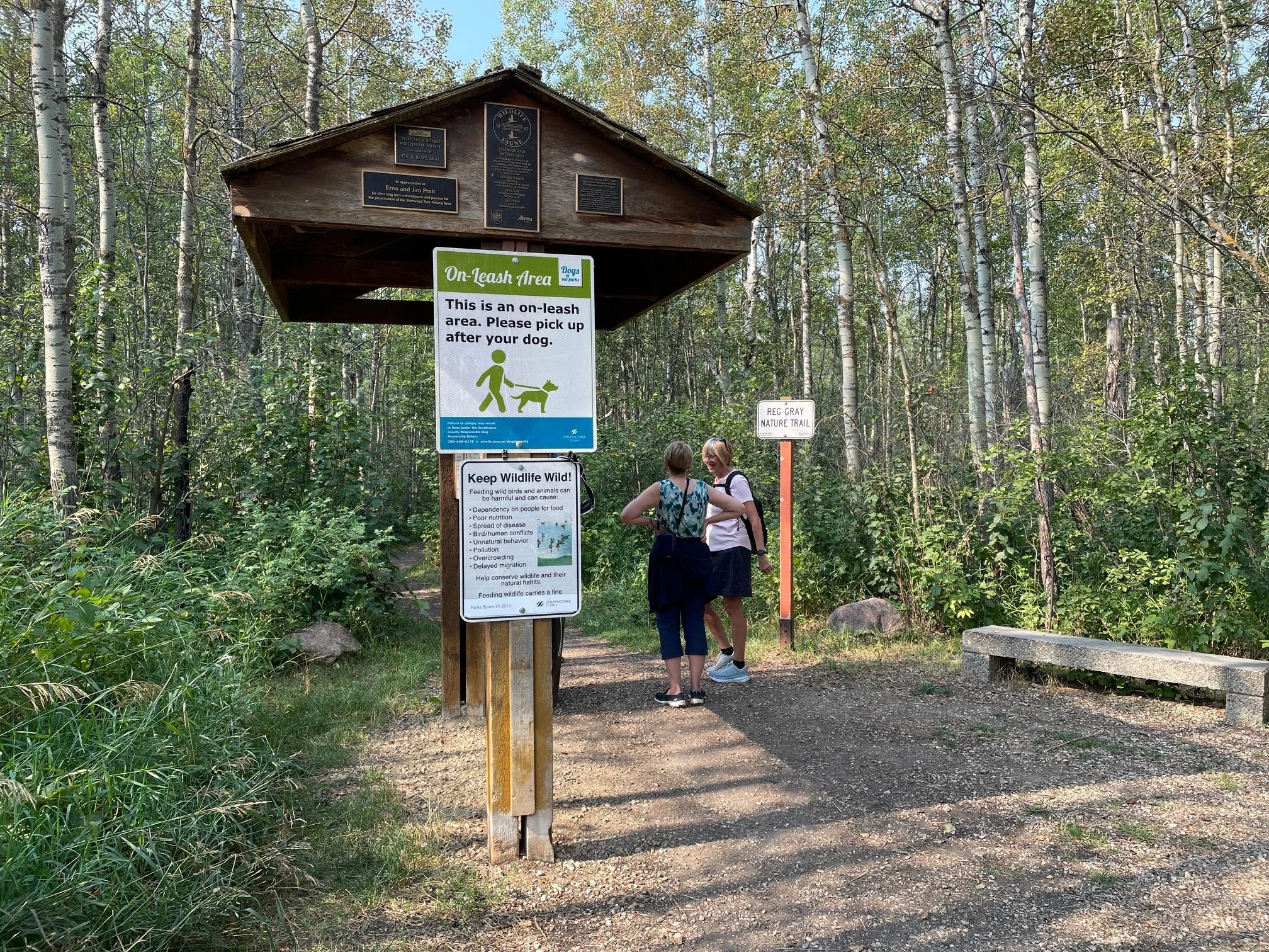
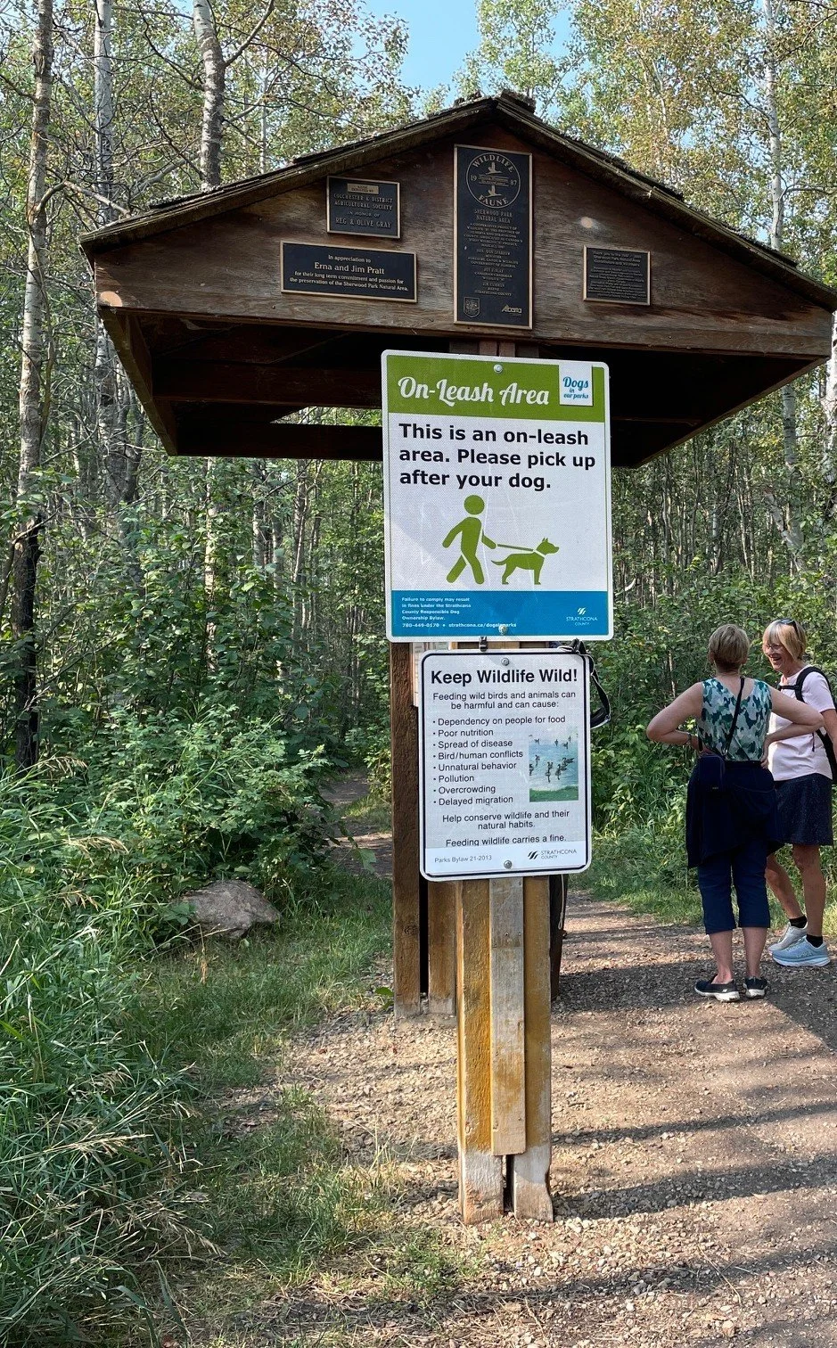
Trail kiosque Courtesy Bill Reynolds
In the image shown, there is the trailhead kiosque that consists of a double-sided panel, parallel to the trail entry point on the left. The intent was to have visitors flow on either side as one side was a clear welcome with a brief item explaining why this natural area is a special place. Also included was trail etiquette to set the stage called “we need your help” with silly graphics to entice reading. The opposite side had very colourful drawings and provided ideas for exploring the trails and things to look out for that varied by season. There were four seasonal panels where each one was designed to be changeable four times a year. Both panel sides instructed the reader to view the other side. Best laid plans, right?
Kiosque positioning and sign clutter Image Courtesy Bill Reynolds
Stay Involved
Well, it worked for a while until a bench and an accessory trail to an outhouse both on the right side were put in. Then the visitor flow tended to the right and the shrubbery started to encroach on the left making any walking around the sign difficult and not encouraging. Having the bench on the left side would have balanced things and kept both sides of the kiosque in clear view. The maintenance crew would have known to keep both sides clear. Did the installer know the original intent? To prevent this assault on the visitor experience from happening, you need to be aware of any “front of house” changes that could potentially impact the site messaging.
Be Wary of Sign Clutter
Originally a double panel sign that already had a lot of information that the site was hoping to get across has quickly become information overload when additional notices get mounted in front of that panel. Someone determined that more visitor behaviour signage was necessary (and more important placement -wise?). As a result, people will have a harder time now to grasp it all and potentially don’t read or even comprehend anything because their visual space is too busy.
Do your best to limit multiple messages and avoid sign plastering. Don’t increase visual competition for your visitors’ eyes.
Be Budget Conscious While Being Effective
Someone decided that they might as well just use the existing kiosque infrastructure. Saving money can’t be the only determining factor when communication effectiveness comes into play. Don’t expect a structure meant for one purpose to easily accomplish more outcomes, on top of the original intent, without impacting both. Do consider options when deciding where the best place to position your message could be, so it focuses the visitors’ attention.
Notice in the image the actual trailhead sign with the name of the trail. Considering cost and effectiveness would this have been a better place for at least one of these additional signs? Whether signs on their own are effective to accomplish behaviour change was addressed in another blogpost Pawsitive Partnerships Jun 19, 2025.

Trail etiquette Image courtesy Bill Reynolds
So now there are two in your face signs telling you what to do. Let’s take a look at the original how “you can help” wording with the zoom in images supplied. Originally, visitors were asked to remember to scoop it and use a leash to protect your pet, wildlife and other visitors. The wording is friendly and about benefits.

Generic sign Image courtesy Bill Reynolds
Presently, there is a statement and a command with a please. The new sign identifying the heavily used dog walking trail as on- leash was and is needed as the first line of awareness. This now familiar wording did not exist when the panel was initially installed. It is a well -recognized label and other areas have been set aside for off-leash so visitors are familiar with the terms. In this case, a generic image and text is reinforcing what is familiar and generally accepted. In most cases, do try to be conversational, explanatory and welcoming in tone when dealing with established human behaviour. Don’t be demanding with rules that can set up defensive postures by the visitor.

Caution with bulleted lists type signage Image Bill Reynolds
Be Cautious of Relying on the Generic Approach
The Keep Wildlife Wild new sign states that feeding wild birds and animals can be harmful and can cause a bulleted list of possibilities. The image is a flock of waterfowl. However, there are no waterfowl feeding issues at this site and the key point revolves more around human dependency and the change of natural habits for small non-migratory birds, due to visitor feeding so only two of the eight are relevant.
Don’t put up a sign because you have a generic one handy covering a broad issue, that sort of covers your situation. Do make sure your information addresses issues specific to your site.
Be Selective About Relevant Content
Don’t present a bulleted list on a sign especially when several of them involve lengthy follow-up explanatory descriptions. Do consider that signage should be employed to get across clear messages quickly. Perhaps a QR code would be helpful here. Don’t offer one-word answers like pollution and overcrowding expecting to provide a clear convincing rationale for behaviour change on behalf of the visitor.
Be Vigilant & Visit Signs Regularly
As plants grow they block existing signage and it can no longer do its job. Faulty signage visibility is something I experience on occasion. This can leave a bad impression on the visitor and reflects on the site and its level of care. The quality of the visitor experience suffers and this is somewhat akin to not cleaning the table before your invited guests come to sit down. I took this image at a botanic garden no less where plants are on display and attention to visual arrangement & detail are emphasized. This implies that interpretation is not valued.

signage encroachment Image courtesy Bill Reynolds
DO check up on visitor signage periodically to determine whether it is still doing its job, it’s clearly visible and it’s still actually there. Don’t let yourself procrastinate and have a schedule of visitation so you are reminded to do your rounds.
Be Cognizant of Height Viewability
If it is necessary to place reading material above six feet in height it better be large and bright. Try to keep material at eyelevel within the range for the average height of your intended reading audience. In other words, if children age 10 and under are your prime audience then placing signage no higher than 4 feet would be advised.
Sign clutter barely viewable recognition plaques image courtesy Bill Reynolds
Notice the height of the recognition plaques on the front of the information kiosque. This is a stretch even for a professional basketball team. This kiosque structure is being used for another purpose - that of recognizing trail supporters. Remember what we discussed near the beginning. Where is the best place for visibility, and for increased attention-getting to ensure the public can actually focus on and see the plaques?
Think contrasting colours
Do consult a graphic artist colour wheel when choosing foreground letter colour and background colour so that the message stands out. Don’t use the same colour for both. Many times I see beautiful carved lettering in a wood background but without painting the letters white or yellow the readability is often poor. This applies also when you place something like blackish & brass recognition plaques on a dark brown wooden structural background. Do provide a dedicated space for recognition.
Beautify or Uglify -Your Choice
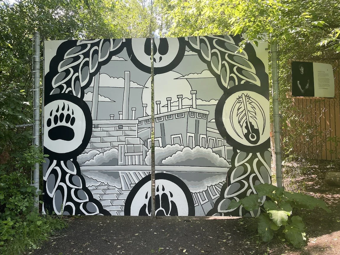
I just had to share this trail closure notice that I ran across the other day in a municipal river valley park. I have never seen one so attractive and one that had so much thought put toward it. Usually it is simply an ugly gate with an ugly sign saying trail closure with minimal information.
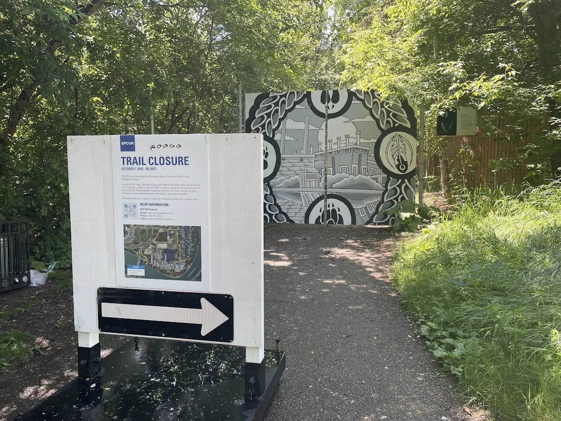
Trail closure Image courtesy Bill Reynolds
In this case, not only is the date of closure clear (just over a year) and there is an aerial view of the closure area along with a brief paragraph about why the closure, there is also a QR code, email, and phone number for more information. How many of our sites do this as a minimum policy?
Somebody chose to go to the next level and must have asked how could they create a gate that enhanced this area beyond simply providing an effective barrier. They could have used inhouse graphic people but the small sign on the right that provides a background on the artist indicates most likely they hired an external artist.
Now that would be an advocacy role an interpretive staff member could play !!
Our challenge to you : have a coffee with the head of site visitor services and/ or your planning, engineering, maintenance or infrastructure person about an upcoming small scale project where brainstorming interpretive enhancements might be easily implemented. Let us know how it turned out.
Here is another image example to whet your appetite showing the benefits of pushing for an enrichment of the trail “stage “ - a water outflow trail safety barrier to prevent trail users from accessing the water is not just a standard metal fence. Instead they employed a cattail motif. Can you spot the great blue heron?
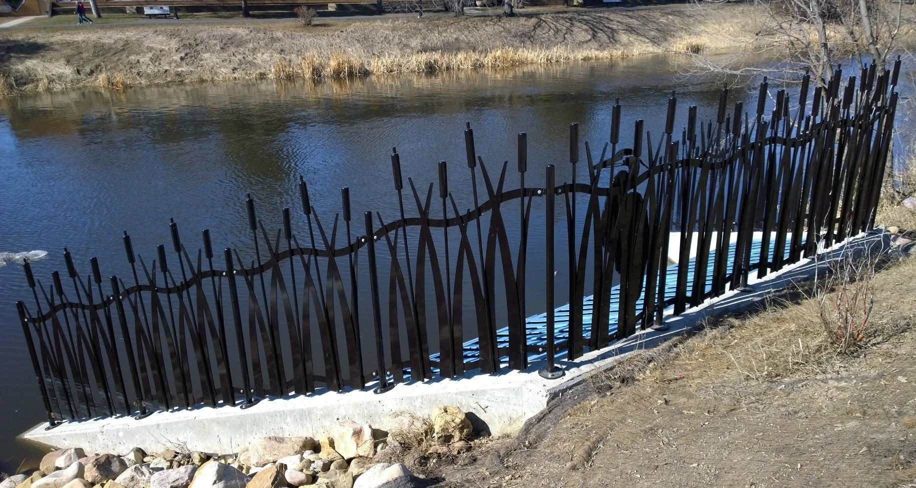
Decorative trail edge water barrier image courtesy Bill Reynolds
Still wanting more on signage check out our post Appealing Approaches to Signage
August 28, 2024