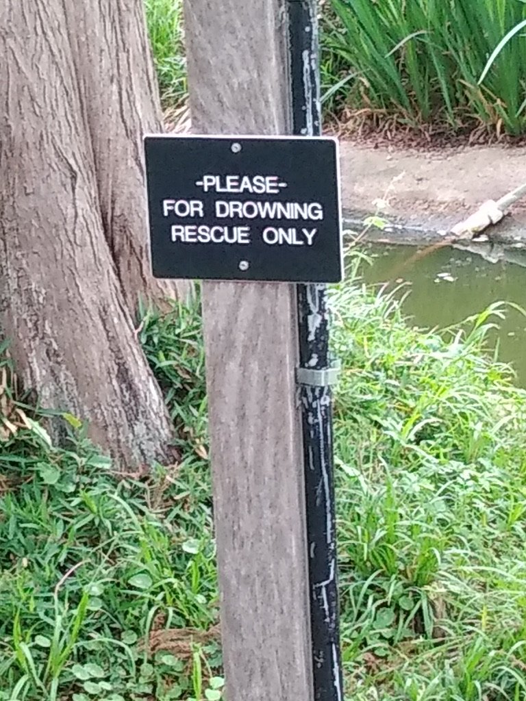
We’ve had signage on the brain lately so time to put in my two cents worth on this topic. An April 2024 visit to two sites, one a large botanical garden in Texas and the other to a smaller heritage garden in Arizona, provided some interpretive signage food for thought.
But before getting into the details of those sites, here’s a few general thoughts on signs and planning:
§ Why do you have a sign in that location?
§ What is its purpose?
§ Does it support the site mission?
§ Is the sign’s intended outcome clear?
§ Have you considered a prototype of the sign so you can evaluate if it is doing the intended job? (The latest research states you have between 8 - 30 seconds before folks move on)
Sign Placement – Where should it go?
Knowing where to place directional or interpretive signs is an important decision for a site. It has been my experience that when visitors arrive they are ready to get out of their vehicles, go to the entrance, pay the fee, find the bathroom, and start the “dance of experience” at the museum or park or zoo or other heritage site. The walkway to the entrance is a time for invitations, anticipation, and some directional landmarks. Anything more is usually a waste of space and money.
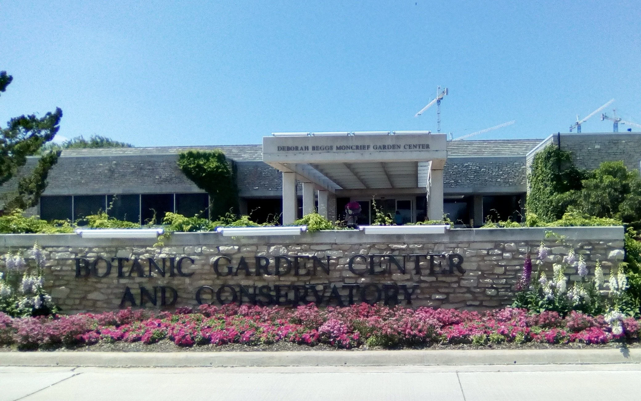
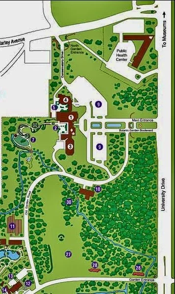
Yes, the entrance and arrival area need to be welcoming and pleasing and clearly marked. All of these things were well done as we drove into the botanical garden in Texas. We clearly knew where to go.
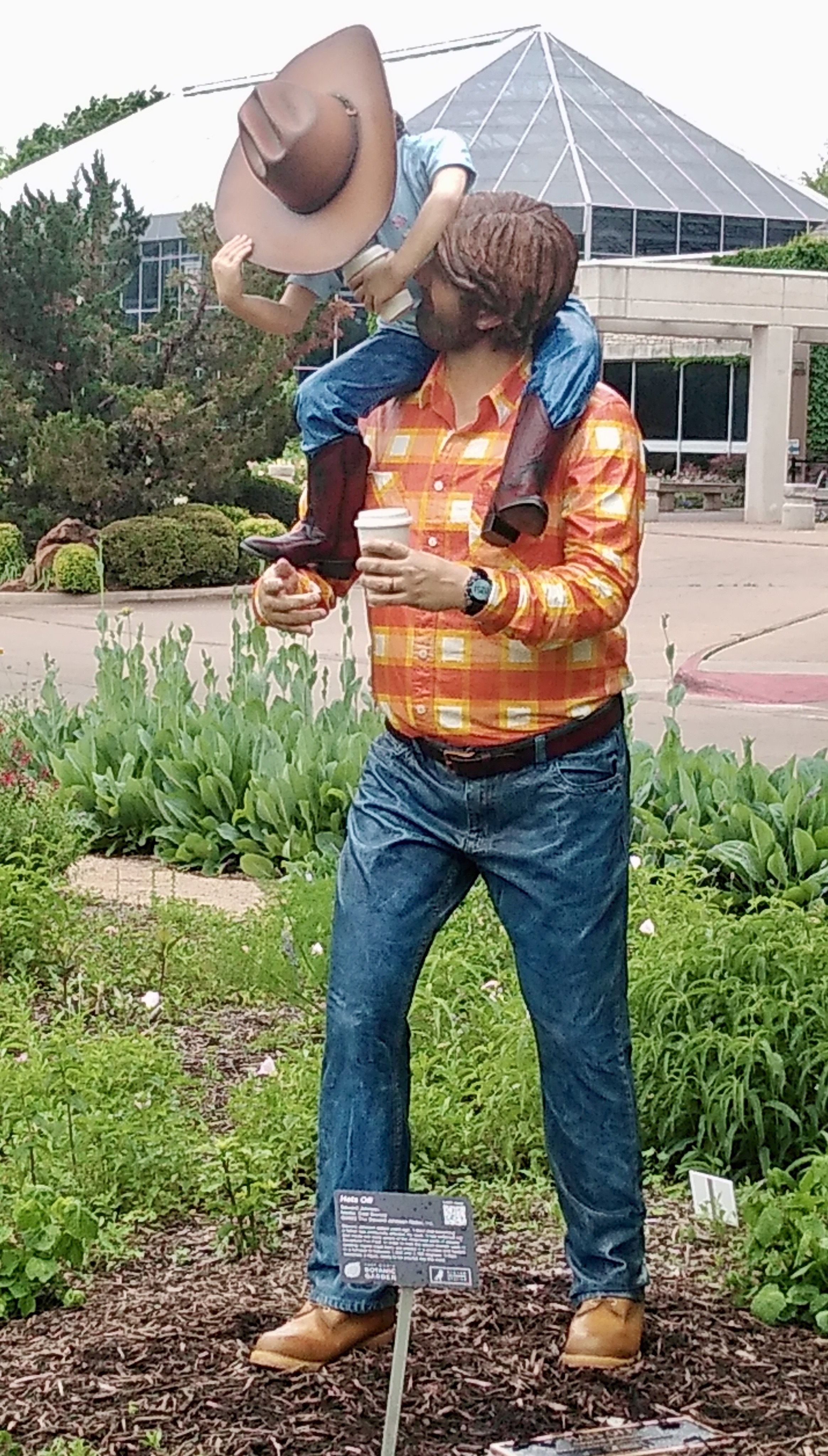
In addition, a statue in the entrance driveway of a father with a young person made me smile and sent the message - “Not just for moms and women.” - and the dad even had a little “belly”. This is all good stuff and sets a friendly atmosphere.
One Too Many…
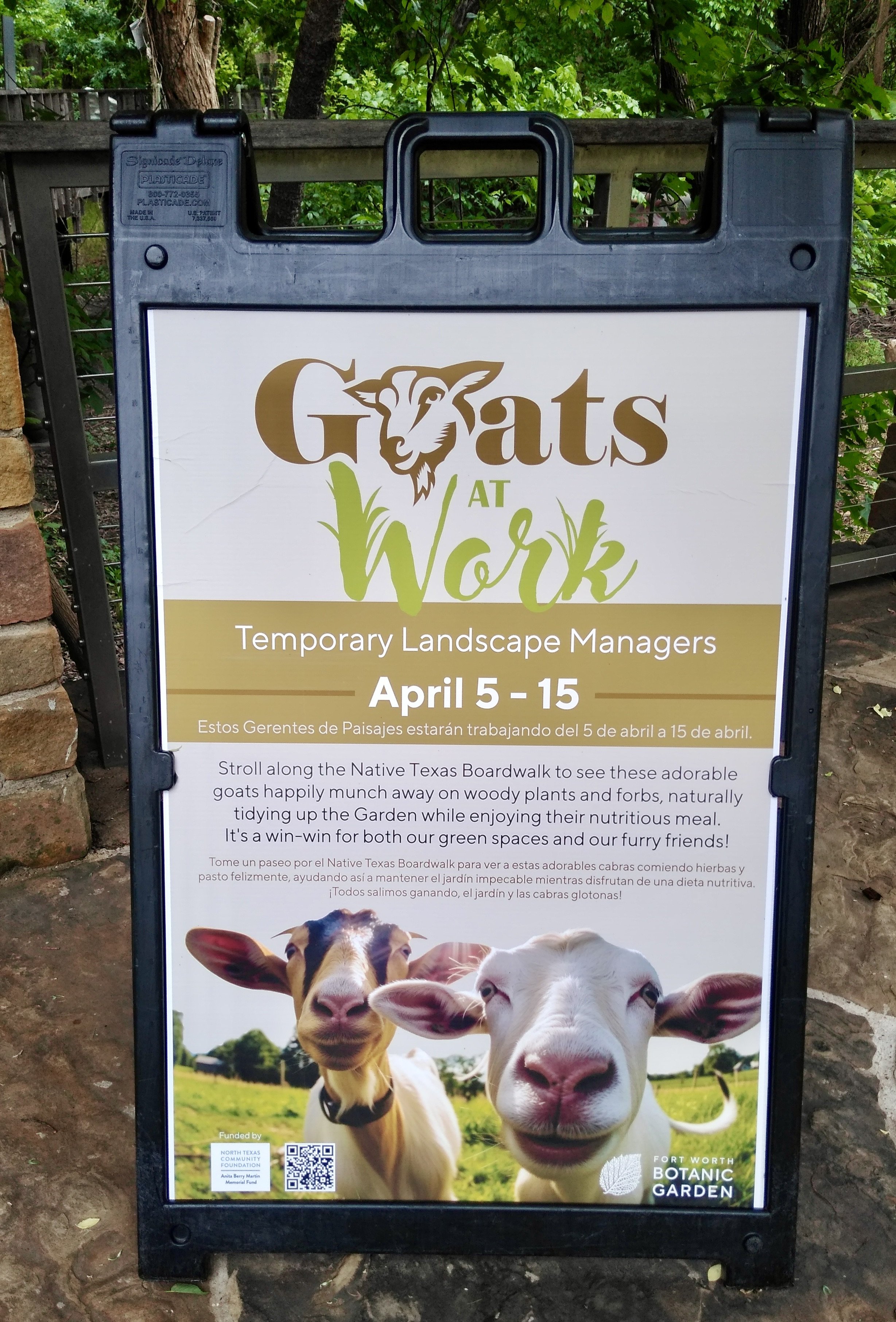
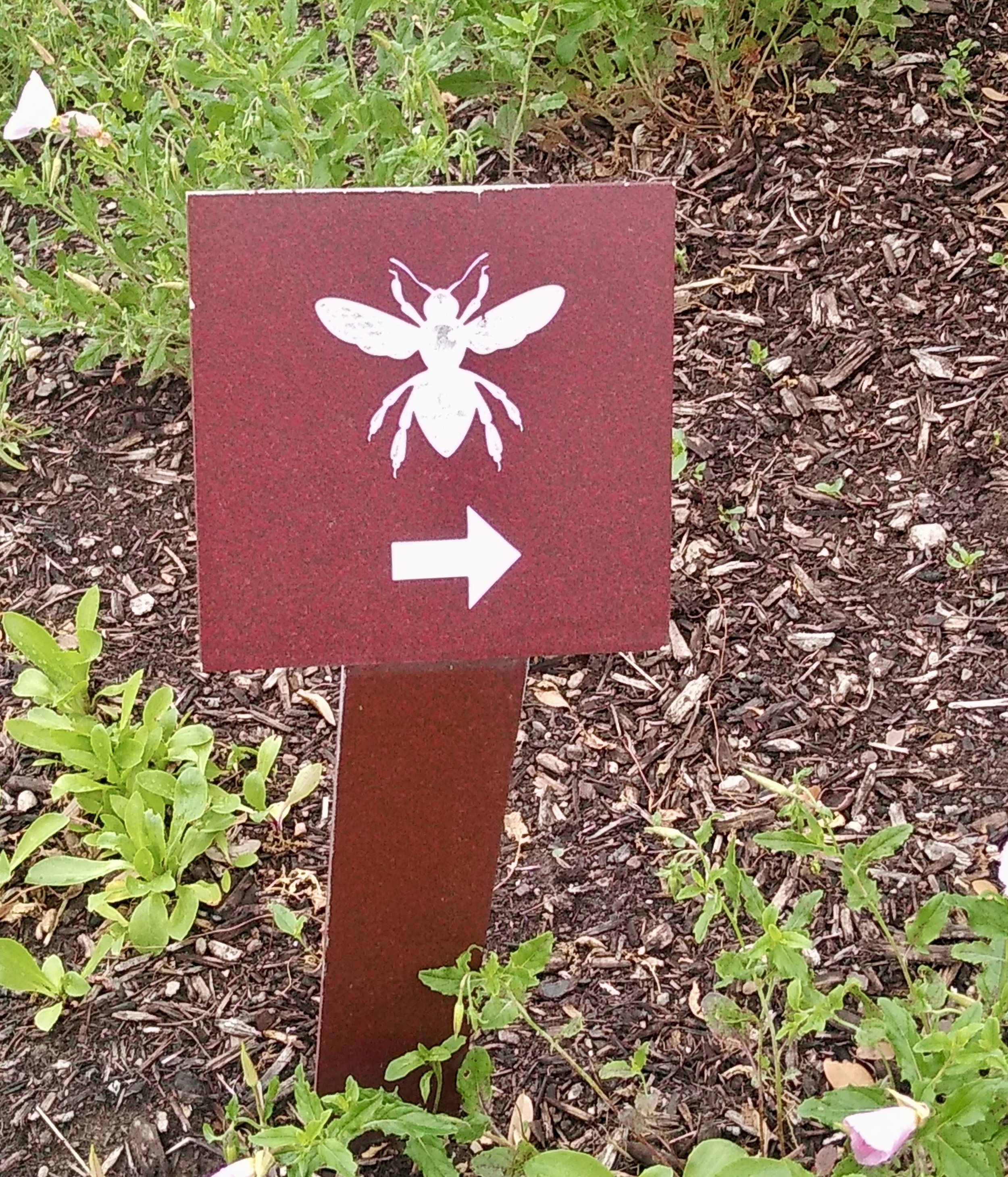
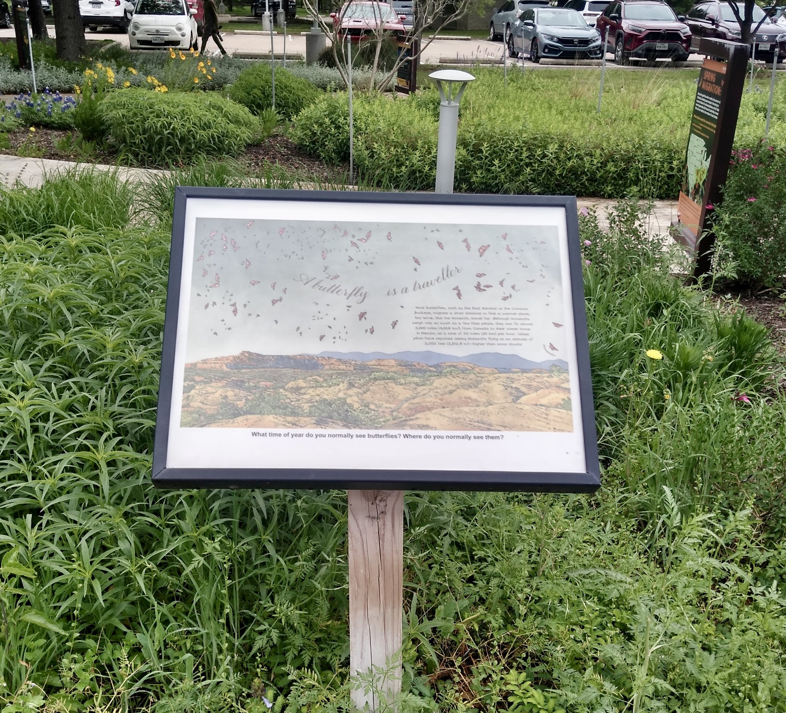
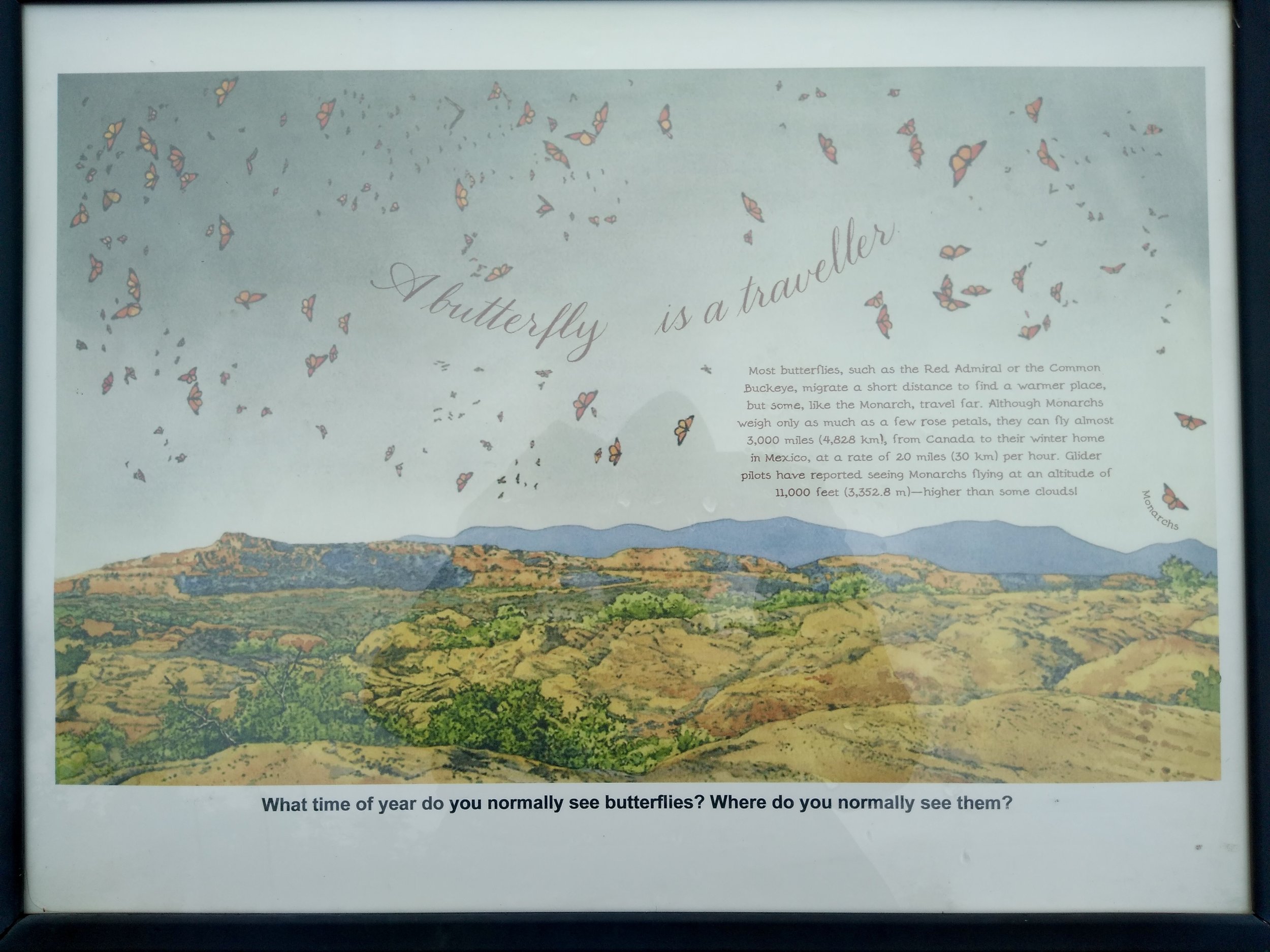
Once folks are out of their vehicles and head to the entrance, they pass several side paths with a nice array of plants and way too many signs. These signs tell the story of the monarch butterfly on its journey through Canada, United States and Mexico. There are also a few other pollinators tossed in for good measure. Most folks aren’t aware of the signs in this area and don’t want to be diverted from their primary destination – the entrance.
Of course, you could intentionally go from the car park, through these paths and then to the entrance path but that is highly unlikely. A well- marked walkway makes it clear how to get to the entrance door.
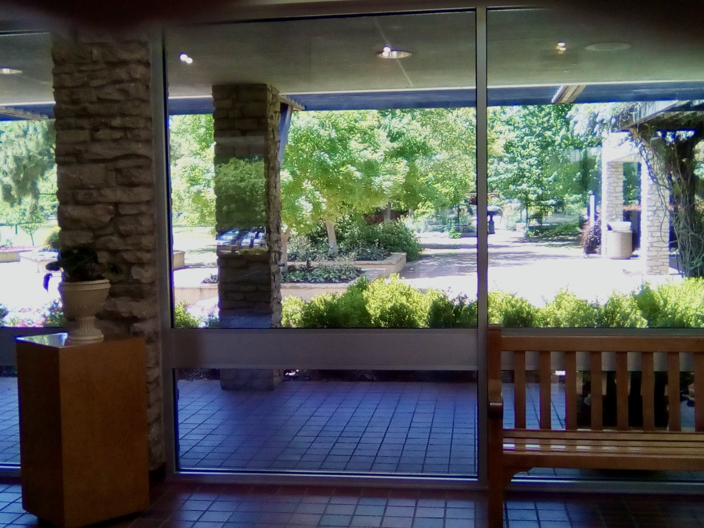
Once inside the front entrance there is plenty of open space, cool air, an obvious fee area, a gift store, restrooms, lots of plant pictures and large windows that invite the visitor to head outdoors and experience the garden’s delights.
During our exit from the main garden grounds my friend and I spent about 45 minutes exploring the signs and paths we ignored when we entered (This is known as “fun” for us interpretive geeks). During this time we only saw one couple wandering down these side paths as they moved toward the entrance. All other visitors headed directly from their cars to the entrance, or when exiting they went directly to their cars. Perhaps if we had visited on a weekend foot traffic patterns would be different, but I doubt it.
Sign Fatigue…
So, not only a lot of signs but lots of information which usually means at some point “sign fatigue” sets in. After a while even interpretive geeks like my friend and me were simply reverting to the standard 8 second average viewing time. Occasionally something would catch our eye, but not on every sign. And it wasn’t even about the signs being text heavy, it was simply too many signs that did not really lead to any experience or even to a destination.
Please don’t misunderstand, the messages along these paths are important. Knowing about pollinators and the amazing journey of the monarchs is an outcome everyone needs to absorb in their Head and Heart. And, if the site thinks this is an important outcome for all visitors to leave with here are some things to consider:
1. Perhaps this information about the monarch and pollinators is better placed inside the main garden where more visitors would have access to the message. Then a simple A-Frame sign inviting visitors to find out about pollinators, and specifically the monarch story, could be placed along the entrance way. This kind of signage builds anticipation and sets the stage for a key visitor takeaways. Realistically, that is about all you can expect to achieve in the pre-entrance phase of the visitor journey.
2. How about this idea…if the site really wants visitors get to experience pollinators before they enter the main garden, why not cover the pollinator section with a tent like netting (seasonally removable) and fill the area with all kinds of native butterflies. Talk about an attraction! That would certainly get visitors’ attention and indicate the site believes knowing about pollinators is important. Then you only need a few targeted signs for the Head and the Heart inside the netting.
3. This area has great potential for an exit experience. Yes, in most cases when folks are done they are done. But setting up an intentional exit experience could provide a strong remembrance and reinforce the garden outcomes regarding pollinators and the monarch.
Not Quite Enough…
At the other end of the spectrum is a lovey 4 acre (1.6 hectares) heritage garden in Tucson, Arizona. It is on land in the Sonoran Desert of the North American Southwest inhabited for over 3,000 years by the ancestors of current members of the Tohono O’odham and Pascua Yaqui peoples, was conquered by Spain, became part of Mexico, and eventually became part of the United States through the Gadsden Purchase. It is enclosed by a colonial Spanish style presidio wall. The garden’s focus is the fruits and vegetables grown by this arc of culture, offers a variety of natural history activities for the community, and is used for public events.
This site is not easy to find even though it is off of a fairly busy street on the west side of the city. Every time I visit I get a bit nervous trying not to miss the turn off and often need a GPS map as a reminder of where to turn. There are no signs along the major road to ease my arrival anxiety; there is not even a sign indicating there is a parking area ahead once I make the turn.
Once out of the car the adobe style wall indicates which direction to head and as you approach a walkway leading to the entrance some signs begin to appear.
When you look beyond entry sign there are some very colorful signs along the path to the entrance in English, Spanish and O’odham. Unfortunately, they are tucked behind vegetation and can be missed. On the positive side, the signs are not trying to educate or interpret. They are pleasing and do pull the visitor along.
At the entrance to the main garden is some information about current events and a definite sense of going back in time. Though getting to the inside entrance to the garden is not difficult, if you are a first time visitor you may start to wonder, “Where am I going and when will I get there?”
A few suggestions…
1. To reduce the “Am I in the right place” anxiety a couple of signs along the main street would be useful. Perhaps coordinating this with the city transportation department is the way to go with one sign ½ mile from the entrance and another indicating where to turn.
2. Once the turn is made a colorful sign decorated with native vegetation visitors might encountered in the garden could help direct folks to the parking lot. It would also help to build anticipation. Having this sign in 3 languages would let visitors know a wide range of folks are welcome.
3. What might be most useful is for the staff and other associates, along with an interpretive planner, to walk through the arrival and entrance experience and decide where to best place important landmark signs.
So, to wrap things up a bit here is what we think an interpretive sign should do:
¨ Provide directions to a trail, building, event, etc.
¨ Help folks know where they are
¨ Reduce arrival anxiety
¨ Encourage some kind of interaction with an object or the natural world
¨ Stimulate the Head and Heart
¨ Prepare folks for something coming next
¨ Make sure visitors haven't missed something important
¨ Provide some reinforcement for what they have just experienced
Here are some things to AVOID when planning signs:
Þ Not too many -- these are just landmarks for what you want people to do or leave with in their Head, Heart and Hands, and to reinforce site outcomes. The cultural experience or natural environment should be the "star."
Þ Don't expect visitors to do much reading or stopping on the walkway to the site entrance. Folks want to get in and get going.
Time for us to take a “sign break” and move on to other topics in upcoming posts. However, if you would like to work with EID on your signage in the arrival, welcome, entrance and orientation area then please take us up on our offer of a free coaching session.This offer is available for the rest of 2024. Email us atcontact@eidcoaching.com and we will set up a date and time that works for you. Meanwhile, enjoy the signs of autumn wherever you may be.

