Do you like being a voyeur into a mini-mystery world? Well that is what one of the galleries at the Museo de la Biodiversidad in Panama City invited you to be. They decided to abandon the normal static/stand alone display of specimens but decided to expose the visitor to a dynamic presentation. How? By designing plant-animal interactions that visitors would walk around & among.
The use of highly crafted and colourful magnified versions of flora and fauna above and below the visitor created an immersive surroundscape. This gave you the sense of being a spy into some inner natural worlds common to the Panamanian forest, a la “Honey I Shrunk the Kids” movie perspective. This Panamanian portrayal went another level and so far beyond a traditional laying out of specimens based on habitat or classification.

Image courtesy Bill Reynolds Do you see the hummingbird mega model?
A typical diorama approach to the visitor is mildly engaging, if the scenography has been well designed and there is some fun associated with finding the various specimens. However this static approach could attain so much more than superficial, enjoyment -level outcomes. Museo Biodiversidad decided to present natural interactions among living beings, allowing them to accomplish so much more.
Each of the dramatic scenes chosen demonstrated the intimate interrelationships between creatures and how they are dependent on each other for mutual benefit (my title scratch concept). Life has many examples of partnerships and collaboration -it is not all one big competition and survival at someone else’s expense. Not a bad underlying lesson for all exhibits going forward.
Each scene was a story in 3 dimensions- a great model to emulate. Because of that design choice the scenes pulled you in to the unfolding natural drama and you wanted to read the labels to discover what was going on in these action- oriented scenes.
One example of the many symbiotic dependencies dealt with the giant model fig tree fruits and combined with a circular display on the floor it succinctly explained how hummingbirds, bats, wasps and snakes all interacted with these fruits in amazingly different ways.

Image courtesy Bill Reynolds Cut away view of fig tree fruit nursery for wasps

image courtesy Bill Reynolds Giant floor “label” explaining the overhead fig fruit cutaway
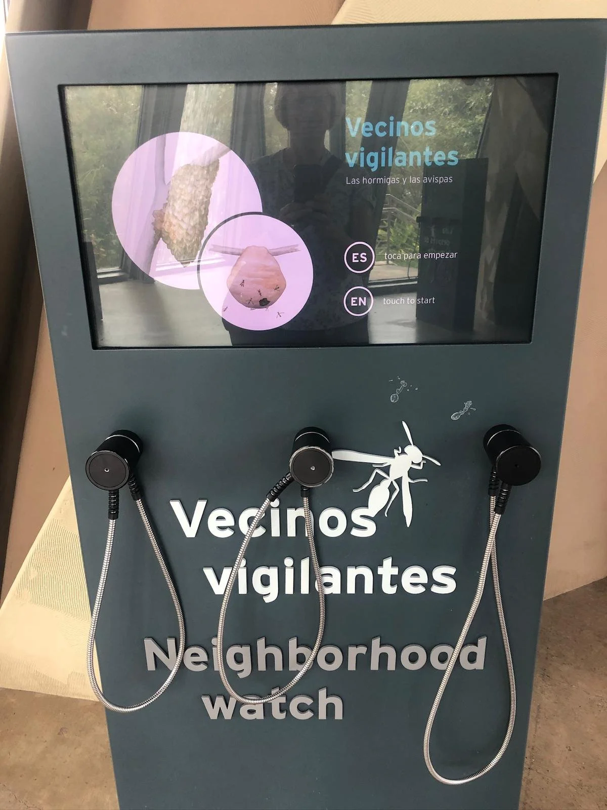
Mega-models of termite mounds and their parrakeet partners, along with supersized bromeliad nurseries for dragonfly larvae and frog tadpoles, both illustrated similar principles of interdependency. These were enhanced by audio clips that extended the catchy titles they used to summarize the species interplay. The next image illustrates the ant wasp collaborative interaction titled “Neighbourhood Watch.”
In the hall about prehistoric animals and the land bridge created by the geological formation of Panama there was a conscious decision again about immersion among specimens to break down the barriers of the visitor spectating in a removed and separated way. A monumental arch effect using the beasts of the past, created the concept of land bridge.
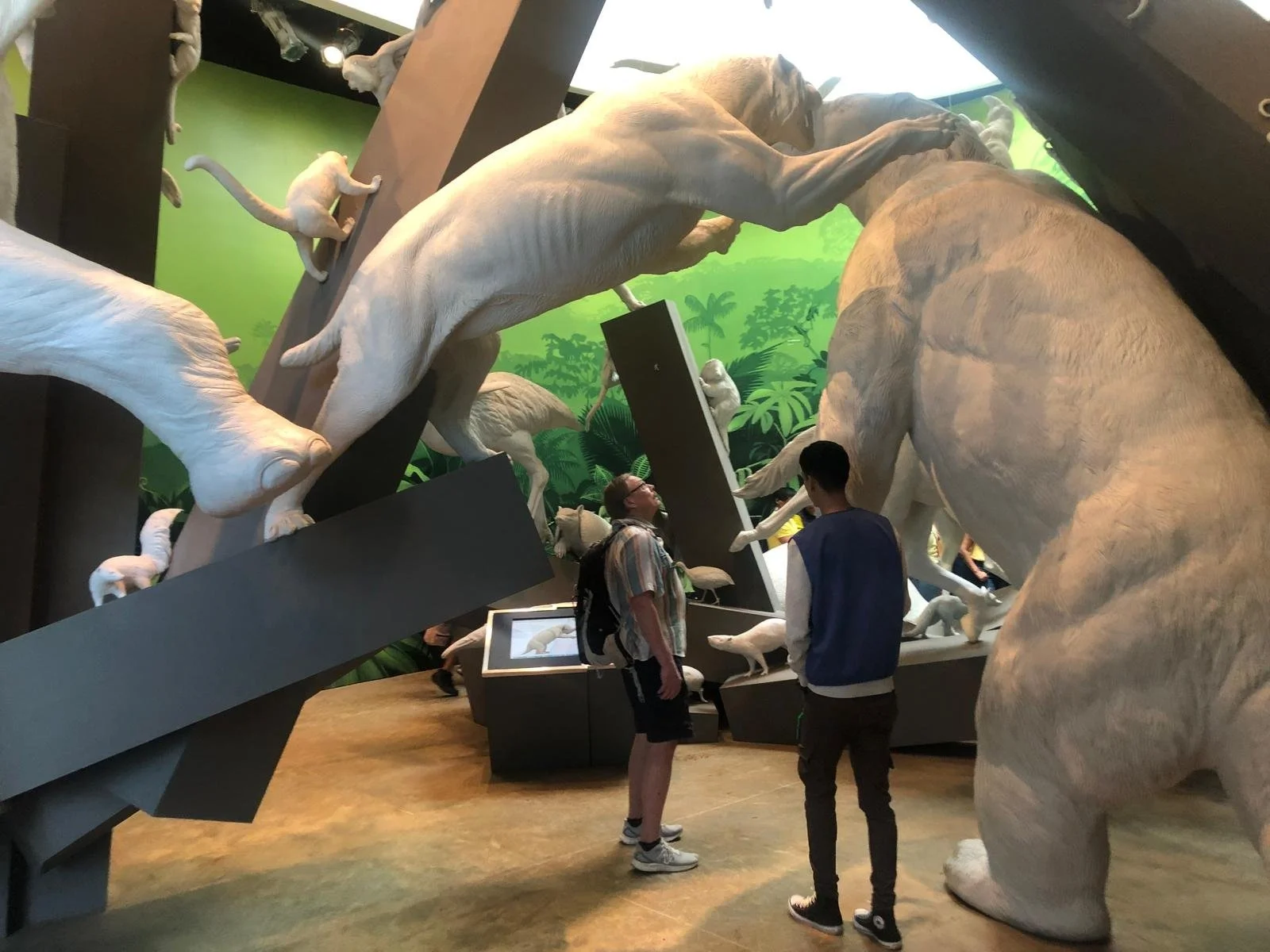
Image courtesy Bill Reynolds Predator prey immersion while visitor is IN the display
This is not to say that you need colossal effects (they sure can help), to impact the visitor experience. However, a magnified introduction into the fascinating mini-worlds of one’s immediate environment that illustrates interactions can. The added bonus is to demonstrate collaboration and mutually beneficial relationships as an underlying positive message.
Exposing visitors to new perspectives in an up close and personal way, can grab attention. This can work inside an exhibit hall and outside on the trail.
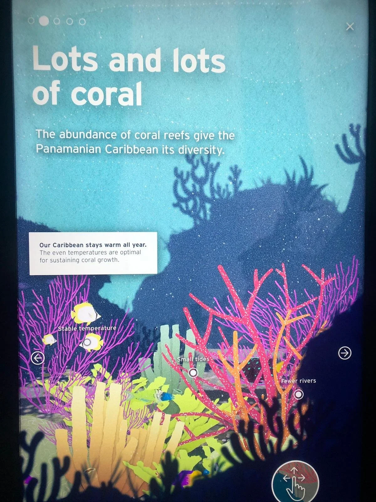
In another hall, they chose to physically divide the two sides into Pacific habitat and Atlantic habitat to mimic the land effect of Panama and it was a very effective way to organize the information. The representative aquaria tanks demonstrated clearly the key differences between them, especially when paired with the text highlights.
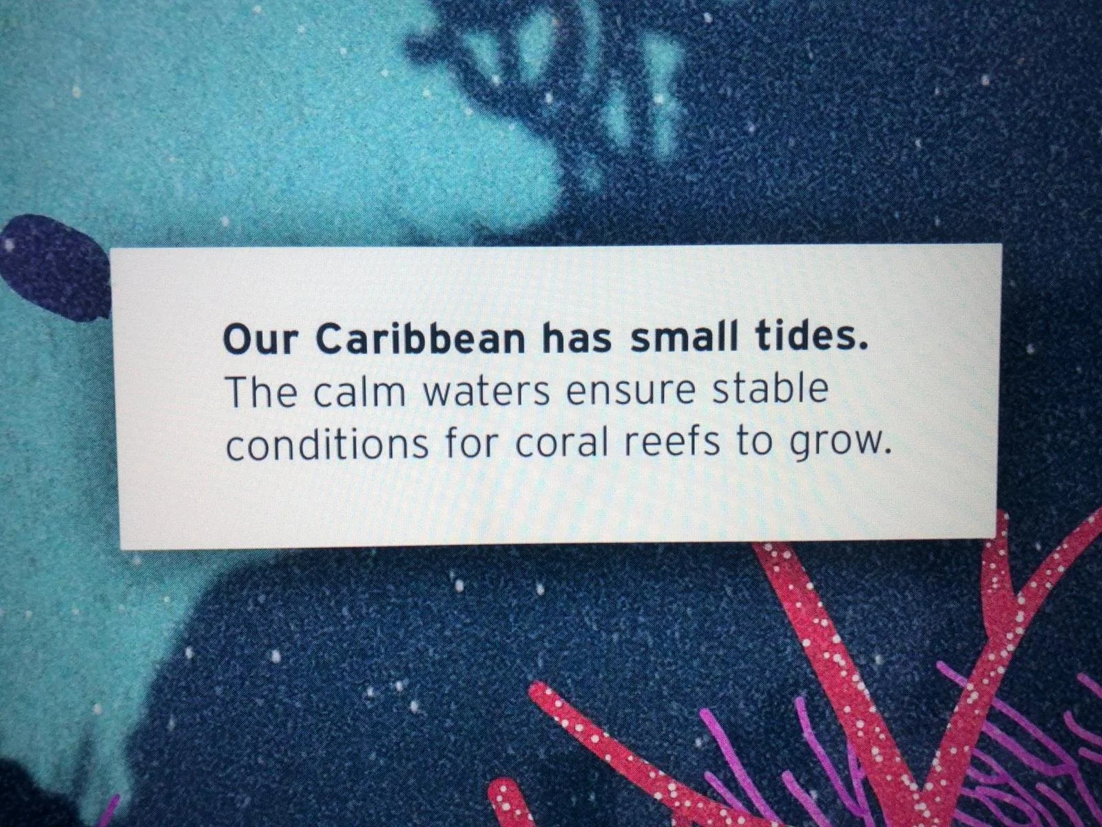
The accompanying large, colourful visual screen graphics about ocean life had short and sweet, intriguing, levelled messages. The master panel had five Big Message choices (see buttons at top left of first image) which you chose to learn more about. In my example here, coral reef diversity breaks down further into 3 buttons to choose on the screen (e.g. small tides). This states a very clear fact. The head outcomes are very clear for this exhibit.
There is a similar approach to the Pacific side -almost a counterbalance of facts- evident as you can see with the next master screen representing the Pacific. Both sides organized their data messaging in a mirror format. The first master choice I have shown for the Pacific is from a physical feature perspective (note “large tides”), in counterpoint to the Caribbean example, and the second image following for the Pacific shows a fish biological feature contrasting perspective (e.g. fewer colours). The Caribbean contrast screen would indicate “abundance of colours.”
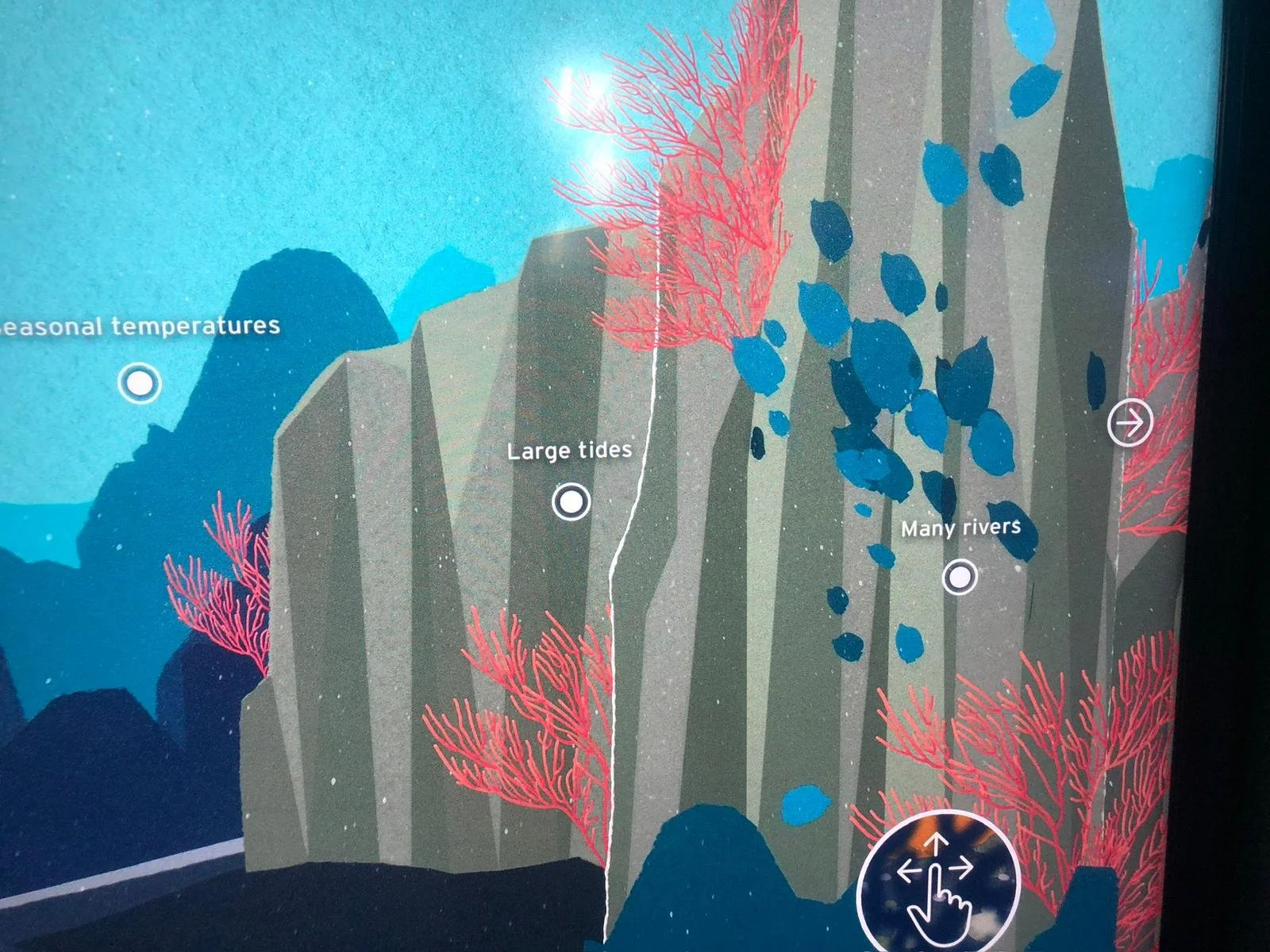
Image courtesy Bill Reynolds Physical features for Pacific
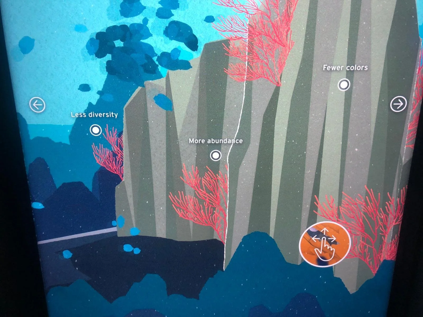
Image Courtesy Bill Reynolds Fish biological features
They always ended each message cascade with present environmental issue alert combined with relevant action you could do at home to protect biodiversity and conserve habitat. They had a natural flow to them and never sounded preachy, just practical. They were also summarized on a large text panel (see image).

Image courtesy Bill Reynolds
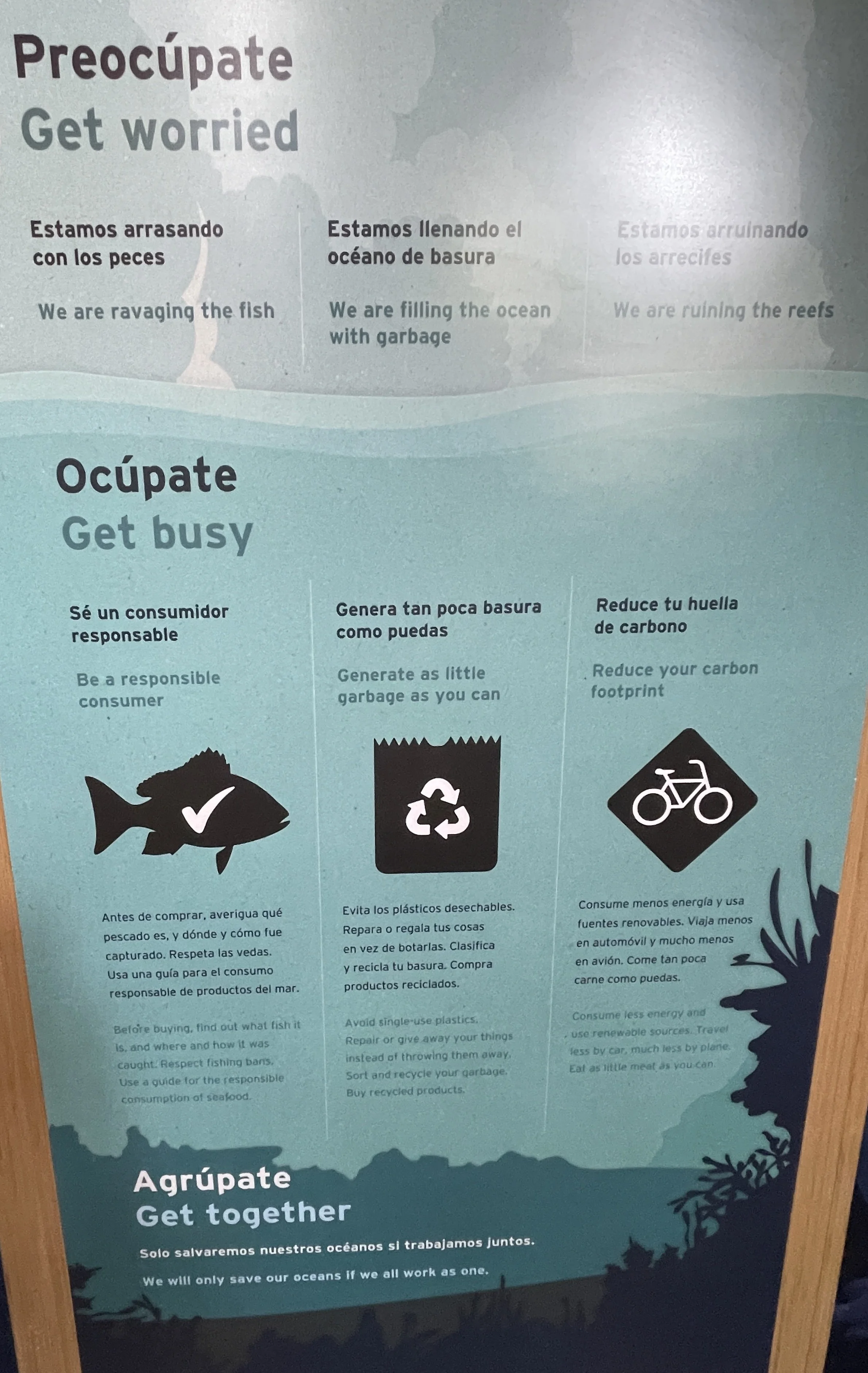
Image courtesy Bill Reynolds Get Worried Get Busy Get Together
The choice of colours (lack of), no interesting images and text blocks all work to not draw you in. For those who do read this it would have been more effective to have a donation box close by tied to what the Museo is doing to actively protect the reefs. The image attached shows the donation box in the outdoor plaza albeit with a semi-catchy phrase.
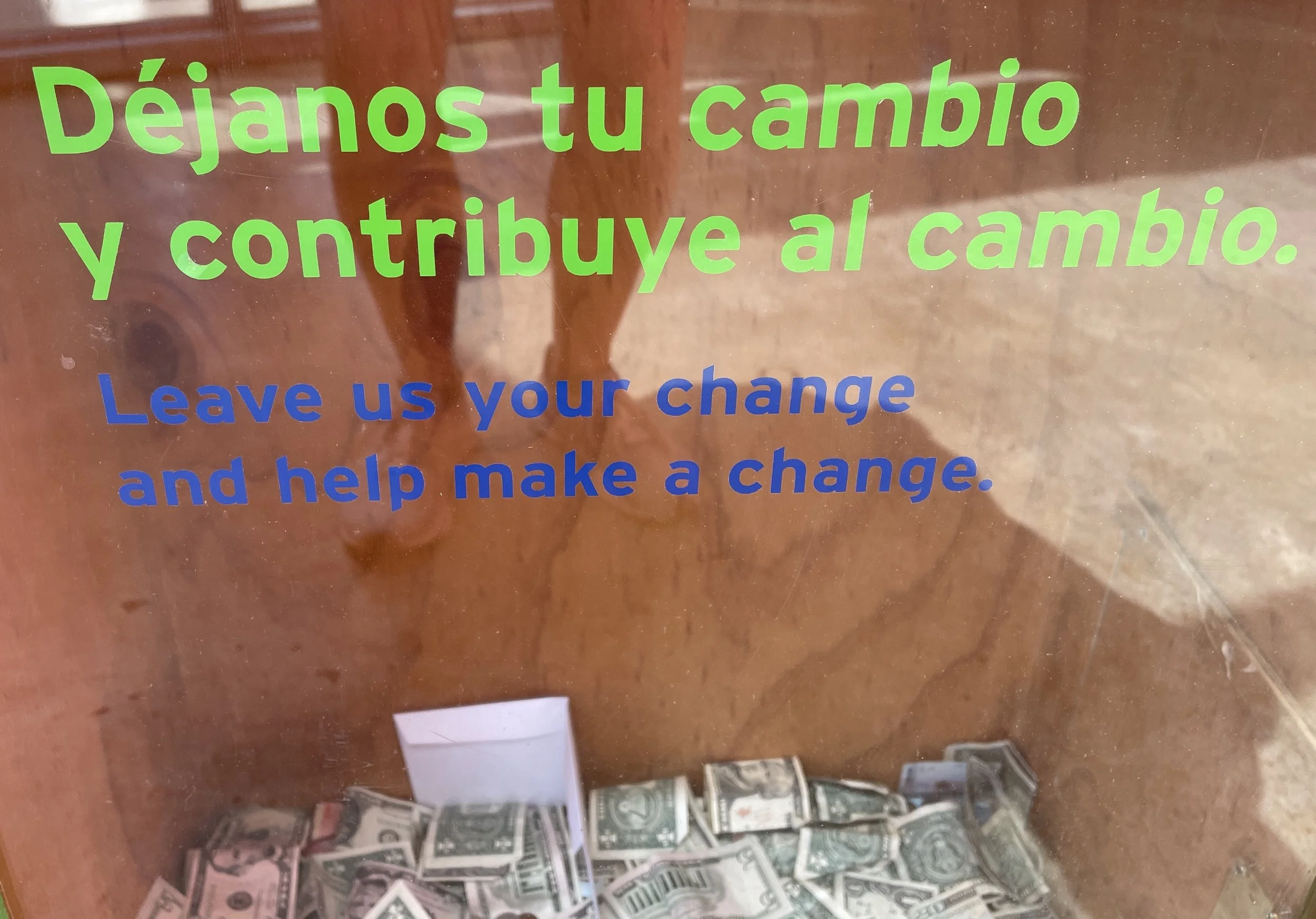
Image courtesy Bill Reynolds Donation box
Bonus: Upon entering the café there was an extra biodiversity reinforcement. They had consciously used a surface that has high visual traffic to do a intense animal wrap on their fridge doors acting as a backdrop to the order counter.

We, at EID, love to see these design enhancements that subtly remind you about the institutional mission. In previous blog posts we have covered quite an array from bathroom walls to stairs to benches to floors to elevator doors but refrigerator doors is a first.
Drop us a line if you would be interested in a webinar on this topic -we have a wealth of examples to stimulate your creative juices.
On the whole Museo de la Biodivsersidad was a very impressive attraction and extremely well attended on the day we were there with a notably higher proportion of young adolescents than I have found to be normal museum fare. The appeal factor was highly evident demonstrating extended engagement.
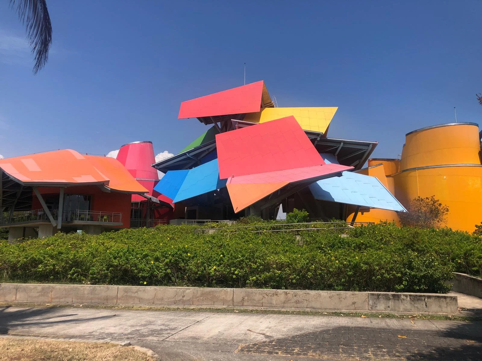
Image Courtesy Bill Reynolds Museo de la Biodiversidad- designed by starchitect Frank Gehry