You want to be recognized for going the extra mile on behalf of the visitor. Spend the extra time to design in features that add joy and elevate a visitor’s experience:
When dealing with “rules” sometimes simple is best - legible, neat and use of a natural tone for a natural heritage site, with an image that brings a smile to one’s face (instead of a frown). Please share any good examples with all of us in comments.
Photo credit: Bill Reynolds
Photo credit: Bill Reynolds
Sidewalks have potential to play a role in engaging the visitor and introducing them to your site’ s purpose. In the above sidewalk of a regional heritage museum, they chose to embed expendable artifacts into the concrete entryway allowing for inter-generational conversations and prompting a form of “what was this used for” type of guessing game.
Photo credits : Bill Reynolds
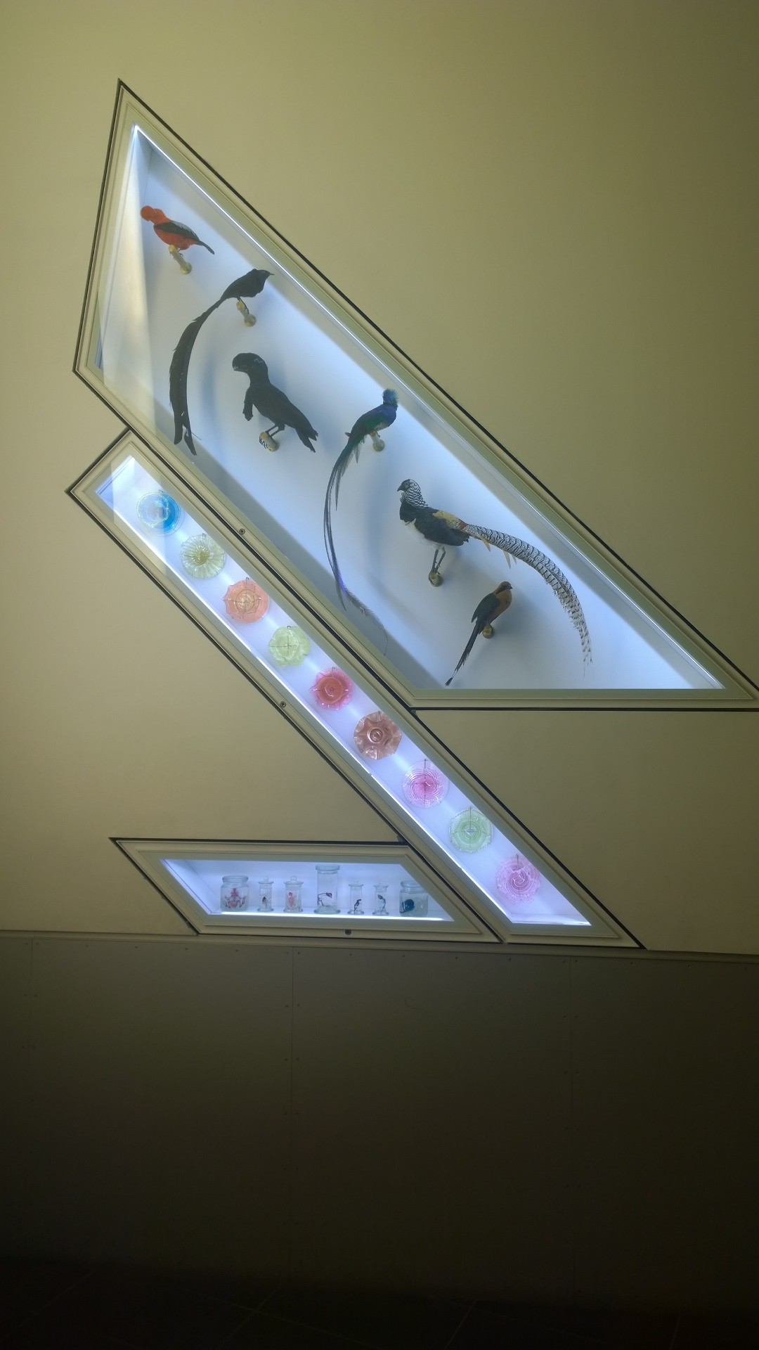
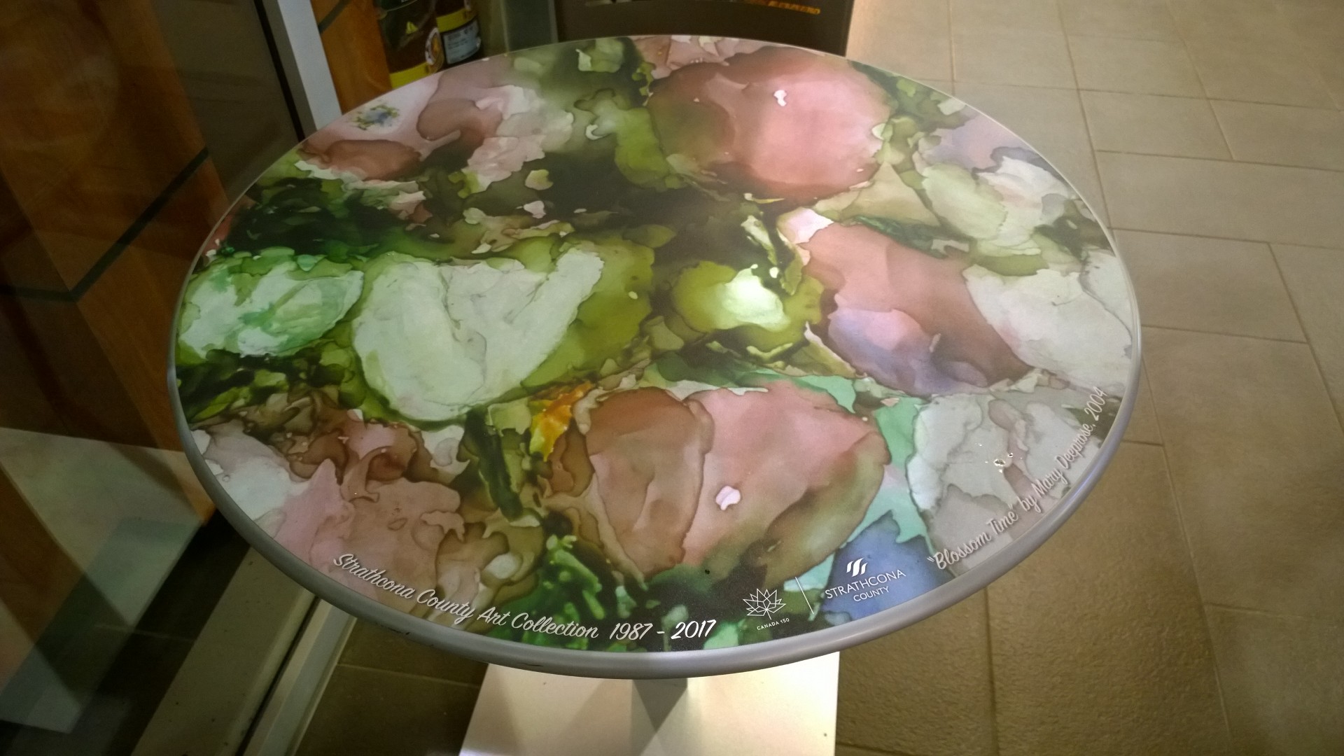
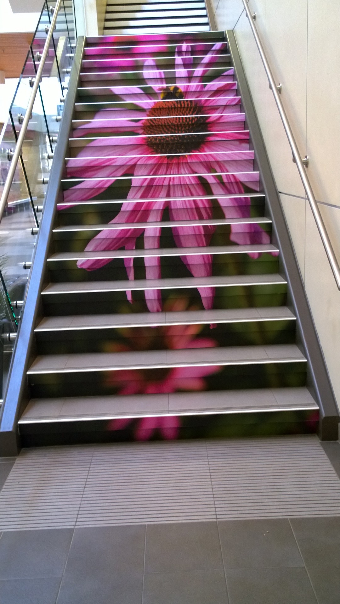
1) Blank wall space in a museum stairwell (on a landing) allows for creative display extension spaces. 2) Table surfaces can allow for creative applications, in this case, for local artists’ exposure while you enjoy a cuppa. 3) Stair risers are often underutilized real estate. Powerful images can raise awareness about what you want visitors to notice or simply act as an uplifting moment in one’s life.


