As I was sorting through my collection of self-guided trail (SGT) materials this week, I was reminded of the good and the bad examples I had collected over time and how I still see similar errors repeated when I visit trails today. So, the following helpful points are meant to assist interpretive planners with the 80% of their time spent on preparation before one launches into the 20% time spent on implementation/production for the SGT. These points are relevant whether one plans to use signs-in-place, brochure-numbered posts, QR codes with or without smartphones, or any other form of audio-enhancement.
Preparing a SGT at its most basic is joining a number of interesting places together along a path. Nature trails, historical trails, and sensory trails have been the norm in park settings. Linking together various artworks, zoo animals, botanical specimens or museum artifacts that create a journey for the visitor to follow is also applicable.
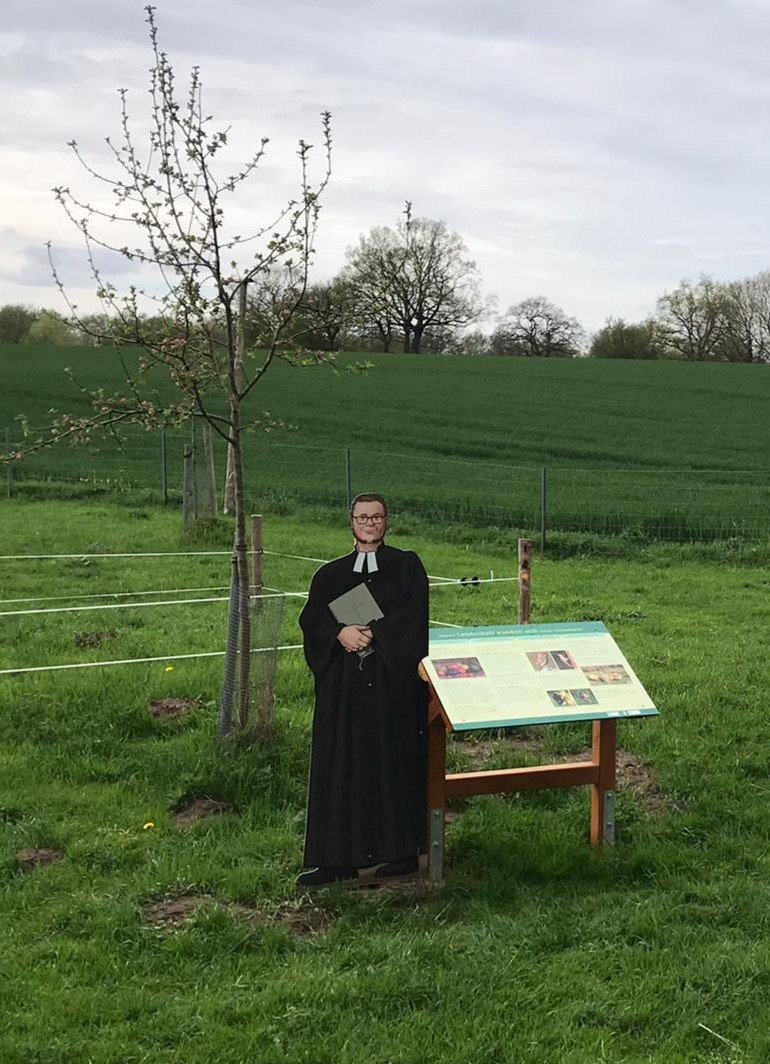
courtesy Lars Wohlers
Generally, SGT’s follow the same pattern. What if we shook up the walking aspect and a microtrail was created that required a “hands and knees” position to focus on the small things in life? What about a trail that would engage the visitor, as in sketching, where your eyes are directed toward certain “scenes” of varying distances using, for example, sighting tubes and picture frames. Or journaling at a few spots along the trail using perspective changing quotes and passages.
Ah, but I get ahead of myself and head down a rabbit hole of sorts. First, some key questions need answering:
What will the trail do?
What are the specific 4H outcomes for the Head, Heart, Hands, and Hunger? (see our Putting Interpretive Ideas into Practice blog posts). What is special about this place that you want visitors to know and feel? What is it you want them to take away? What do you want them to remember?
Is it about pointing out things? Is it exclusively about explaining things?
Is it about finding meaning in what we see or experience?
Is it about reinforcing old skills or learning new ones?
Who is it for?
This step is often forgotten in one’s enthusiasm or evaluated when considering the content and format. One size does not fit all. Would we expect the same story aimed at a grade one child to be interesting for an adolescent or university graduate? Have we included something of relevance for the elderly couple or a family with toddlers? Is there a sense of past, present, and future about the interpreted site?
Courtesy Bill Reynolds
Are they naturalists wanting to learn about plants or birds specifically? This audience seems to be the one that is often catered to. What level of knowledge are you assuming? How do you plan to “hook” and boost the level of engagement for the visitor who wants to stroll through the site?
How long are your visitors here for? Why do we design only short trail with densely packed signs along the trail? How about inserting interpretive enhancements at longer intervals on the longer trails? What about inserting viewpoints that are not dependent on long distance vistas but help the visitor to look up in the canopy or gaze at a nurse log? The stop designed with these kinds of stops might need special equipment like hammocks or kneeling pads.
Creating swollen trail nodes with interpretive stations could encourage visitors to linger and explore their individual senses or some neat site feature that will connect with the visitor. Maybe it will pose questions like:
Do they live in the area? Do you live in the same watershed, same country, same continent? Can we provide some comparisons, some similarities?
Some other visitor types to consider…Is it their first visit or do they come regularly? How do you counteract the “been there- read that” SGT experience? Do you provide options? Many heritage facilities are continually creating multiple background materials for changing exhibits. Why don’t parks and nature centres do the same and adapt to changing situations and multiple guest interests? Ever thought of a leveling system of booklets that lead to graduation? “Wow you have attained the gold level! Congratulations!” This consideration is as important as translating into different languages or the visitor’s spoken dialect.
Courtesy Bill Reynolds and his grandson Jakob
Where should it be?
This should be determined by answering what do you want your visitor to discover and then picking the best spots that demonstrate this.
When will this trail be used?
Is it meant to be taken more than once and at different seasons? Seasonality seems to get overlooked at times, especially with plants, as the text and drawings often represent only one season. This connects back to taking approaches necessary to counteract the “been there, read that” trail syndrome.
Mechanics Checklist:
The SGT intro should include how the trail is marked, estimated length of walking time, distance, change in altitude, washrooms, accessibility, safety concerns and expected behaviour.
Prospective trail walkers need an orientation. Maps should show the shape, distance and position of the trail, and its location in the park along with the location of the park in relation to the nearest population centre(s).
A SGT leaflet from Maine’s Acadia National Park notes that “Stops were selected for the purpose of introducing the visitor to a small slice of life {in this case} near the edge of Jordan Pond.” It followed up at Station One by saying, “An evergreen corridor welcomes you - a balsam fir holds its branches out as though inviting you to slide your hand along its flat, soft, dark green needles.” All communication should have an element of welcoming and invitation for the visitor, especially to offset, at times, what can be perceived as onerous safety rules.
A summary should include where to get follow-up resources for enthusiasts, where to contact the relevant staff and where to locate the information centre and other nearby SGT’s. Shenandoah National Park’s interpretive trail booklet mentioned the other park SGT’s and how they each emphasized a different facet of the interwoven influencing factors in the Park’s story.
First cautionary note: Don’t try to tell people in one hour what it took you 10 years to learn.
This formula has been around for ever:
Total number of stops: 10-15
Total number of words per stop 30-75 (this was for written text; however, oral listening should not extend this by too much)
Yet I still find examples where the site has gone textual overboard and they wonder why general interest visitors walk by the designated stops along the “interpretive trail.” Not only the length of each text but the content depth needs to be dialled back in many cases.
courtesy Bill Reynolds
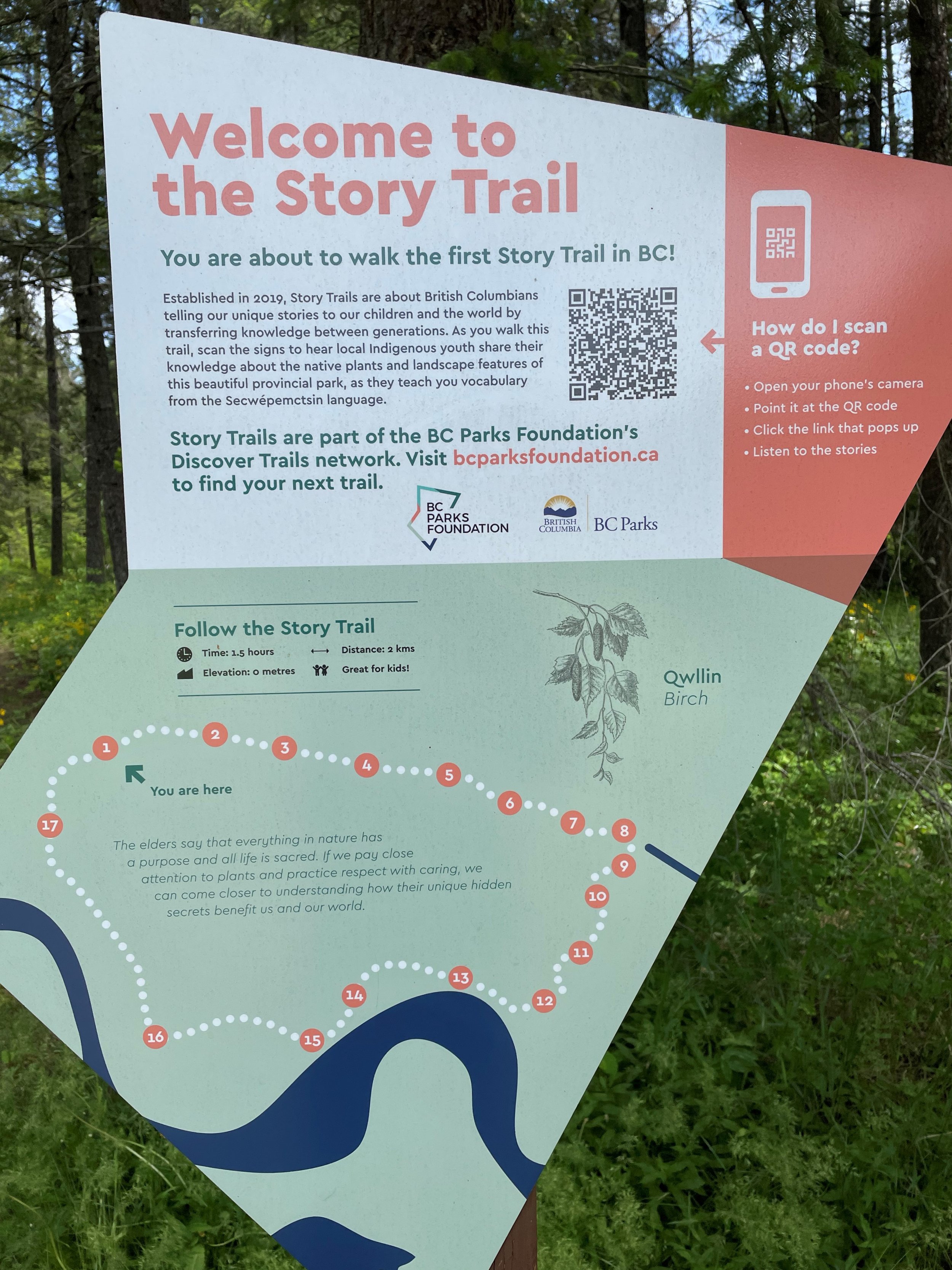
Something I have never seen in trail brochures is levelling of text for one stop so that the layout shows a short, medium and longer paragraph version of text - each one building on what came before and each one using a smaller fontsize. This caters to the person who has either a small, medium or large interest in the topic at hand. Labels in museum exhibits often employ this strategy and I have noticed some signs- in-place doing this. Incorporating a QR code can accomplish this levelling aspect - note how the example below includes instructions.
Also in the example below, the voices of local indigenous youth are employed to share their knowledge about native plants. Different viewpoints and connections to our heritage need profiling and a scientific or naturalist perspective is just one lens.
courtesy : Bill Reynolds
Expanding out on the topic initially discussed also can be done with audio as the listener can choose more tracks after the base track.
Second cautionary note: Don’t try to explain thousands of years of change or a series of complex interrelationships in one stop.
Glaciation erosion, evolution, geologic time scales don’t lend themselves to a 30-75 word descriptor even with graphics. So why do we keep trying to include them in SGT signs and brochures?
On the complex interrelationship topic, here is one half of the text from the last station on a nature path: “Locked forever to the spot where germination takes place, all wild plants must be able to satisfy their needs there if they are to succeed. Sunlight, amount and distribution of rainfall, soil content and structure, temperature range, and plant and animal competition pressures all help to determine which plants will thrive.”
If you want the visitor to have an inkling of plant need satisfaction when it is stuck in one spot, as this previous sentence lays out, then one would have needed to partition out each italicized and alternating bold determinant as its own stop. This could easily have been the concept for the whole trail and stops could be selected to demonstrate each element in action. Making this message relate to the human condition and need satisfaction would also strengthen the visitor connection.
Third cautionary note: Please, not another beaver or lichen stop!
I have travelled all over the globe and I have encountered the same type of introductory text as the primarily fact-driven text on signs about these two living entities no matter wherever I take a trail. Talk about “been there - read that.” We need to really search for elements that stand out as differentiators while noting the universal message that can tie many communities together. We don’t just have a stop about trees so why do we talk generically about lichens? Lichens vary alot and need more respect. What makes your site special? Let’s never forget to highlight this.
“Have a good look at the tree across the track because you won’t find it anywhere else but here on the buffalo plateau.” I really liked this line that drew attention to a special park feature from a gorge nature walk in Victoria, Australia. A great opener and a great reason for a stop!
Then it falls flat. “It is called Buffalo Sallee. The fine leaves distinguish it from the other gums in the park.” That’s it? The only interesting thing about this gum tree is its name and leaf shape?? At least we should have a message about the mission of the park and protection values.
When planning that SGT ensure there is real appeal and interest in any reading or listening the visitor does along the trail.
We will pause for a week and take this up in our second segment. Please throw me a crumb and let me know if there was anything – even a morsel -- that got you thinking in a different way and was helpful to you in this post.


