Hey folks, we received a positive shout out from John Veverka after we sent you all the first half of this post about self-guided trails (SGT). He passed on an article he had written explaining his approach of mass customization to solve the issue of the “one size (story) does not fit all.” He nails it, in my opinion, when he laments the lazy approach he names the “Wikipedia on a Post.” His article recommends a step-by-step process of resource inventorying, setting objectives (to understand and to feel), and choosing subtopics before deciding the best self-guided options available at a site using print or send to phone capability. Check out John’s article here: https://mail.google.com/mail/u/0/?tab=rm&ogbl#inbox/FMfcgzGtvsbNBjCbzmMKPlgzjgbVWgzk?projector=1&messagePartId=0.1
Pat A of this post left off with: When planning that SGT ensure there is real appeal and interest in any reading or listening the visitor does along the trail. Reflecting on John’s contribution we could easily start with a reminder about avoiding the compulsion to become Wikipedia on a Post. In the age of instant access to information the SGT should be performing tasks other than informing. It’s time to explore the act of directing our visitor into new perspectives and encouraging their act of doing and involving themselves with trail elements that tie to SGT objectives.
Have you involved the reader?
One example jumped out at me from Elk Island National Park in Alberta, Canada where the first line on the trailhead sign said, “What are your first impressions?” The text continued with a conversational tone that instructed the trailwalker to “…focus on the background and pierce their way through the dense hazelnut and aspen foliage…” to try and read the landscape beyond.
The next stop was at the first bridge and the text went like this, “Since the first stop you have travelled down a slope to this depression-a site where an ‘iceberg’ melted.” It is like we are having a conversation right now and we are being asked to reflect abit on our walking.
“Kneel down on the bridge and sweep away the curtain of duckweed.” (Note: there is a drawing of duckweed included.) “Under the water a swimming, gyrating show proceeds, free for the watching. Spend a few minutes here, you’ll enjoy the show.” Several images are included of a few underwater denizens to spark interest. The brochure and signage text maintains its friendly chattiness and yet can be directive suggesting something to do.
Is there any magic or sparkle in your wording?
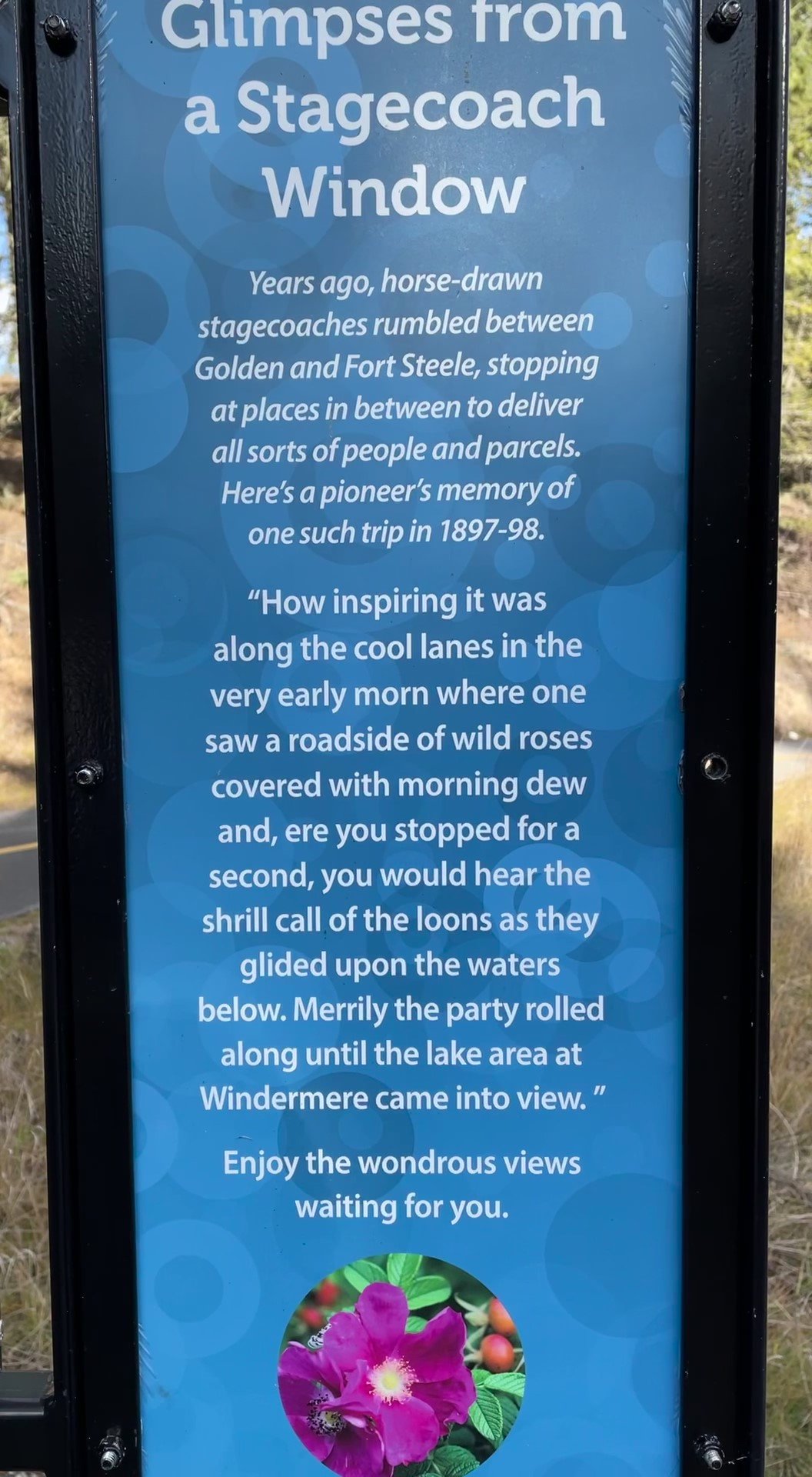
speak to the visitor when using archival quotes
Courtesy Bill Reynolds
Sparkle is especially important for the trail name and the individual stop titles. Continuing along the Elk Island NP SGT using the brochure mentioned previously, there is never a sense of formal instruction in the writing style - always a sense of awe and wonder is expressed. The author writes about the pond by saying, “…an ecosystem that rivals the great oceans…” - you can almost hear the circus barker’s call. “Wielding oversized jaws, the water tiger chases after prey and literally sucks the life out of it when captured.” (drawing of water tiger included).
Would it be better to draw not say?
One time I found this grid drawing of a British Columbian temperate rain forest as part of a self-guided trail brochure, reminiscent of a 2-D drawing laying out an indoor museum diorama exhibit. The grid allowed you to pick out objects in the picture and find their name by combining the horizontal-vertical alphanumeric code and then refer to the list. For example, the owl you see is at B-12, you look up under birds and you discover the creature is a spotted owl. You can also look up what alphanumeric code corresponds to certain herbs, mosses, fungi, mammals, etc. and find out where they “are hiding” in the drawing.
This had potential to be a good interactive tool but it needed to be connected directly back to certain areas along the trail. The accompanying text also did not match up to the items drawn. If they had reinforced each other and related to the actual trail this could have been neat. Choosing what went into the drawing based on the trail sightings would have been the preparation needed. This would have been perfect as a placemat in the cafeteria and as a laminated take-home placemat gift, all acting as wonderful educational and marketing tools.
Clever use of graphics in a SGT trail pamphlet cover is seen below in Le Relais. They tried to pique curiosity about the trail, without words, by using a mosaic of images that you would eventually encounter from various trail stops. Some may call it a form of dramatic foreshadowing, others may call it previewing - in any case both techniques are effective when you attempting spark interest and to lure in a reader/viewer using a 2-D format.
Have you considered the interest level of your visitor?
McGillivray Falls Trail in Manitoba used trail stop descriptors on one side of the leaflet, thus avoiding the often overabundance of text dedicated to floral identification. Meanwhile the leaflet’s backside was used for a list of flower descriptions and accompanying drawings. Not a bad plan to concentrate on a topic like flowers in one section so it doesn’t dominate or dilute the SGT desired messages. Of course in this case the assumption has been made that there is a large visitor base who desire to know more about the common flowering plants along the trail. As an interpretive planner, or evena front line interpreter, have you checked whether this is the case or whether other topics might be of more interest?
This brochure dropped the ball as they concentrated on a litany of botanical descriptors as the way to describe different aspects of flowers like you were reading a condensed book on botany (Remember - ou are not Wikipedia and no condensing 10 years of knowledge into one brochure).
Here are some points to remember if you decide to focus on how to tell plants apart from each other:
· Having a drawing with arrows alerting one’s attention to key visual differentiators on the plant.
· Deciding what is it about the plants you are choosing that is importnat to highlight.
· Having seasonal descriptions for each species and describing what time of year they bloom.
· Indicating where on the trail you are likely to find certain species and their preferred habitat. (eg. dry, sunny or moist, shady)
· Careful what vocabulary you use — in the case of the Falls Trail they referred to umbels, pinnately divided leaves, and inflorescence. Unless they are shown in a drawing or are a trained botanist then these technical terms should probably be substituted for more common words, or no name at all, just a description of the parts function. (Of course if it is the site’s objectives that visitors should learn these words before leaving, there would need to be some “doing” involved — but that is for another blog post.)
· For the reader’s ease, determining how to arrange the plants you chose to place in the brochure is important. In this case with the Falls Trail the vertical ordered placement seemed quite random.
Courtesy Bill Reynolds
· Being careful when using the term “flower” in your title when including a lichen and a fern.
· Don’t always relying on flowers - they can be overrated. Why not have some fun with leaves and their varied shapes and arrangements, or checking out their undersides. Try using the word ”underbelly” as it’s guaranteed to crack kids up.
· Instead of focusing on simply describing the identifying characteristics for the visitor, why not turn it into a discovery for by directing them to check out hidden details. (e.g. look closely at the lower petal lip to see if it has a vein and describe its colour)
· Highlight the secret and saucy life of plants and their reciprocal relationships with insects and their interdependency with us.
Have you drawn the connection to the visitor’s life?
McGillivray Falls Trail reminded me about the importance of context whenever we have an interpretive trail that follows close to a river. We should always mention where the water is flowing to and where it is flowing from. In addition, this is also a great opportunity to include a connection to the water cycle and how we humans are intricately tied to it – as in drinking from the water fountains in a local airport, or from the taps that provide the water for cleaning dishes at the local McDonalds or from the faucet in the bathtub at home.
Have you built in a way to measure your SGT success?
If your hoped for takeaway message was, let’s say, “Insects that crawl in and around meadow plants are beautiful” are you checking after the walk to see if visitors are making comments like, “Gee, I didn’t know crawling insects were so beautiful.” If you are not accomplishing what you set out to do then it is time to go back to the drawing board and decide if a self-guided trail is really the best vehicle to use. Prototyping your trail and doing dry runs with different test audiences can help you out before making an expensive mistake.
I do not run across a SGT leaflet with a built-in evaluation questionnaire very often but in my home province of Alberta, I did find one in the Marl Lake Trail brochure. The evaluation pages were perforated so it could be easily torn off and handed in. The brochure introduction stated “The booklet can lead you to new adventures…” and “The booklet can help you enjoy your walk…” among the delicate high mountain fens. The stated goal of the evaluation was “…to help park staff improve future Marl Lake Trail brochures.”
We should be seeing more evidence of this openness to seek improvement, and accept feedback from the visiting public so they feel more invested. It is also a great idea to evaluate, however, get the questions run by several different visitor types to ensure you are going to acquire helpful answers that you can act on. In the case of this brochure it felt a bit more like a school test rather than a gathering of information.
Courtesy Bill Reynolds
All the evaluation questions were factual about fens using classic test set-ups with True or False statements, circling best answers and matching phrases. Is this type of test marking to see what visitor’s remembered the best way to improve the brochure? Do the visitors go away really knowing the top 5 things about fens and marl?
After I turned off the alarm bells going off in my head about this brochure, I started to re-assess the intent of the trail brochure and the takeaways desired. In my opinion, open ended questions to determine what the visitors felt about their time spent in this habitat would have been more helpful - like what they found most exciting about fens, or most intriguing about marl, or why we should protect this community? This would have begun to provide the park with better feedback.
If you ever desire to receive feedback on your interpretive resources, we at EID are always open to share our expertise from over a century of experience. Check out our blog page “What We do?” to get a sense of the types of capacity building we can help you with.


