Glad you could join in for the fourth installment of thoughts and perspectives emanating from Bill’s Austrian voyage. Something that continually haunted me (in a good way) about Vienna that I have not shared yet, was its inspirational and uplifting public art used to brighten blank surfaces like immense building walls.

image courtesy Bill Reynolds
This served as a reminder again that our visitor centres should be considering more how to employ blank surfaces in order to inspire their visitors and support their mission. This does not require large scale options -although they make a whopping impact- but small scale options usually abound when you look around. I will be touching on a few examples in this post to provide adaptive ideas for you to apply in your setting.
Actually, what jolted my memory was a series of articles from the British e-news service, “Positive News”, that highlighted the positive concept of urban transformations through public art. The end result is a place where people want to be and it feels good- where they can be comfortable and relaxed- pretty much how visitors should feel around our heritage spaces.
Graphic Rewilding
Grey urban spaces are a fertile canvas for Catherine Borowski and Lee Baker’s vast nature-inspired artworks. “Where real rewilding isn’t possible, our goal is to inject the colour and diversity of nature into rundown spaces, urging people to notice – and find joy in – the world around them,” says Baker. This is not meant to supersede the need for rewilding but cultivate an appetite for it in a complementary way.

image courtesy: Graphic Rewilding website
Lee Baker cites research published in “The Journal of Alternative and Complementary Medicine”, which found that patients in hospitals have reduced feelings of stress when exposed to imagery of plants. Check out their stunning web site at Graphic Rewilding, where their home page acts as a dynamic visual portfolio.
Could an approach like this work on fencing or sidewalks to build anticipation for your park’s inhabitants while also helping to re-wild the minds of those who walk past?
Asphalt Art Colour Boosting
Another upbeat piece from “Positive News” featured the Asphalt Art Initiative as part of the Bloomberg Philanthropies’ response to the growing number of cities around the world embracing art as an effective and relatively low-cost strategy to activate their streets. This initiative had three foci:
· visual interventions on roadways (intersections and crosswalks)
· pedestrian spaces (plazas and sidewalks), and
· vertical infrastructure (examples of utility boxes, and traffic barriers have been shown in previous posts).
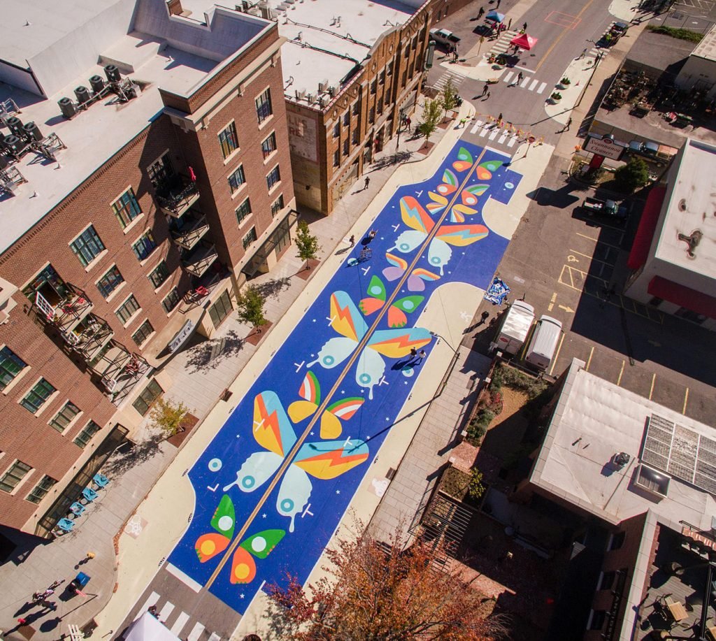
image courtesy Bloomberg Philanthropies website
The colourful roadway interventions have also created a safety factor as cars slowed down reducing crashes at 22 surveyed sites by 50%. The percentage of pedestrians who reported feeling “very safe” at the intersection jumped from 23 per cent to 63 per cent. An Asphalt Art Guide, produced by the pro bono consulting arm, Bloomberg Associates features over two dozen case studies highlighting the how to’s for successful plaza and roadway art activations.
Could a crosswalk near you use some “arrested development” and reinforce your heritage message at the same time?
I wonder what percentage of visitors would feel safer, activated, and more welcome to our facilities if entrances and parking areas greeted them with a feel-good boost of vibrant colour that reinforces the heritage message at the same time?
Does your facility have an outside “canvas,” or even an inside one, that needs revitalization through colour and community engagement – could be a nice double bonus?
Note: Above I mentioned Bloomberg Philanthropies being at the heart of this kind of art by providing financial assistance. Previous grant rounds supported 65 projects in the U.S. and Europe between 2020-2023. Newly awarded projects in 25 cities were announced in November 2023 and included Canada, Mexico, and the U.S.. Are you up for applying in 2024?
Patch Macadam-No More Wisecracks
On a much smaller scale, Lyon-based street artist, Ememem, is fixing up Europe’s pavements by filling hazardous potholes with colourful mosaics. Describing himself as a “bitumen mender, sidewalk poet and macadam surgeon,” he was inspired to act by the dreary sight of a pothole in front of his workshop.

Before & after asphalt art sidewalk repair Courtesy Positive News and Ememem
Would there be any possible “pothole partnerships” or dreary views needing artistic repair existing on your site?
Focus on Facial Facade Functionality
Just as a contrast to the friendly use of colour I submit an Austrian example of a non-inviting street entrance for the Landesgalerie - talk about cold in colour and materials. Only after I took the photo and framed it the way I did, that I noticed the inscribed “Welcome” flat on the ground. Reading the ground is already overshadowed by the large lettering over the entrance that catches your gaze, so then why make the typeface of English word “Welcome” more difficult to make out?

image courtesy Bill Reynolds
Nothing about the museum doorway reinforced “Welcome” for me. Take a moment to gaze at this image and imagine you were walking by on the street in front of this doorway. What does it say to you?
For me, the mail slot “windows” in the doors recall the days of the speakeasy where you needed a password to gain entrance and it was a privilege if they allowed you in. It also says “Mask” to me, with eye slots and there is a mystery hiding behind the facial façade if you dare to enter. Even worse it conjures up “Prison Incarceration” and an all-around barrier setting vibe. . BTW, there were several museums to choose from that morning and we gave this one a pass.
Take a picture of your entrance and share it with non-staff, asking for feedback. A critical analysis with fresh eyes may provide new insights for you and improve its visitor appeal.
Did You Smell That Colour?
Use of colour is sooo important but let’s not forget sense of smell. Scent marketing is a new trend as McDonald’s is demonstrating with their mobile street level mini-billboards in the Dutch cities of Utrecht and Leiden, each about 650 feet from a restaurant location.

mini- mobile billboard image courtesy McDonald’s
The plain red and yellow billboards pump out the aroma of warm french fries to passersbys. “Smell has been proven to be more effective at sparking clear and emotional memories than images,” says McDonald’s Netherlands CMO Stijn Mentrop-Huliselan. You can see its effectiveness in action at “Smell’s like McDonald’s” on YouTube.
At least two ideas here to be treated separately or together: employ the use of smell (forest, meadow, ocean, polished staircase, baking bread, etc.) as an iconic memory synonymous with your heritage site to attract visitors, and experiment with the use of mobile mini billboards as interpretive signage.
Looking at the World Through Other’s Eyes
Interpreting involves changing sensory perspectives and colouring your world differently. How about a series of participatory art projects dedicated to helping us look at the world through other people’s eyes with a focus on storytelling and dialogue? I just ran across a must share item about the novel travelling empathy museum- what could be more needed these days
One approach they employ is the Human Library. Instead of borrowing a book, visitors can borrow a person for conversation – a Living Book. The concept of the Human Library was developed in Copenhagen in 2000, and has since been adopted by people all over the world, including the Empathy Museum. They’ve been across the UK and to Belgium, Ireland, the USA, Australia, Brazil and Siberia. Explore their empathic link to see where we’ve been and where we’re going. Maybe you could host them.
Viewing in Abstraction
McDonald’s, a leader in marketing know-how, has experimented with striped abstract art in public spaces to represent iconic menu items like Big Mac and Egg McMuffin. Remembering that our potential audiences do not all use their left and right brain the same way to perceive their world means we have to vary our approach in order to communicate to different audiences.
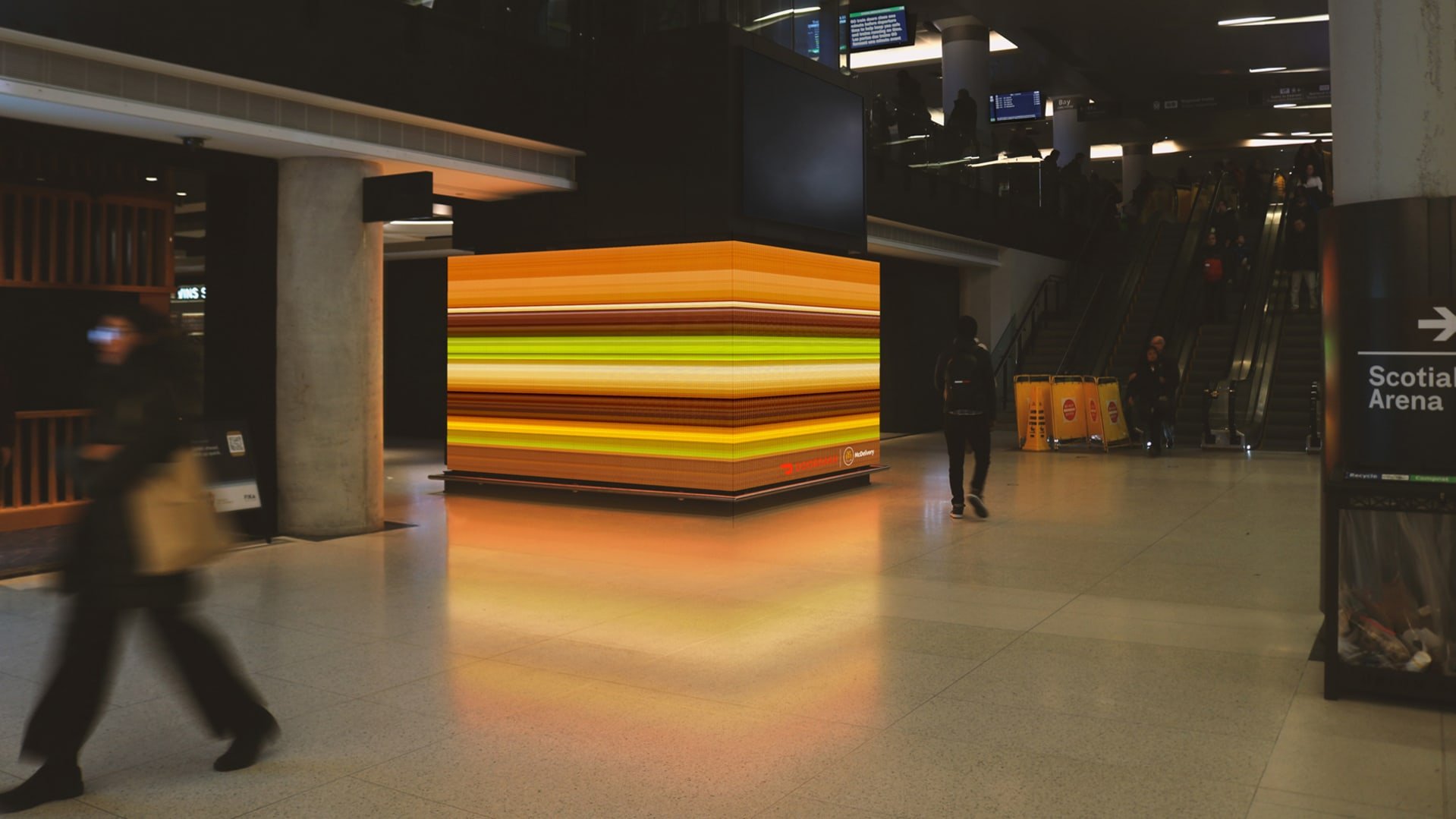
image courtesy Fast Company web site
The ad agency hired by McD’s stated that going abstract means that some people just might not get it—but there’s something to be said about an ad that stops you in your tracks, even if it is to puzzle out its meaning and make a connection. (Do you see the layers of a Big Mac hamburger in the image above- what no tomato?)
“The best work doesn’t tell you what you need to know, it gives you a little moment to go ‘ah,’ and that’s what makes it more memorable.”
Could this apply to interpretive signage? Can you SEE/PERCEIVE the use of abstraction or unexpected puzzle imaging to generate an ah moment for your visitor?
Ciao till next time.