The Power of a Colourful Character
I have a few more observations to share from my Austrian adventures. The Austrian city of Melk’s visitor approach attracted us right off the bat as Melk had covered their interpretive bases. As you can read in the close-up image of the initial information column, they described having an introductory film, a printed brochure, an audio-guide, QR code enabled audiotracks, and a scattering of signposts along with several information columns integrated into the walk. They even experimented with visual simulation stations allowing you to semi-superimpose an archival image in front of the now existing view.
Town of Melk information column Courtesy Bill Reynolds
They employed an effective large vertical information column outside the town’s visitor centre. Of course, one’s eyes naturally gravitate towards the visuals:
· a map with red dots
· a character in a yellow outfit smoking an odd shaped pipe and
· a series of black and white building photos
There was nothing special about the map although it clearly showed there were a number of stops in a concentrated area that appeared to be quite doable in the time we had dedicated to this outing. The inclusion of a representative three building photos, gave you a positive hint of what was to be seen. The piece-de-resistance however was August Prinzl, the colourful mustard man who supplies the audio voice that will take you on a tour. What appeared to be a theatrical interpretive guided opportunity was unavailable here, especially in this town of regular Danube tour boats (a minor missing the boat example). A tale-spinning character voice was a wonderful concept and was the piece of intrigue that sealed the walking deal for us.
Mustard man Courtesy Bill Reynolds
So, we set out but alas, we were not able to meet Mr. Prinzl. The audioguide was not a viable option due to the visitor centre being closed early in the morning when we were there. Using the QR codes would have been handy if we had managed to get the downloads to work but after trying two stations with no luck, we abandoned that for the signposts. When reviewing the texts this is where we discovered the signposts were missing the boat.
Confusing Text Courtesy Bill Reynolds
Stop 21 included an information column (see the image of the English bottom half of the column) that incorporated a building signpost and a descriptive summary point in Melk’s history- in this case circa 1800. When we read the two texts, we found them to be very confusing. This is an example where the information presented may be very clear to a resident or someone familiar with the region but a direct translation for other visitors would fall flat. When dealing with geographical reference points a map is always so helpful for orientation. Keep the range of visitor origins in mind and their lack of geographical familiarity when writing for them.
Limited Space – Laser Focus
Secondly, when reading the transport hub explanation, we discover a reference to an entrepreneur who was building a postal empire -a concept that is foreign to many people as this is now a public service. In addition, a further reference is made to indicate “citizens of Melk fear that this entrepreneur would take control of the Vienna Route” -without context there is not a clear understanding why this should be feared?
There is always limited space on a signpost so the point (not points) being discussed has to be laser-focused. With interpretive writing, points should reinforce the central message. You can’t afford padding- for example, the fact that the entrepreneur was a lumber baron is immaterial to the key point.
In this case, there is a QR code option where the reader could acquire “the rest of the story.” A statement that invites the reader to remember to use the code for that very reason should be inserted. Remember to provide context and acknowledge the “why’s” in readers’ minds.
Spotlight Universal Stories
Thirdly, the connection between the actual post house in front of the viewer and the historical point in time relating to a transportation hub could have been stronger. The entrepreneur is the link and the potential story that people could relate to, but it is not explained how his transportation service and his acquiring a network of postal stations would signal a fear in people. The postal empire concept seems to be a good story hook.
Can you find a universal cultural process relating to human needs and relationships that could be explored and spotlighted for your visitor? Do you think this was dealing with the concern of business monopolies and lack of competition with too much control and concentration of power in one person’s hands? Shades of Apple and Amazon? What do you think?
Please send us your thoughts. Especially with historical cultural differences between now and then, we have to help our visitors relate the stories of the past to their modern life.
Gateway messaging
In a similar vein, we need better approaches to frame and connect what we set out for visitor’s viewing pleasure. Providing the visitor a relatable concept that can mesh with their present- day mental web of experiences will help them immensely to connect and fit in new perspectives.
Central Messaging Courtesy Bill Reynolds
When I witnessed the attention-commanding impact of a few words in large type in the centre of a wall, just below ceiling height, I thought what a solid approach to getting across your central message to the visiting public. I have never noticed this arresting technique being used before. In this case though, the art gallery was missing the boat. The phrase being used, Landscape in Squares, did not set up any useful framework for linking the paintings together nor did it provide any thoughtful way of looking at these pieces of art.
Visitors will benefit from some form of unifying structure so it would be helpful to provide them with a “gateway” message that sums up the distinguishing characteristics of the subject of the exhibit -in this case- a certain landscape approach, or artist or artistic style perhaps. This defining phrase could act as a perceptual tool to help the visitor see a painting with greater clarity or in more depth. A contributing sub-message could hold a prominent place on an adjacent wall.
The same attention-commanding large type message approach could be employed for any interpretive exhibit. This would help to provide the visitor with a takeaway of the essence we are striving for them to experience. By assisting the visitor to clue-in to significant points, you actually give them a leg up so they can “poke their heads above the crowd” and increase their sense of accomplishment and satisfaction.
This is one way we can smooth the learning way forward. We can provide conceptual structure & perceptual direction that minimizes visitor state of confusion or embarrassment from a knowledge deficit in front of their peers, spouse or child.
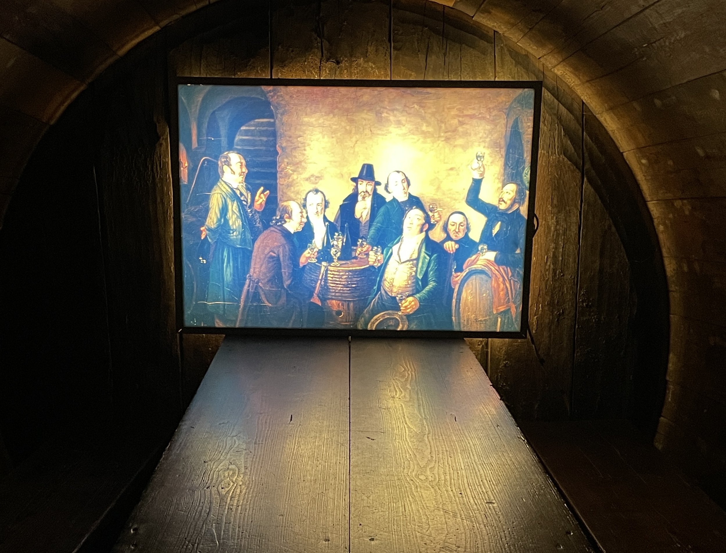
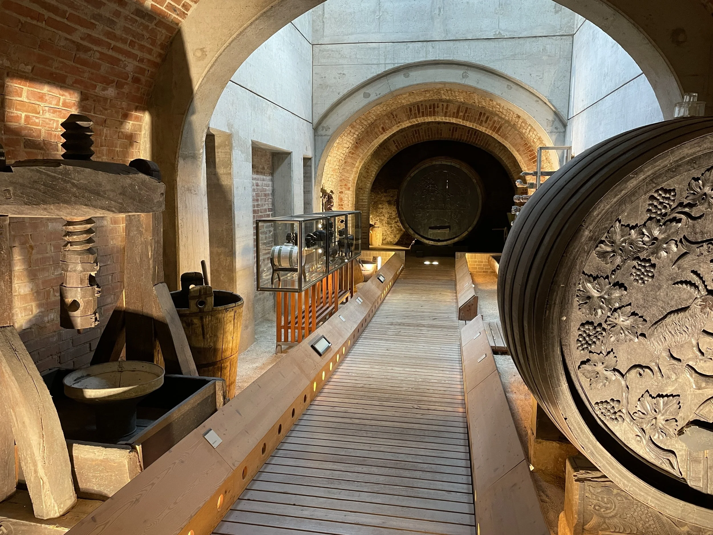
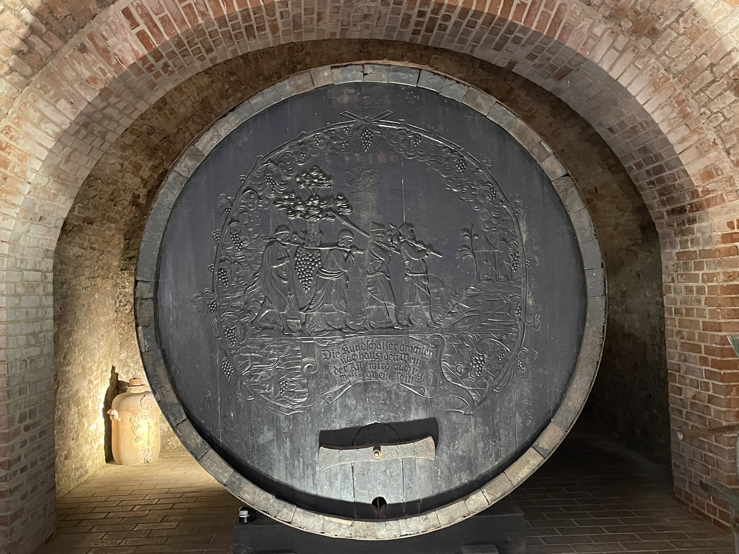
We can also avoid confusion and ensure key aspects of a display are not missed by understanding traffic flow and sightlines. In the case of a winery display in a city museum, giant wine casks have an appeal and a strong linkage to the theme of the exhibit. A novel approach that was seen, allowed visitors to enter the side of the cask into an intimate interpretive slide presentation “room” with table and benches facing a screen. But because of existing visitor flow and poor positioning of the barrel cask, the museum had missed the boat.
Evaluate Traffic Flow
The mini-staircase entrance was shielded from view at the back of the barrel cask, because visitors strolled down the hallway looking at the end of the barrel straight on (see photo) instead of them looking sideways at the barrel.
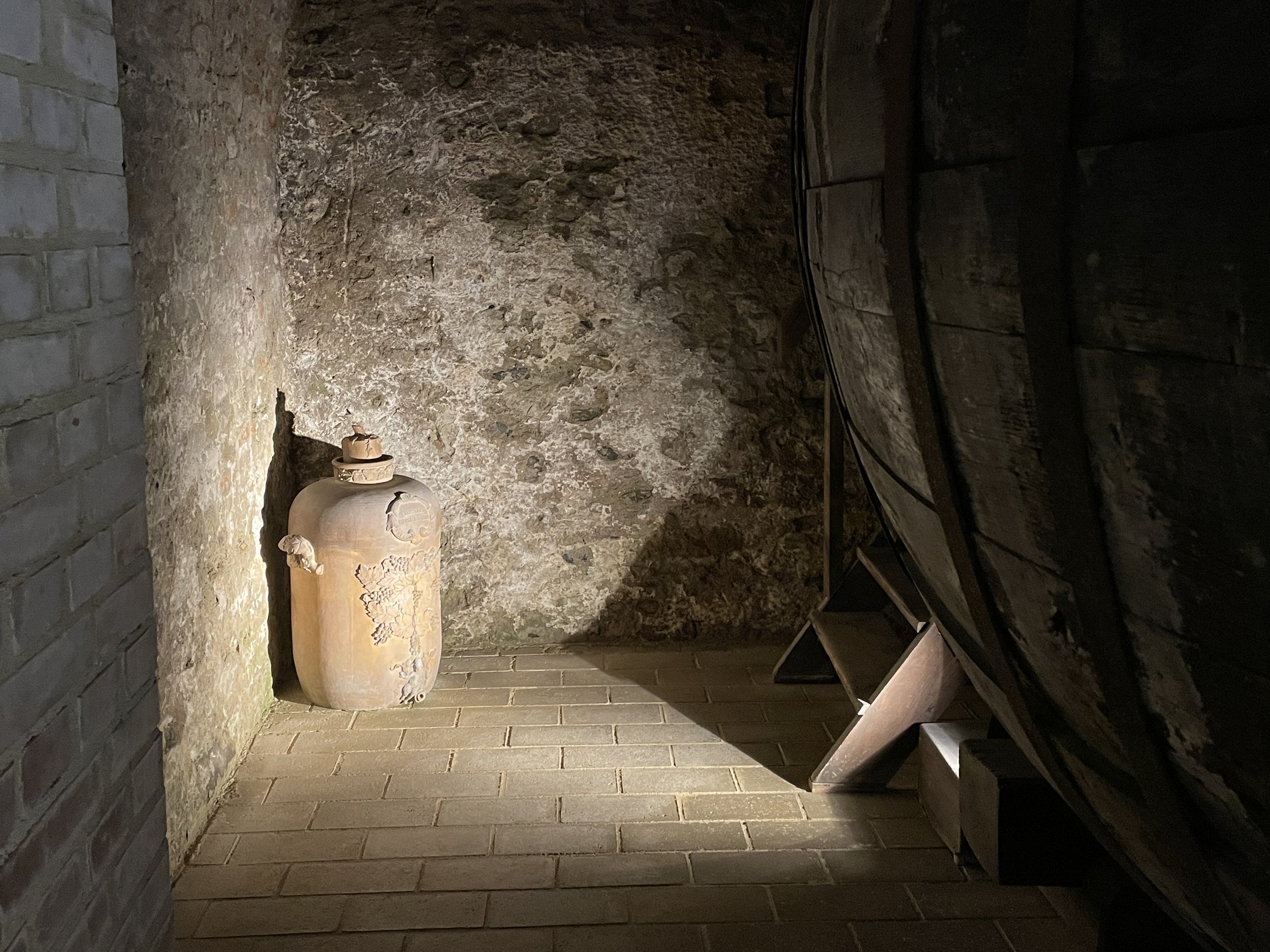
As a result, my three companions (and I am sure many others) all missed the hidden entrance and the presentation. It was the subtle corner lighting for me (see photo) that triggered an exploratory look around the corner of the barrel, allowing me to catch a glimpse of the mini-stepladder leading into the cask. The subtle corner lighting was sufficient for my curious soul but because it was trying to invite people to the back of what is clearly perceived to be a dead end – it was creating a situation that is not enticing to enter even at the best of times.
If a cask re-positioning was out-of-the-question, then I hate to say it but some form of directional signage was needed here. Signage is usually employed after the fact to fix an initial poor decision. in this case, a band aid could be applied by using a cardboard cutout of a sommelier with his hand open directing one to the back to invite traffic flow into a charming space.
Moral of this story: take time out regularly to see first hand where visitors go and don’t go. Observe different components of your visitor’s journey in order to make changes to:
· avoid sending visitors into constricted dead ends,
· design for clear sightlines into accessory entrances.
Don’t Wine about Low Awareness
While on the subject of wine barrels, and observing traffic flow, I was struck again by the circular iconic face of one, while hiking along a forest trail. I had to squeeze-press this last observation in to this blog post, as this observation created such an impactful impression on me. A passing image that was cleverly unobtrusive, and yet still caught attention by acting as clever backdrop. It was being used as a marketing tool for a local winery advertising its wares to a pedestrian traffic flow wandering through vineyards. Their plastic see-through brochure holder on a bulletin board style post would never have had the same draw.
Effective wine barrel backdrop Courtesy Bill Reynolds
In this case, I am going to suggest we look in a mirror to see how we (our interpretive facilities) are often missing the boat when it comes to effectively advertising our existence by not:
· reinforcing our essence
· using an eye-catching iconic shape
· positioning alongside busy walking paths close to our physical locations.
Looking out for unique locations beyond sharing space in a brochure rack with a gazillion others can bring rewards. If this is presently not in your wheelhouse of responsibility then have a discussion with the people who have this role. Interpreters need to flex their communication expertise muscles for everyone’s benefit. Our profession is about facilitating impactful impressions both to attract the visitor in, and frame their new perspectives in a relevant way when “in”, while being cognizant of traffic flow. Let’s get on board with continual enhancement and ensure we don’t miss the boat of interpretive opportunity and influence.


