The other day, I was cleaning out files and ran across some “pre-visit information” brochures from the Australian Parks Service from many moons ago, and I noted some excellent approaches worthy of sharing. Setting the stage for the visitor before they arrive acts as a component of site orientation and as an early stage of information. The more prepared visitors are for what they will see and the more their curiosity is stimulated the better their experience. Building their anticipation while eliminating confusion and fear should be the objectives.
How often I have heard staff complain – if they (the visitor) were only better informed and prepared for their visit they would be able to have such a better and more rewarding time once here. Have you heard this or personally ever felt this way?
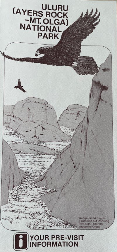
Pre-visit info cover Image courtesy Bill Reynolds
Do you provide people with pre-visit information before they arrive at your site? You most likely prepare something for booked groups, however this can also be very worthwhile for the independent visitor and they often get forgotten.
Interpretive – Marketing Connection
How important is providing pre-visit information for your site? The level of importance will vary, however a succinct pre-visit package that is engaging to look at and presented in a conversational tone is a key piece of exemplary experience-making for your visitor. This communication piece, whether digital or print, will make a first impression whether that is perceived as excellent or so-so. Ensure your objectives are well thought out. This is where interpretive and marketing skills go hand in hand.
How easy is it to find the information and is it fun to read? I am afraid to say I often find the presentation somewhat transactional /business like and certainly low on the scale of holding my attention, and enticing me to read on. Web sites have taken over this print role and have a tendency to be a straightforward “how to plan your visit?” page and/or a FAQ (frequently asked questions) section? The layout is formal, blocky, black and white, with maybe a photo or two. Is this doing the job? What did you determine the job was supposed to be?
This is why I wanted to share some observations from my brochure review as I found several jobs being done well, that frankly I don’t run into that often. The example employed is for a park setting but the lessons learned apply to historic heritage sites and urban heritage facilities as well like museums, zoos, aquaria and botanic gardens.
Capturing Sense of Place
Take another look at the cover page and what do you observe? A landscape drawing to capture the sense of place! Don’t underestimate the power of artistry.
Secondly, they incorporated a wildlife sighting that was emblematic and presumably would appeal to their prospective visitor. In the case of a museum for example, an emblematic artifact could be chosen. They have lots of white space and the image portrays a calm place to getaway and relax, presumably what their research determined about their visitor needs and expectations.
Note: as we go through this analysis, think about an exercise you can do. Check out your site’s approach and some approaches from the other competing/complementary “neighbourhood” attractions. Analyze the good, the bad, and the ugly elements and send us your observations about what you would keep and what you would change. Volunteer to be a case study that we can turn into a webinar for our blog readers to be invited to. We have done this in prior years with success.
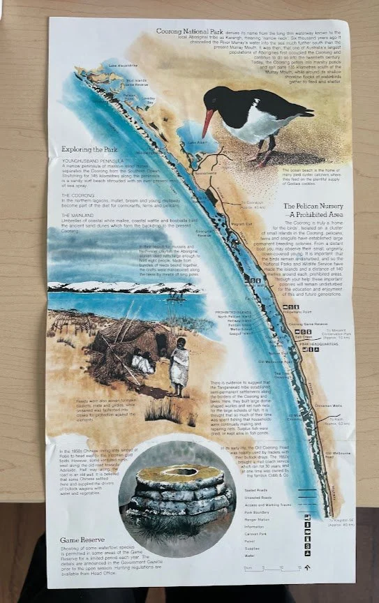
Pre-visit portrait & feature map Image courtesy Bill Reynolds
Ok. What about this page that illustrates a site map showing access points, trails, road types, distances, facilities and parking. A linear park naturally lends itself to a portrait style format and what else has been done here?
Certainly not a blah engineering/architectural aerial site plan or floor plan sketch. A drawing again yet this time using colour. Is it worth the bigger expense? You tell me. Artistic yet practical. Intriguing and invites your exploration. Does this possess memorability strength? You better believe it does. By utilizing wildlife and an historic site image it grabs and holds attention for different visitor types. It also is able to provide an introduction to key features inside the park and an explanation of the park name in bite-size chunks that move you around the page. It is so far removed from an institutional FAQ page.
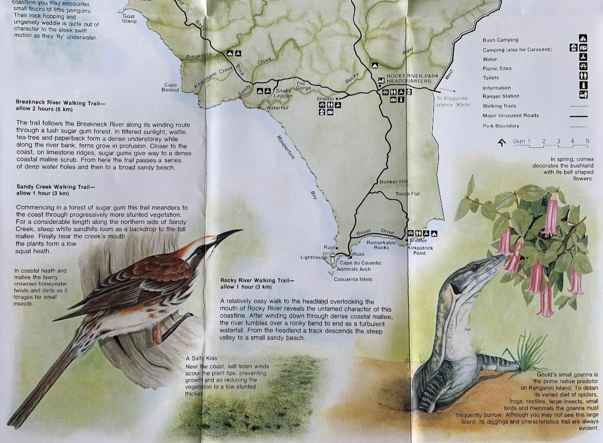
Landscape format trail map info Image courtesy Bill Reynolds
Here is another look at a site location map with trail descriptive listings that takes a landscape versus portrait perspective in fitting with the lay of its land. The map holds interest because of the faunal images and fun facts associated with them. Check out the trail descriptors like “A Salty Kiss” where “salt laden winds scour plant tips…” Hiring a skilled writer goes a long way. I really like the way they have incorporated a plant-animal (Correa-Goanna) interaction image to hint at the concept of interrelationships. Often animals and plants are presented in unnatural isolation. They chose deliberately to present not just cute mammals and to highlight a few rather than provide a list.
Presenting Safety Guidelines
Pre-visit safety conversation Image courtesy Bill Reynolds
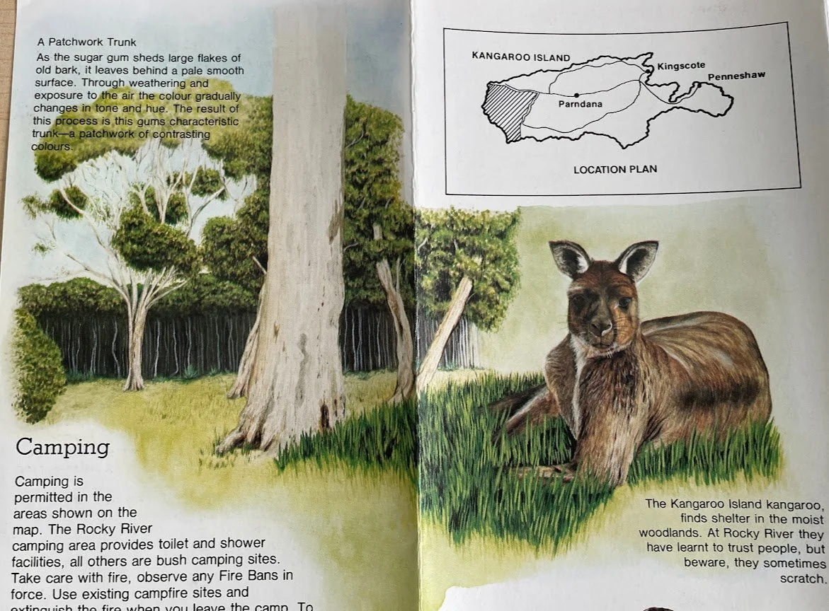
What about this page that deals with providing a regional site context map along with safety concerns around fire and wildlife encounters? Rather than setting this information up as text bullets listing regulatory items, that barely gets a nod, let alone a read, they have interspersed a colourful habitat drawing to lure you in. As a point of enhancement, I would BOLD the phrase: Beware, they sometimes scratch. It deserves to stand out and provide a reason for reading.
Promoting Sharp-eyed Visitors
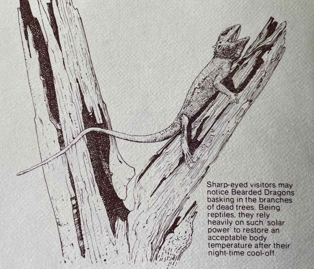
Pre-visit skill building info Image courtesy Bill Reynolds
Back to the original black and white pamphlet, I have zoomed in on the top half of the back page, where they have included a natural history tidbit about what sharp -eyed visitors could notice. Normally the back page is reserved only for contact information and admission hours/fees type material but in this case they choose to mix an interpretation objective with information by placing that text on the bottom half only.
This device could be used for all types of heritage facilities in pre-visit information. This gets the ball rolling for wildlife -observation -skills and sets the seed of discovery by suggesting that dead tree branches are a good place to investigate for self-guided sightings. Little clues like this can be referenced when visitors arrive and can be built on by graphically suggesting other good types of places to investigate. Even with artifacts, one could show where to look in order to pick out hidden details on carvings or quilts, for example.
Interpretive Programming as a Must See
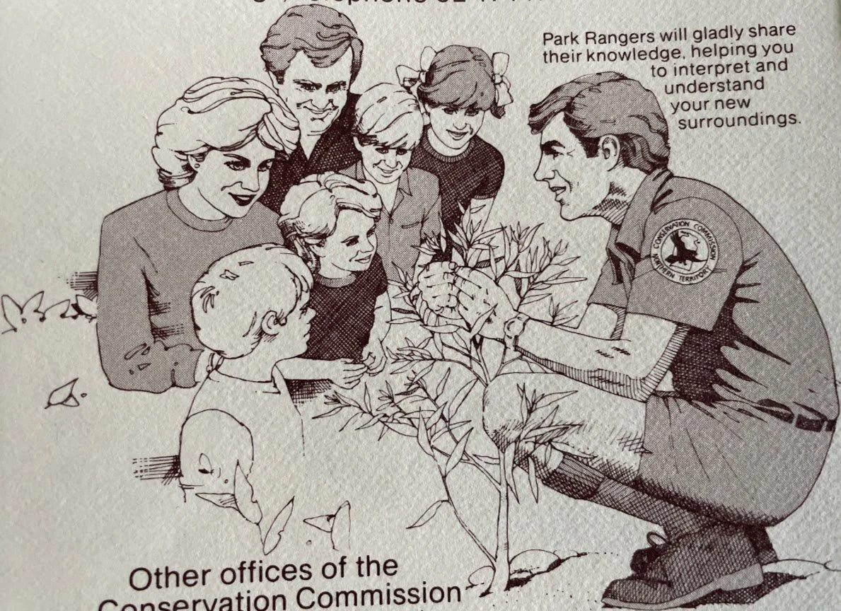
Pre-visit interpretive promotion Image courtesy Bill Reynolds
Mention of the park interpretation programmes is not forgotten and it is not treated simply by a line item but instead by a drawing that is really invitational by illustrating a friendly smile and showing an interpreter kneeling down speaking at the family level.
Interpretive programming has an opportunity to be presented as a must see experience so prospective visitors build these programmes seamlessly into their itinerary rather than finding out about them when they arrive and scheduling becomes difficult.
Should we not incorporate an artistic flair and should we not be trying to encourage a well-prepared visit? I repeat: this is where interpretive and marketing skills go hand in hand.
Whether you use print or digital format, there are still some fundamental things to consider in order to be effective that we have presented above.
Reflection time:
· Do you have a pre-visit information strategy for prospective clients?
· Do you depend on your web site? How is that working?
· Are the significant site features highlighted?
· Is the material presented in a light and engaging way?
· Does it go beyond just the facts about hours, price of admission, facilities, accessibility, pets, and location map?
· When discussing safety and regulations, are they done in a caring and concerned way?
· Are you attracted to read and encouraged to read on with graphics?
· Are you teased with interesting heritage samples, available on-site, to look out for?
· Does this communication medium initiate observational skills?
Don’t forget your homework and we look forward to your observations. In the age of QR codes and youtube, how and when to distribute such infotaining visit - preparatory material is the subject for another day.