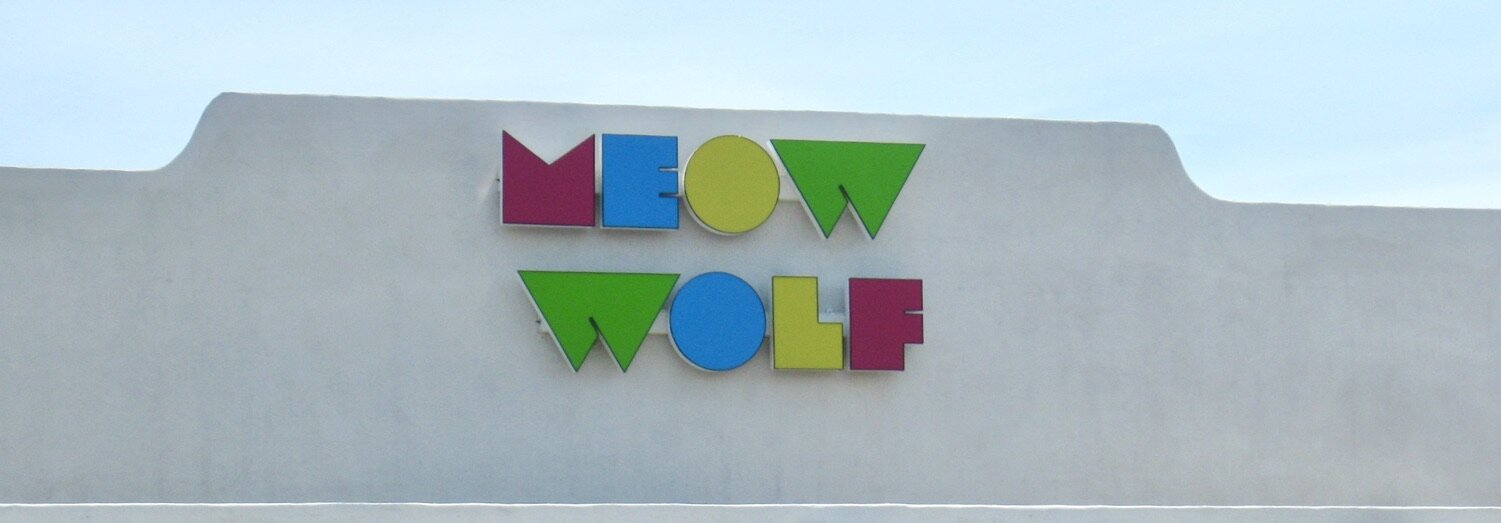
Meow Wolf

Photo Credit: Mike Mayer

Photo Credit: Mike Mayer

Meow Wolf: Please Open All Drawers and Doors

If you have a chance to visit a Meow Wolf installation near you, by all means go…and hang on to your hats, it can be a bit of a wild ride.

After reading Bill’s post regarding a museum in Belgium that presents artwork in an unusual fashion, I couldn’t help but think about my visit to Meow Wolf in Santa Fe, New Mexico. A friend of  mine thought I would enjoy the experience and here’s what I knew: it was set up by artists and it had a story line dealing with a top government scientist and his family that went missing. I was open to whatever might happen next.

Meow Wolf’s converted warehouse was full of energy with families, young kids, teenagers, and adults all taking part in various experiences, playing with and on the installations, and the staff encouraging everyone try and solve the mystery of the missing family, and to please touch everything, open drawers and doors, and have fun. These instructions fit nicely with the Meow Wolf mission, “Meow Wolf champions otherness, weirdness, challenging norms, radical inclusion, and the power of creativity to change the world.” There is something for everyone in Meow Wolf, but perhaps not a lot of peace and quiet.

However, things they have done in the name of art and fun offer some important interpretive possibilities that I think could liven up even the most staid museum, historical or even natural site…if you are willing to challenge the norms and allow some otherness to seep into the site.

Photo Credit: Mike Mayer

Photo Credit: Mike Mayer

Philosophy

I was also impressed with the philosophy they took toward the importance of art and artists. “Meow Wolf firmly believes that accomplished artists must be compensated on an equal level with other skilled, in-demand professionals, and that successful businesses must give back to — and participate energetically in — their communities. We provide financial assistance, expertise, and other forms of active support and we are excited to support innovative, community-focused art and social projects.”

A movie produced by Meow Wolf chronicles their unique approach to the development of the space in Santa Fe and a trailer on the web site is definitely worth watching. The movie is for sale and is one way they raise funds for the artists.

Radical Design

From an EID perspective, I was fascinated by the design process that took place in Santa Fe. After obtaining a large warehouse everyone worked together to come up with the layout and design of the space. This included the artists, tradesman, architects, engineers, designers, and anyone else involved in the project. Though I am pretty sure this process had its ups and downs, it certainly was inclusive and allowed various perspectives to be considered. The group had definite outcomes in mind and yet there is a sense of freedom and joy embedded in the space.

This approach is what EID advocates in the design process at preservation, collection and historical recognition sites when new spaces or exhibitions are being planned. Get the Interpretive Designers involved from the very beginning to help embed mission-based, experiential outcomes for the visitors before a building is designed. Then when it is clear what you want visitors to leave with it will be easier to design a building or space or a trail. All too often the process is donation – design – build – interpretation. EID advocates donation – interpretation – design – build, or even better interpretation - donation – design – build.

Photo Credit: Mike Mayer

Photo Credit: Mike Mayer

Interpretive Design From the Beginning

A recent EID project is a good example of how using the Interpretive Design perspective at the beginning could have provided a better visitor arrival experience. The site in question is about 90 minutes from a large metropolitan area and is quite unique in its mission with a strong set of outcomes. However, when most folks arrive and park the first thing they will need to do is get comfortable – and that means finding a bathroom. No amount of impressive interpretation is going to happen before the bladders are emptied.

But where are the closest bathrooms? In the main building, of course, on the other side of the ticket office. There is no way to have any meaningful introduction to the site between the car park and the visitor’s centre because a rest room is needed. After a certain level of comfort is restored, the visitor then returns to the front of the building and purchases a ticket — then they are ready for some interpretation. Bathrooms near the car park are now a distant afterthought. I’m not saying the current situation can’t work, but if an interpretive designer had been involved before construction plans, maybe a different introduction to the place and its mission before visitors entered the building could be a possibility.

Nooks and Crannies, Surprises and Allowing Otherness

Yes, lots of big things happen at Meow Wolf, and there are also some small touches that I found intriguing as an interpretive designer. One place was a windowed room with a table and chairs and some information on the “missing family” that I casually walked by. All of a sudden from behind a wall next to the room a couple appeared and continued on their way. To my delight I discovered a small, secret space between the room and the main wall with a one-way window where I could watch people in the room. What fun to do a bit of unnoticed watching.

I immediately began to think how this secret space could benefit an historical site. What if you could secretly watch Martha and George Washington at Mt. Vernon discussing the day’s events. Or maybe the farm overseer arrives to talk about the need for a few more slaves to run the plantation (now there’s a way to introduce a difficult topic around America’s first president). Real people could portray the parts, or, in this day and age, holographic figures could act out various scenes.

Photo Credit: Mike Mayer

Photo Credit: Mike Mayer

Not too far from this false wall was a small balcony hidden behind a curtain that overlooked the main floor. A bit of peace and quiet was available in this space while observing visitors interacting with the various installations below. In busy natural and cultural sites, a bit of reflective space would be a welcomed relief from all the hustle and bustle…and it doesn’t have to be much of a space, just a little something out of the way. I welcomed the pause and a chance to just observe.

Photo Credit: Kate Russell, Courtesy of Meow Wolf

Photo Credit: Kate Russell, Courtesy of Meow Wolf

Doors and Drawers

A couple of surprises I liked were in the kitchen and laundry room of the “missing” family. As some visitors read a “newspaper” on the kitchen table about the family, others opened cabinets and drawers looking for clues. Then someone opened the refrigerator door and disappeared. This I had to try. Sure enough, open the door to the fridge and a bright light partially obscured the fact that you could walk right in and enter another room (I felt like I was in the Monty Python movie “The Meaning of Life”). What a delightful surprise! Couldn’t a science museum use a similar unexpected experience to keep folks interested in what might happen next – like splitting an atom and entering a new “world” on the other side.

In the laundry room the kids had already discovered the dryer. If you dove in head-first a slide took you into a different room. It was a tight squeeze, but I did make it. Surely it is OK to have some “just for fun” spots to move people about in any interpretive site.

Photo Credit: Kate Russell, Courtesy of Meow Wolf

Photo Credit: Kate Russell, Courtesy of Meow Wolf

The Power of Creative Spirit

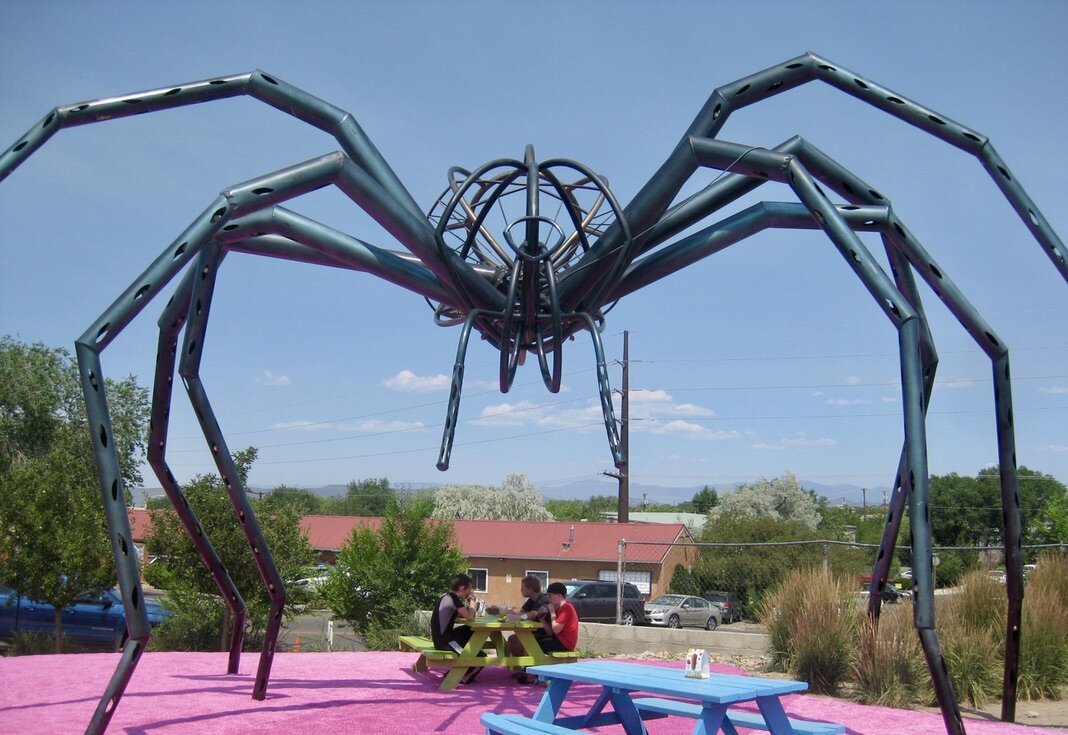
There is no lack of creative spirit in Meow Wolf. Several gigantic structures greet the visitor near the entrance that can be admired, touched or used to sit beneath and relax.

Photo Credit: Mike Mayer

Photo Credit: Mike Mayer

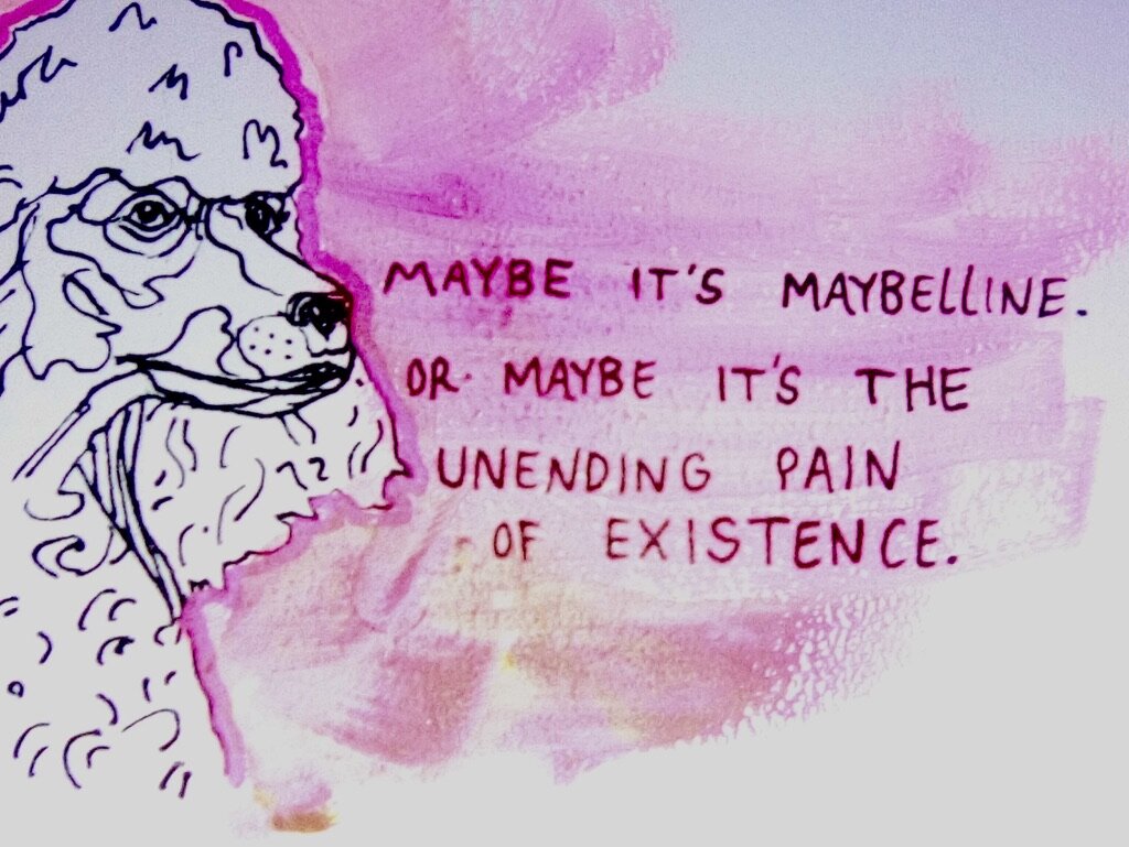
Several interior walls display the artistic flair with paintings and drawings and funny quotes. So often empty wall space is not used to help reinforce the mission and messages of a place, so why not put that space to use where appropriate.

Photo Credit: Mike Mayer

Photo Credit: Mike Mayer

I thoroughly enjoyed the huge dinosaur skeleton suspended from the ceiling in one room that was actually a musical instrument. Using soft mallets, you strike different bones and a musical tone sounds and a light is activated. Definitely more of my kind of fun. I could envision something similar in a natural history museum but instead of musical tones each bone made a different dinosaur sound and a picture of that dinosaur is activated. An intersection between art, science and interpretation.

Photo Credit: Kate Russell, Courtesy of Meow Wolf

Photo Credit: Kate Russell, Courtesy of Meow Wolf

My wife discovered a 15-foot narrow, darkened corridor with very thin fabric on each side. She accidentally touched the fabric and it created a line of light. She proceeded to create designs of light on the fabric and spent a good 10 minutes just playing and laughing.

A forest house was available for climbing and each level had different artifacts from the “missing” family. And, of course, you could exit the house and be on another level of the building, or take a slide or stairs down a level. Another great way to create interesting structures that move folks about and still keep true to the message.

Photo Credit: Lindsay Kennedy, Courtesy of Meow Wolf

Photo Credit: Lindsay Kennedy, Courtesy of Meow Wolf

Meow Wolf was loud, busy, exciting and may not be for everyone, but if you get a chance it is worth the visit. It is fun and provided me with a wealth of ideas. By the way, wondering where the name Meow Wolf came from? Each person working on the project put two of their favorite words into a hat, and the two names drawn out became the name of the experience…thus Meow Wolf.

(Besides the Santa Fe location, other Meow Wolfs are being planned in Denver, Washington, D.C., and Phoenix)

Photo Credit: Mike Mayer

Photo Credit: Mike Mayer


Guided Tours that Break the Mould

What if? You wanted to…

  • be different.

  • exhibit a collection in a non-traditional venue that would draw attention.

  • create an event feeling that was intimate.

  • pull together objects, sourced from many places, & never been shown together

  • arrange for a group of celebrities to share past experiences with selected objects ·        

  • move visitors through the experience (without having to say “follow me, gather round”).

  • provide life histories about the living entities that made the displayed objects.

  • allow for the visitor to share stories of their life connections to selected objects.

Chapel of the Holy Spirit church in Mechelen, BelgiumCredit to HetKunstuur web site

Chapel of the Holy Spirit church in Mechelen, Belgium

Credit to HetKunstuur web site

Two enterprising people referred to as Het Kunstuur, created and presented an initiative called The Art Hour in an historic church in Belgium.  Talk about an exhibition guided tour that breaks the mould.  The “collection” happens to be painting driven but it could be any collection of natural or cultural objects or artifacts. The above bulleted points collectively create an interesting list of criteria, that could be realized in different ways, as long as you stay truthful to the criteria’s essence of what it is you are aiming to accomplish. Let’s unravel this experience.

Focal point

Eight visitors are admitted at a time to do a self-guided tour of 32 art pieces during a 1 hour experience. Only one work of art is lit up at a time. This is important to establish a focal point and keep people’s gaze directed, thus preventing distractions. As the light goes off one painting and then comes on at the next painting, people will pick up their chair on the cue to move along. The intent is for a seamless and subtle coercion to migrate.

Visitors sit in a group, viewing not only the one painting but also the first celebrity narrator, who is being projected in 3D beside the painting. Headphones play the music and narration. The celebrity shares what holds significance for them in relation to the artwork and the emotional bonds they may have developed with it.  Visitors progressively move around the church to sit in front of subsequent paintings and view video projections of the different celebrity narrators.

Projected image of narrator beside exhibit paintingcredit HetKunstuur web site

Projected image of narrator beside exhibit painting

credit HetKunstuur web site

Celebrities

You don’t have to use holavision techniques to achieve the celebrity wow factor, but you do need some visual of that person for recognition value. The focus should be after all on the object or painting in this case. Modern - day celebrities of all ages certainly bring allure to the exhibition, yet celebrities do come in all shapes and sizes, as they say.

A variation on this would be if you are dealing with an historic site for example, where a modern day descendent of a significant person from the past could be used to share their relative’s and their own connection to the object in the spotlight. At a nature centre, a bird of prey is a wonderful “object” and celebrity all rolled up in one, who may need some translation services on behalf of the interpreter in order to share some birdlife experiences for the visitor. Any idea what celebrity has visited your site recently? Discovering this may be as simple as inserting a column in your guest book titled “FAMOUS FOR…” beside “Name.”

Movement

Moving around a space is not necessary either, as your visitors could be seated together and the objects could be positioned on a stage at different heights and depths only being seen in succession because of the spotlight shining on them while the rest of the area is in the dark. The viewer’s eyes move but not their bodies, as in the classic object theatre approach, where different artifacts and short video clips are chosen to weave a story together, usually time-line based. The small group intimacy is lost however.

I have also seen a combination of these techniques used where we as natural history museum visitors were admitted to a dark exhibit space representing the ocean depths. A few people at a time were admitted and you were limited to viewing one denizen of the deep due to only one illuminating light. As the successive single lights came on from left to right, we all moved in whispered silence from one end of the cleverly “hidden” wall – to - ceiling exhibit case, to the opposite end, then exited.

Moving around within one building space creates the experience package with a co-ordinated beginning and ending feel. This would not hold up the same way if you, being the visitor, encountered the objects by moving inside/outside between buildings on a site.

People Connect to People

In the case of The Art Hour, added value is provided in the chapel by an actor’s narrated rendition of the life histories of the artists who created the pieces on display. People connect to people. Yet so many galleries ignore the public’s insatiable urge to connect with the artist as a person. Connecting to THE ART on many levels is so important, however galleries too often forget the fact that people want to know what makes these individuals, these artists, human: their desires, their foibles, their backgrounds ( the dirt, the sordid affairs, the weird factor, etc.).

If your collection contains natural history items the added value could be the life histories of the living beings that produced the chosen objects on display (e.g. honeycomb and a worker bee describing how she manufactures the comb and its hexagonal shape). In keeping with the thought that people connect with people, consider relating an interesting life history moment of a famous scientist, musician, poet, etc. who had a connection with whatever natural history object is on display (e.g. Charles Darwin and ants)

credit Bill Reynolds

credit Bill Reynolds

Do you know what really stands out for me?  It was the fact that there was no primary, traditional, fall-back dependency on little white label cards with the artist’s name, the painting’s name and the medium used. If this was banished from our stable of labelling choices would there be an outcry among the general public? Please send us comments on this blasphemous statement.

For more info on this exhibitory technique go to https://hetkunstuur.com/en 


What if? You wanted to test whether:

  • a self-guided experience could be just as (or more) engaging with an object as a personally guided experience?

  • you could facilitate meaningful experiences with objects on view, when you don’t have time to properly research them?

  • · you could satisfy 3 goals: 

  1. to foster personal and meaningful connections to objects on display,

  2. to have fun learning with the people you came to the museum with, and

  3. to encourage creativity

Theresa Sotto at the Los Angeles Hammer Museum did just that with art works using a semi-self - guided experience set up for sharing between partners. She prepared prompts ahead of time in three categories under the headings 1) Select, 2) Question, and 3) Translate.

1} Select: Gallery visitors were invited to choose a work that they associated with a certain adjective. Some of her options were secretive, awkward, and friendly. Options for participants could range from choosing at random or alternatively picking an adjective they really wanted.

The great thing about having the visitor choose is that they are starting where their interest is and not where your interest is -a classic faux-pas of many a guided visit. Again, this is a technique that could be employed for artifacts, botanical specimens, zoo animals, you name it.

2} Question: Once a work was selected having been matched to the qualifying adjective, the visitor then picked one of many Question cards which directed them to reflect on issues and outcomes that Theresa desired her visitors to grapple with. These queries ranged from, “Could this work change someone’s life? If so, how?”; to “In what ways is this work relevant to people in Los Angeles?” Depending on the nature of the work other probing questions could focus on emotions in general and delving into the artists’s intentions.

Credit: Bill Reynolds

Credit: Bill Reynolds

In certain situations, visitors were supplied a second question card. The number of cards chosen by people should really depend on the interest of the participants. You could really have fun with this stage of the experience as the style of questions could vary depending on the outcome the interpreter is trying to accomplish and how they want to focus the visitor. For example, in a natural history setting, using something as simple as “I wonder how that flower smells?” or “How would you describe the way that leaf feels, on its top, its bottom, its side?” catalyzes action on behalf of the visitor to explore.

3} Translate: This exercise related to describing first what the visitor thought was truly the essence of the work of art they had chosen. Then they were to think creatively about how those qualities could be translated into another form or genre–such as a Craigslist ad, a restaurant menu, or thirty seconds of sound. You could really expand on these options and have an array to choose from. One could even take the opportunity to have some cardshark fun adding appropriate lines, for example, with the film buff visitor, “pick a card, any card, sweetheart,” using your best Humphrey Bogart imitation. Be creative and send us your favourite line for a specific audience type- you may just win a book.

Theresa created this experiment for her peers during a meeting of the group she started known as The Gallery Teaching Lab, where her goal was to foster innovation in gallery teaching. Best of all though is her motto: Rules are meant to be broken. Tell us about any peer to peer learning groups you are involved in in our comments section below.

Theresa shared her Select Question Translate example, among others, in the blog titled https://artmuseumteaching.com/2017/02/28/gallery-teaching-lab/ This is a digital community and collaborative online forum for reflecting on critical issues in the field of museums. Check it out.

­­­­­­­­­­­­­­­­­­­­­­­­­­­­

Hodgepodge Lodge

Why hodgepodge lodge? There were numerous snippets that floated across my screen and in my mind within a week after the last post that related to it so why not share right away and strike while the iron is hot, as they say. Each snippet cascaded into the next coming to reside, connected yet jumbled in their home called the hodgepodge lodge.

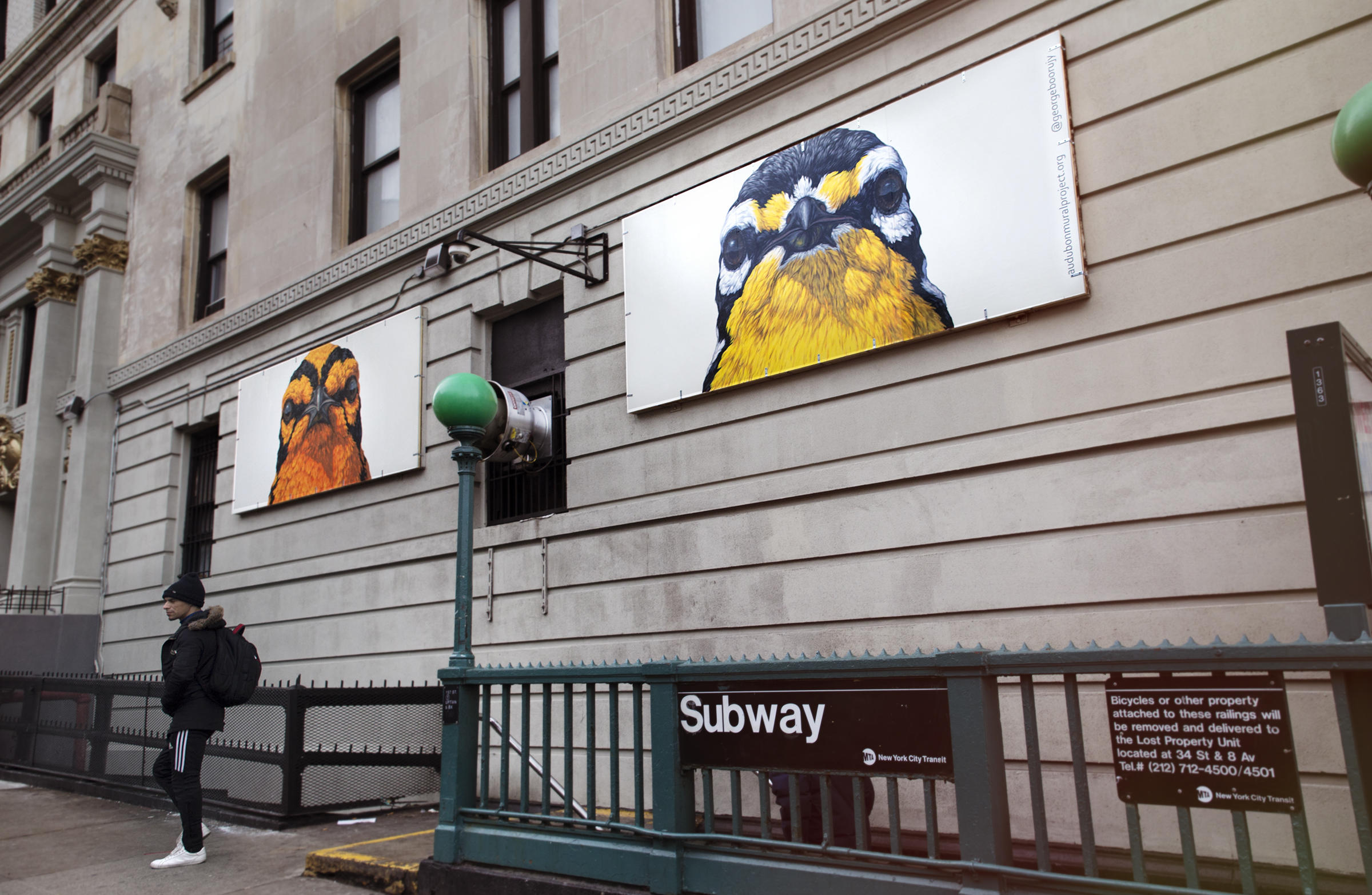
Remember the Audubon bird mural project in Manhattan from our last blog. Well, lo and behold just a few days after I stumbled on a podcast with Jason Ward, a birder of colour, as he describes himself, that featured the mural initiative. David takes us on a bit of an actual walk with him and the project coordinator throughout the neighbourhood for a human’s eye view. In addition, he interviews one of the artists, inside the artist’s gallery. You will get up close and personal with the work that he titled, the gang of warblers – he said “I wanted those birds to have attitude.” He wasn’t kidding. Perhaps he was trying to appeal to a certain demographic in the neighbourhood. I highly recommend checking out these podcasts as Jason is very genuine and funny. https://www.topic.com/birds-of-north-america

Photo credit Marion Reynolds

Photo credit Marion Reynolds

Jason also did an interview with an actress- hobby birdwatcher, in another post, where she alludes to the skills used in birding are similar to the skills she uses in acting. Top of the line is of course listening as an actor has to be in the moment on stage and be extremely conscious of what is going on around you. She emphasized the art of tracking your character so you don’t impose on your character. Follow your character and you find a story that you can develop. Similarly by listening and following your avian character, s/he will allow you to plug in to the annual seasonal cycle and connect to the natural world.

Artists are stealth change agents. Their power is both subtle and profound: They grab hold of hearts and minds, and reveal a whole new way of seeing things — a way that can inspire people to take action.

This applies to actors as well and I would like to credit the individual who said it but can’t find a reference. It was too good to not share.

I watched popular author Richard Louv’s (Last Child in the Woods, etc.) webinar, called Finding Nature, through the children & nature network website .  He expounded on our recent blog spotlight that dealt with paying attention. He added cloudspotting to the backyard pursuits on top of bird spotting. He talked about the importance of nurturing nature not just observing it in your backyard. He challenged everyone to create their own “national park” on their front or back lawn by planting native seeds and encouraging native pollinators back to urban environments. He makes a passionate plea that land conservation is not enough and we need regeneration of native landscape. If you want to plant for birds benefit then this US site will tell you what is native to your zip code http://bonap.net/Napa/Genus/Traditional/State . For other countries, maybe the national bird conservation society has something similar in your neck of the woods, as we say.

Along the same vein in this week’s e-newsletter from the children & nature network website, Richard Louv posted a column titled, The Art of Seeing.  Previously he had asked for readers to submit stories about animals that had changed their lives. He shares a wonderful story about the impact of a dragonfly that was “a bit of a ham.”  https://www.childrenandnature.org/2020/04/21/the-natural-art-of-seeing/?mc_cid=5fdff6bdf8&mc_eid=d30eca01e5
When describing Canadian artist Robert Bateman, Richard writes in the same article, “he saw the world as a bird would and for the rest of his life experienced the world from that viewpoint, of how a bird might sense the world combined with his own insights. Such sensitivity is felt both from outside one’s own body and from deep within it.” He encourages us to draw or paint what we see outside and try to become the animal.

He touched a neural connection for me at that point as I remembered a book from my university days that changed how I “saw.” Titled “The Zen of Seeing” by Frederick Franck it was handwritten because as he said it is a love letter in a way and love letters should not be typeset. It is slower to read but there is no hurry…He said that the exercises are for those who feel they cannot even draw a straight line. He saw seeing/drawing as a way to “inscape from the overloaded switchboard” of urban life. “ He was all about getting into intimate touch with the natural world by  establishing “ an island of silence, an oasis of undivided attention, an environment to recover in…”

In this century, to stop rushing around,to sit quietly on the grass,to switch off the world and come back to the earth, to allow the eye to see a bush, a cloud, a leaf, is ‘an unforgettable experience.’
— Frederick Franck
photo credit Bill Reynolds

photo credit Bill Reynolds

One small gallery in southern England, Hastings Contemporary, aims to harness the power of art to inspire people to see the world differently and a place for respite and renewal. They have recently innovated accessibility by being the first gallery to introduce telepresence robots. By turning their gallery walls inside out they are now allowing up to 5 visitors at a time to login to a 30 minute guided tour to view the gallery using the art droid. The tours use The Double videoconferencing robot, developed by the Bristol Robotics Lab.and allow you to zoom in. If you want to watch the short video https://www.hastingscontemporary.org/exhibition/robot-tours/

In the hot off the press column, here are two of many reactions to the social isolation situation :

A series of fun activities for earth week involving superheroes

https://planetprotectoracademy.com/for/parents-he/?source=david-suzuki-foundation&medium=email&campaign=home-edition-spring-2020&mkt_tok=eyJpIjoiWTJRMVpqQXhNVE0xTkdWaCIsInQiOiIwaEZSbkNkVTc1Zmpadm05cTFuSEJCRGJRQ3FmajM5eWs4eTU0RzdxOUhQdjROVkIxQ0dpbzAwTVk0T3ZNamxPYTZSYXlZK1BtaTBmcHlIQ3ZveGdRWUZPbGw4OXhZRlpWNDEzTlhTelpDcGtQMXQ4MmFwU3BFOGh5bjVaQWVQTSJ9

London’s V&A has launched Lockdown Wednesdays, a weekly series of hands-on activities to spark creativity. The programme, which is available on the V&A’s blog encourages participants to make items inspired by pieces from its collection. What could you have digital visitors make inspired by natural residents on your site or your collection?

Don’t leave home without these!

We are receiving a wake-up call.  The virus is sending us a message:

STOP !

Time to hit the PAUSE button.

RETHINK relationships.

Photo: Mike Fernandez/Audubon

Photo: Mike Fernandez/Audubon

We are being given the opportunity to rediscover the kinship between us and other species. Especially during these unprecedented times, interpretive coaching can assist the strengthening of a natural relationship with all species that share the earth.  One of our roles as interpreters, is to help people figure out how to decode our mutually common language with the earth’s inhabitants. So, when people go out for their social distanced walk, we as interpreters need to be reminding them about something:

Your senses- don't leave home without them.

Jon Young, author of What the Robin Knows, strongly believes that birds are the best mentors to unlock the outdoor nature-based conversations. The only talent you require is awareness and motivated practice. You do need to also bring along a respectful attitude to allow close encounters with wildlife (binoculars help too).

When we train ourselves to listen to the birds…when we ‘lose our minds’ and ‘come to our senses’… the texting, emailing, twittering mind will eventually quiet down.
— Jon Young

By sharing his tips on improving our eye opening and ear opening skills, he shows us how to access the world of birds through what he calls deep bird language. He considers deep bird language a multidimensional full contact sport that will allow us to see more wildlife. The main idea is not just to hear birds but to hear everything.

Stop walking with arrogance

Jon mentions that the awareness required to understand and connect with birds changed his life. It allowed him to connect with his deepest instincts and to stop walking in the woods with arrogance and in a state of self absorption. I can relate to doing this on occasion and I certainly observe this behaviour in many park visitors. The benefits are there not only for the novice but also for the experienced birder. As a birdwatcher already myself, Jon has added a whole new dimension to my avian observations.

Sparking a connection with the subject is the primary goal; the learning follows. This philosophy is at the heart of EID’ s work. The learning is in the questioning and the doing. This book aims to provide the behavioural doing tips, along with some tools for asking the right questions. This allows you to uncover the answers the birds have been providing all along. In true interpretive style Jon is careful at not providing answers forthright but presenting the guidelines for your own discovery.

So, what happens? We rebuild habits of perception buried within all of us.  This allows us to open up to an often, ignored world and add an interesting dimension to our backyard or neighbourhood walk. This guidebook walks one through how to rediscover the instinct we all have of bird tracking. The greatest teachers he says are the species you see every day, like robins. Robins, from his experience, are often the real gatekeepers to approaching other wildlife unobtrusively.  

Photo: Mike Fernandez/Audubon

Photo: Mike Fernandez/Audubon

Birds’ language is loaded with meaning if we pay attention, and Jon provides the methods to still the chatter, quiet the mind, and practice the routine of invisibility. It may a sound a bit mystical at first, but the approach is very practical, coming from an indigenous & scientific viewpoint. You are trying to minimize the ripples, waves, and concentric rings of disturbance that propagate in all directions when humans blindly charge off on a walk or stride boldly into their backyard.  This movement pretty well guarantees the comment, “I didn’t see any wildlife.”

Shrink the sphere of disturbance

When our disturbance exceeds our awareness in size and scope, we cause a wake of disturbance around us seeing little. Tied to this signature wake is what Jon refers to as the bird plow.  To reverse this effect you want to aim for awareness growing larger than disturbance. He expands on techniques for sensory expansion using owl vision, deer hearing, and raccoon touching while one also practices a gliding versus bouncing gait and fox walking with the use of shorter, softer steps versus the normal swing and stomp method.

Having close encounters with animals is not random. Bird alarm calls give all wildlife advance warning. As Jon says, if you want to see animals, you have to ask permission from the birds first. Jon talks about the attitude of respect when walking and the need to pause frequently when moving in a relaxed manner, to replace collision with connection. He has found that all birds have a species-specific tension sequence, some of them being hard for us to differentiate before explosive flight. The book is full of practical examples to reduce this tension like turning away techniques using the honouring routine. Trying this with a red squirrel will provide an endless challenge.

Photo: Mike Fernandez/Audubon

Photo: Mike Fernandez/Audubon

Law of the Land: Disturb one, Disturb all

A bird’s last resort is the cry of alarm.  To survive, birds have to know where and what danger is, along with a plan to avoid it quickly and quietly, with minimal energy expenditure. Heeding alarm calls for prey species is a good strategy not just for their own family, species or us, for that matter, but for all wildlife. Birds are prey species and are always on the lookout for dangerous situations and signs of trouble. You need to place yourself into this perspective. Over time, within a given habitat, one can organize birds, based on their alarm reactions, along a shy-to-bold scale.

Their pre-alarm call evasive reactions have a distinctive shape based on the specific kind of aerial or land - based threat involved. Categorized by Young, there are twelve kinds to be on the lookout for like: bird plow, sentinel, popcorn and parabolic for example. What demands practice is the recognition of these occurrences and your avoiding being the stimulus that creates them.

The birds’ wisdom is their awareness and their awareness, is their wisdom.
— Jon Young

Alarm calls, however are just one of 5 key vocalizations by birds. Their knowledge can add layers of enjoyment to your getting to know your neighbours. Alarm calls are similar phonetically to what is known as the companion call but exaggerated in speed and intensity, and accentuated by the landscape position and body language. Here is a summary of these five so you can get a sense of what to listen for (with apologies to those who dislike anthropomorphic frivolity):

  • Songs proclaims territory indicating fitness level (to males) and knowledge of hiding places, safe roosts, best escape and avoidance strategies/routes (to females); “These are my home boundaries and I will defend them so keep movin’ on buddy,” OR “I have lots of energy to put the best tasting grubs on the nest table and to protect you and our children from predators.”

  • Companion Calls sweetest and most calming, indicating well being; “All is good my darling, and you ARE looking ravishing today.”

  • Territorial aggression calls minimize all- out fighting by posturing and warning; “If you step one foot closer, I'll drill the nape feathers off your head.”

  • ·Adolescent begging is an indicator of hunger; ” I WANT MY FOOD AND I WANT IT NOW”

  • Alarm calls surprised panic due to predator danger; “Holy S__T, Robin. Escape to the Birdcave.”

Audio files have been produced as a companion to the book having representative vocalizations from robin whinnies to chipmunk alarms. They can be found at birdlanguage.com

Photo: Mike Fernandez/Audubon

Photo: Mike Fernandez/Audubon

The delightful thing is you will never exhaust the subject. The lifelong learning curve is very appealing.

Jon recites a story about a San bushman at the beginning and end of the book to cement a thought in the reader’s mind. I have paraphrased it like this:

If I see a small bird and recognise it, a thin thread will form between me and that bird. If I just see it and don’t recognize it then a thread does not form. If I see and really recognize that same individual again the thread will thicken.  Every time I see and recognize that bird the thread strengthens. Eventually it grows into a string, then a cord and finally a rope. We make ropes with all aspects of creation.

Jon shares with us the sweet feeling he senses when he is accepted not as a predator, an intruder or a stranger but a neighbor. The learning benefits of watching an individual on a regular basis more intently are that you’ll get to become familiar with his or her habits. Just like a human neighbour I find myself offering a verbal greeting to my feathered friends when on a walk. This provides me with a sense of something- a good feeling- camaraderie? 

Listen farther than you can see

It is all about building a connection with other living beings, and to appreciate them not as a species but as an individual.  Jon emphasizes finding a comfortable place to sit down for around 30-40 minutes to allow everything to settle in. He calls this a sit spot, and sees it as the key to a natural relationship.

A sit spot is the heart and soul of bird language, practice room and concert hall, raw canvas and glorious museum.
— Jon Young

This is a time to really learn to listen to the silence, so one can hear more of everything else. We need to listen farther than we can see.  The main idea is not necessarily to hear birds but to hear everything. Jon combines this with journal writing to record impressions and questions. He uses arrows to depict movements.

Photo: Jon Heller

Photo: Jon Heller

This approach by Mr. Young brought back extremely pleasant memories for me of participating in a solitude enhancing activity called magic spots as well as being immersed in an Earthwalk sensory awareness activity called symphony. Participants were set up to focus on sounds and record them not by identifying who made the sounds but simply by capturing the acoustic essence like volume, speed, pattern and tonal elements being heard. I never knew the wind had so many nuanced sounds. 

This occurred during the 70’s in an ACClimatization Experiences Institute outdoor camp workshop. That Institute has morphed into the present- day Institute for Earth Education. Their Earthwalks; an alternative nature experience book describes the wonderful activity called symphony (among many others).

You have really had a strong hit of natural history content in this post so I would be remiss to not include some cultural history. Art and science are not strange bedfellows but great reinforcers of community inspiration.

Brighten Your Community

The National Audubon Society has a wonderful project called the Audubon Mural Project where they have matched sponsored money with artists to complete murals of climate-threatened birds using urban walls as a stark reminder of the birds that once lived in cities—and might yet again with the restoration of habitats.  It started by brightening up the urban environment throughout John James Audubon's old Harlem‐based neighborhood in New York City with an amazing range of creativity.

Not just walls were used as canvases but a variety of surfaces from metal security store shutters to chain link fence to bridge panels were commandeered. BTW, the images in this post promote the Audubon Mural project and have all come from their website  https://www.audubon.org/amp

One street artist called ATM, has a video which captures the essence of the project and explains his process of matching the chosen bird to the surface contours. https://www.audubon.org/news/townsends-warbler-atm  

Photo: Mike Fernandez/Audubon

Photo: Mike Fernandez/Audubon

Might there be an opportunity to brighten your neighbouring community to profile threatened birdlife and raise awareness of your centre? Go for it !

For those more culturally inclined readers who have got this far, then I add for your pleasure what the Getty Museum has done to lighten the isolation load.

https://www.fastcompany.com/90484459/getty-museum-challenges-quarantined-people-to-recreate-famous-works-of-art-with-hilarious-results

Noticing: Attention Antidote

As an act of compassion for each other, how can we employ our interpretive skills to help bolster the close directions from the health authorities to help flatten the Corona curve, slow things down and save lives? Paying attention to the world around us can be an antidote to the isolation being prescribed to avoid COVID -19 infection. This can take place in the built environment with architectural details as well as in nature with exuberant biodiversity.

WP_20191017_05_33_56_Pro.jpg

However, we know fresh air and contact with the natural world help with a psychological and physical health regimen needed to counteract cabin fever when dealing with the required self-isolation.

The challenge is to be find strategies to absorb more from the world around you while social distancing. We have a few to share.

Helping people on all levels find solace in observing signs of spring and listening to birds is an important task, starting with what is happening just outside their window and progressing to a neighbourhood walk and trip to a park. Along with the inherent qualities that interpreters possess, we want to share ideas from two books that should help you ramp up observations, by providing fun new perspectives. Helping friends and neighbours this way is a given but many of these exercises can also be used, with a little ingenuity, for your site visitors, using a self-guided approach. This allows you to be productive and generate material from home.

A little book with a big punch by Rob Walker called The Art of Noticing (2019) is a compilation of 131 ways to discover joy in the everyday. The author makes a point (pre-COVID-19) that the most vital human resource in need of protection now and in the future is our mental space. He is coming from the perspective of counteracting the culture of distraction and releasing one from device connection. DIY techniques are supplied in Walker’s book as a way to regain business and social focus along with creativity and innovation. We can easily employ these in service of getting outdoors (with social distancing) and improving our ability to NOTICE.  Creativity and innovative qualities will no doubt also bubble to the surface as a bonus to the mental health boost gained by being alert in the outdoors, both in the natural and built environment. 

Walker borrows from a whole range of sources to encourage an enlightened reading of our world. Here’s a few highlights from the section entitled “Sensing” starting with a great quote from visual artist Nina Katchadourian,

My job is really to pay attention and see what’s there that we haven’t seen yet. I am always trying to look at things we are overlooking and underestimating in terms of their interest or value.

Does that not describe our job as an interpretive planner? Then we just add to that the role of assisting our visiting public to “see what’s there that they haven’t seen yet.”

Nina asks her students to notice something they always notice; now notice something they’ve never noticed. What an enticing provocation one could use with heritage site visitors! This works of course, better when setting up subtle ways of discovery, rather than a command to your visitor.

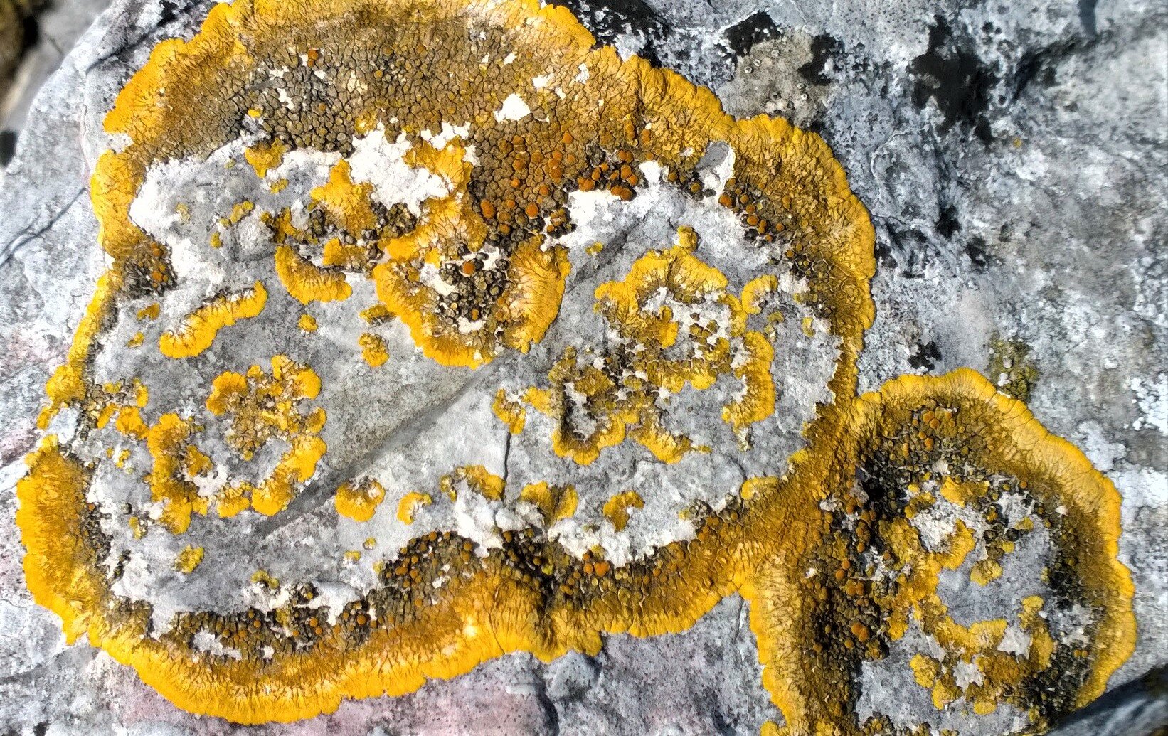
a rock surface image Photo credit Bill Reynolds

a rock surface image Photo credit Bill Reynolds

Incorporating the act of describing the “always noticed” item pulls the visitor into seeing more details of something taken for granted. We have used this technique in the fall using leaves and it is amazing how different aspen or poplar leaves can be when you slow your visitor down to absorb what is around them. When you set up the exercise of finding a leaf that speaks personally to the individual visitor because it shares similarities with them – well, you open up a variety of emotional bonding that you could never anticipate.

Dealing with the “never noticed” item, sometimes we have to help visitors change their vantage point by getting on their hands and knees to explore a microtrail or we position them at weird angles so they appreciate a tree from different perspectives.

Nina has been described as performing curiosity. Would you not love to describe yourself that way? “I perform curiosity so that my visitor engages with our special place.”  Known for her playful conceptual pieces Nina has a section on her web site titled, “Uninvited Collaborations with Nature,” which is guaranteed to give you a chuckle and provide you with interactive program inspiration for your visiting public… like spider web repairing.

To awaken our senses, Walker recommends that we “Make a Sound Map.” Jumping out at me, within this exercise, was a second attention getting quote (in bold no less): “The world is a museum. You are the docent.” This was attributed to music writer and instructor at the Academy of Art University in San Francisco, Marc Weidenbaum. He takes his students on an urban soundwalk where he gets them to notice where, when and how sounds work, regardless of whether they are ephemeral or immobile. They are challenged to create a sense of place soundmap charting audible points of interest – potentially functional, historical, cultural, and natural.

Did you know that you can take sound shots (audio snapshots) using the voice memo app on your phone? Walker encourages us to do this and replay them to a friend then see if they can pinpoint the locale. Can you see how this could play out at your centre as a form of interaction between visitor and certain aspects of your site? 

He profiles Peter Cusack, a self- proclaimed sonic journalist, who gets people talking about the way they hear everyday sounds and what they think or feel about them. Instead of asking how a place looks he asks how does it sound. Peter produces a favouritesounds.org web site.

How about crowd sourcing from your visitors a favourite sounds web site for your interpretive space? Watch out, you may end up in places you have never heard of before.

Here is another idea from the book -”Take a Scent Walk” - a tool for discovery and exploration. He cites Dr Kate McLean, an artist and designer, who is a creator of smellmaps of cities around the world, working at the intersection of what she calls “human-perceived smellscapes, cartography and the communication of ‘eye-invisible’ sensed data.” She captures scents and embeds them on scratch- and-sniff cards. One can download her DIY smelfie guide to smellwalking at https://sensorymaps.com/about/

Having your visitor be their own docent and giving them hints on how to create their own map can lead in so many directions. Having them take a sensory focus other than visual- what a concept. Having them share their map with others – what engagement.

All this sensory awareness play brought back memories of handing out what we called scent catchers (one- inch square sponges having been soaked in a mystical solution) to visitors to use under their nose. This took place each time nature walk participants would scratch the surface of a natural object to release the smell then sniff the released scent. This sensory awareness activity was one of several stitched together into a different kind of nature walk called an Earthwalk.

shelf fungus Photo credit Bill Reynolds

shelf fungus Photo credit Bill Reynolds

The intent was to slow down:

  • enjoy a light refreshing touch of nature    

  • celebrate nature not study it,

  • explore with the senses not with an identification guide and

  • discover the unseen and ignored hiding in natural patches.

A series of earthwalks have been designed and painstakingly developed by Steve Van Matre and Associates from the Institute of Earth Education over a series of decades. A book describing these carefully crafted activities that aim at developing the feelings of joy, kinship, reverence, and love for the natural world is now available. Having both led earthwalks, Mike and I can attest to the highly impactful, and refreshingly fun experiences they are. We will have a review of this book in an upcoming blogpost. For now check out Earthwalks; an alternative nature experience  at  http://www.ieetree.org/education-tree/earthwalks/  see page 20-21 in this flip style digital catalogue http://www.ieetree.org/sourcebook_iee/

As I was just about to put this blogpost to bed, I came across a fitting passage from the 1960’s I needed to squeeze in. Louis de Kiriline Lawrence wrote with a lyrical reverence for life. As part of a concluding last paragraph to The Lovely and the Wild she wished that people would strive to be on a heightened awareness of natural changes: “… not for the sake of selfish pseudo-recreation in their midst {creations of millenia}, not for relief from man - made sordidness and artificial pressures, not just to gratify the need of mercenary exploitation and vain possession, but to obtain some deeper guiding comprehension of nature’s irremissible logic, of the intricacies of all its balanced systems.”

Fungi and algae take a lichen to each other Photo credit Bill Reynolds

Fungi and algae take a lichen to each other Photo credit Bill Reynolds

Life is about cultivating our sense of wonder and helping others rediscover theirs. 

Rob Walker’s book provides many tools to do just that emphasizing the urban environment with easy crossover applicability to whatever your interpretive space is. The Earthwalks book produced by Steve Van Matre and Associates, focuses on sensory awareness in the natural non-built environment with detailed descriptions of the mechanics on how to craft such a walk. Add them to your bookshelf.

Let’s follow up these practical tips with a bonus (we hope you consider it so) riff on interpretive philosophy, which was instigated by a little background digging about author Rob Walker and where he teaches. Side note: He was the originator of the word “murketing” as a blend of murky and marketing. He needed a way to explain the different promotional focus using buzz creation rather than direct advertising sales that Red Bull broke away with through their sponsored events approach.

Rob is on the faculty of the Products of Design MFA Program at the School of Visual Arts (SFA), in New York City.  Looking into their mission and philosophy one sees how design and interpretation have so much in common. SFA sees the power of design as something:

Ø  to fix problems,

Ø  to create value,

Ø  to reinvent businesses, and

Ø  to address vital social and environmental challenges.

That fits really well with our view of interpretation, although we would exchange reinvent businesses with reinvent experiences. Their faculty motto seems to be “Designers don’t design things. They design consequences.” Interpreters design situations so people have interactions with the place they are visiting (i.e. consequences). Another parallel. Let’s follow this path a bit more.

The SFA considers the department itself to be a “product of design” because it responds nimbly and comprehensively to the critical questions around the role of objects, the impact of digitization, and centrality of justice in contemporary culture. Interpretive site teams if they stay relevant to their visitors also grapple with these critical questions.

They see designers as the connective tissue of their environments because:

Ø  they translate between stakeholders,

Ø  reframe problems,

Ø  reveal opportunities,

Ø  render the invisible visible, and

Ø  champion change.

 Similarity with the modern interpreter role, n’est ce-pas??

Our hope is that this blogpost about NOTICING has provided some joy in your life.

Questions for the comments section:

Do you have any thoughts to share on ways you have helped visitors to render the invisible visible (and in the process made someone’s day)?

Can you contribute some insights on how you would do this in a self-guided way at your site while working remotely?

Portugal Postulations: Insights come from corners and corridors

A series of travel observations will be coming your way over the next few months as I have stockpiled quite a few of what I like to call “Ruminations and Revelations from the Road.”  I hope they provide you with new perspectives and perform as idea generators that boost your interpretive output.

A recent journey to Portugal was the impetus to launch this series. Corners and corridors are often ignored or passed through too quickly, yet they can contain surprising elements for the wary eye. Don’t ignore the interpretive potential of your site’s “corners and corridors.” Here are four examples with the first one being explored a bit in depth and the other three being quick hits.

#1 One thing that struck my wife and I while travelling throughout Portugal was their habit of publicly memorializing their past citizens who excelled in the cultural realm - something our country Canada does not do very well. Authors, poets, painters, sculptors, dancers, film makers, opera singers have a presence in parks and on boulevards mainly through bust-like sculptural works, and sometimes by also including representative pieces of their work. By keeping this cultural aspect of everyday life alive, we provide a form of “hero” inspiration quite different from those commonly directed at military, political or sports personalities who seem to dominate our urban public places. Let’s not even start down the skewed gender path.

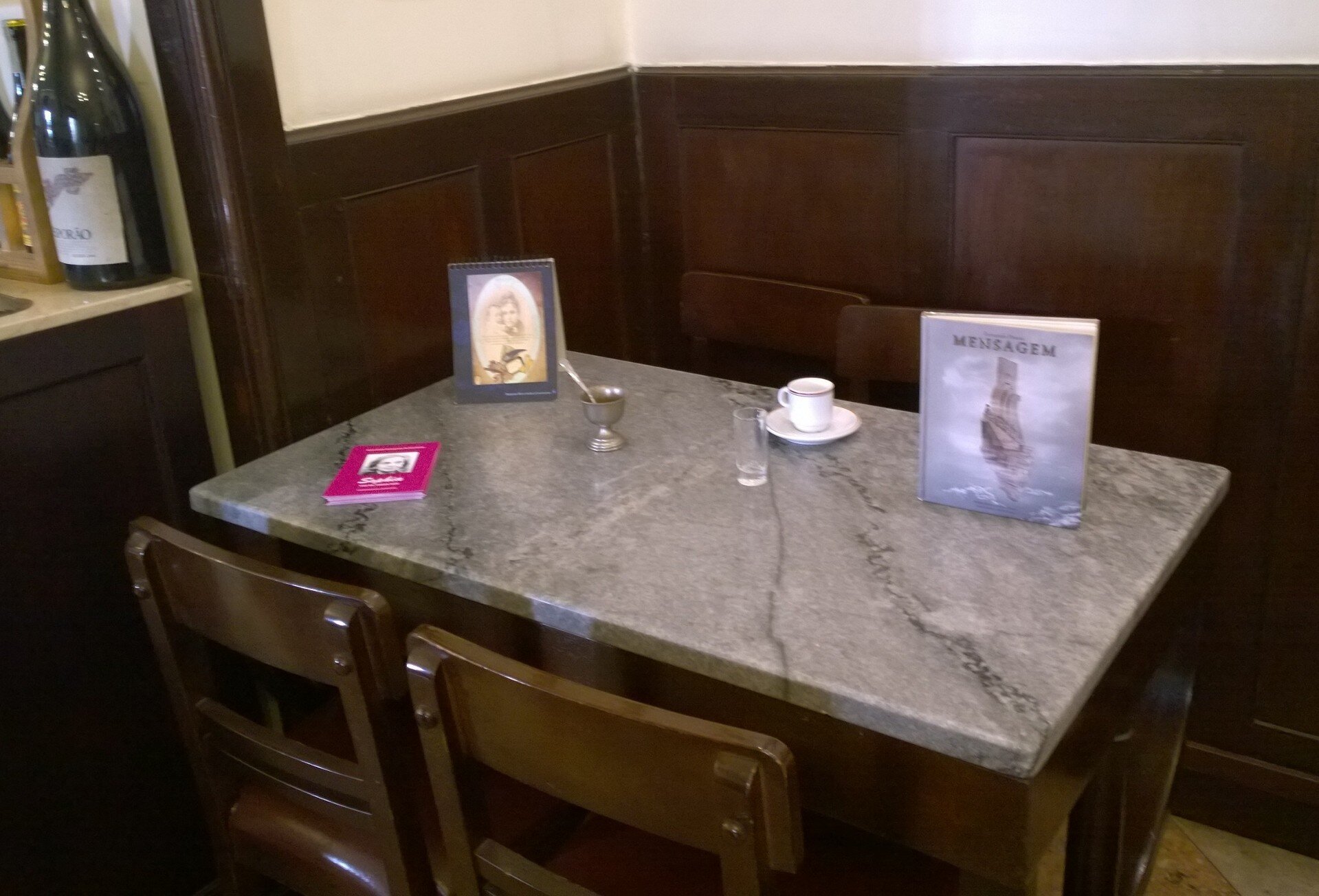
Then we noticed another type of personal tribute in a café corner. It caught our eye due to its personal nature. In the main salon of the Café Martinho da Arcada in Lisboa (Lisbon is the anglicized version), there was a table set aside in an unobtrusive corner, with a few objects on it.

Credit Bill Reynolds

Credit Bill Reynolds

This is where Fernando Pessoa (1888-1935), perhaps the most famous Portuguese poet of the 20th century, wrote pieces of his work after closing time. The corner table had a copy of one of his books, along with a coffee cup and a shot glass for anise-based aguardiente - two of his favourite pastimes while writing in the cafe. The corner wall was adorned with pictures of Mr. Pessoa. What a fitting tribute!

You were welcome to sit down and engage with a book, imagine a conversation with this poet, reflect upon what it would have been like at the turn of the century, even consume his favourite meal or libation at a nearby table. This simple “shrine” kept a memory alive. Caution: by shrine I do not mean a place of standoffish reverence but one of approachable involvement.

Think of the interpretive possibilities for your situation. First, we would need to think who then where & how best to design the space. Obvious who choices are those personas who have expressed a love of place and have spent a significant time at your site, in your city or country. But let’s not stop there, as there are many people who have contributed to humanity’s appreciation and understanding of natural and cultural heritage that should be recognized, and haven’t any direct association with your site. Who deserves a place of honour at your site? Who should your visitor become exposed to, know more about and be reminded of for their inspiring views, research, conservation or expressions of joy that capture the essence of your site?

By taking time to reflect on who might represent what our sites stand for it can better communicate what values our sites express. That way we assist our visitors in extending the inspiration they initially felt in our parks and heritage sites. We can provide a new human connection for them.

These people being recognized don’t have to always reside in the past. Maybe you just want to honour a living individual who could have a positive impact on your visitors by encouraging heritage appreciation and awe. Perhaps “a conversation” between two individuals - one living and one having passed away -could be designed.

Conversation-inducing railingCredit Bill Reynolds

Conversation-inducing railing

Credit Bill Reynolds

The designated WHERE could be an interior space like the restaurant example, or it could be a sofa in the giftshop/bookstore, an alcove in your exhibit area, a portion of a lab bench, a seat in the auditorium…  The designated spot could be an exterior space like a conversational-inducing railing, a bench along a path, an Adirondack chair at a viewpoint, a treehouse in a forest, a picnic table in a botanic garden, an easel in a meadow, a driftwood enclosure at a beach...

HOW might we recognize these people who have shined a spotlight in various scientific or artistic ways, on significant aspects of our natural and cultural heritage?  As in Pessoa’s case, if you have a literary “celebrity” who frequented your site an obvious application would be the setting aside of a table in your visitors’ eating area, if you have one. Remember, you do not have to possess such an individual, although this would have strong allure. You may simply know of someone (past or present) that you would really like to come visit because they have a strong connection to the site’s mission.  You could create an invitational space designed to make your person of interest feel at home (if they ever were to visit) with objects that site visitors could also relate to.

Spaces can be perpetual but they don’t have to be.  The people being celebrated could change every so often giving visitors a reason to be exposed to another noteworthy personality annually or throughout the year. You could have one at a time or many. You could make it an event where visitors come to experience a sampling of people’s perspectives who love your site and what it stands for.

#2  Again another form of tribute caught our eye – this time on a street corner. The plaque type signage format is familiar to most of us however this treatment, subject matter and placement  were different. A friendly oval not a formal square shape was observed. The sign performed like a Warm Greeting due to the choice of informal attire and stance in a kitchen location.

street corner interpretive greetingPhoto credit Bill Reynolds

street corner interpretive greeting

Photo credit Bill Reynolds

Street corners had been chosen in the old section of town, in Lisboa, to honour the lives of selected senior citizens. These were people known for their hospitality and community spirit - another form of celebrity or hero. This reflects a time when humans were intimately associated with their immediate environments and were a part of the sense of place. We need to recapture that feeling for visitors especially in our natural heritage environments – is there a role for more human tributes so visitors can see the relationships that others have had with nature, thereby planting seeds for experiences they could have?

Yes, we have our walls of fame but they are often sequestered away inside buildings and not out in the open where people will be reminded of them as they go about their daily lives or recreationally walk down a path. And who do we recognize? for what traits? The challenge to do better is out there. Grab it.

#3  Lisboa’s Bertrand Bookstore claims We are books since 1732 and profess to be the oldest bookstore in the world. It was bound to have something of interpretive value – and something novel as well. Lo and behold down a side corridor was a bulletin board with a relatively small poster mounted on it with the title “We Witnessed:” followed by a listing (see photo):

Bookstore posterphoto credit Bill Reynolds

Bookstore poster

photo credit Bill Reynolds

Done from the perspective of the bookstore building and what it has witnessed over its long history since 1732 the list reflected historical events that would have happened in and around the walls and floor you are standing on. This was followed by a summary statement with a direct link back to why spending time in their business would be worthwhile- because they have the books that tell you all about these events. They hook you with a bunch of curiosities then inform you that within these walls you can begin to satisfy those curious itchings - if you stay awhile and explore. What a superb promotional piece! Just the tip of the iceberg when it comes to witnessing possibilities, as there are so many subjects to focus on - certainly not just major civilization upheavals.

 This got me thinking about the interpretive ramifications.

What do we have on our sites that could have witnessed significant cultural happenings or natural events without having to rely on an actual person or a role playing individual?

What about inanimate objects?

 I am sure you all have a wall or a floor, as in the above bookstore, or an artifact or a natural feature like a river or outcrop that could have witnessed interesting events taking place around or on them. If you are ok with a bit of fantasy on site, you may try introducing to your guests a specially trained interpreter with translation skills that can interpret “wallspeak” or “riverspeak” for your visitors. Have fun with it!

Share with us any imaginative ideas you have used in corners and along corridors in the comments section below. And please tell us about any innovative tributes you have seen employed. 


It’s Makeover Time in Interpretive Planning and Design!

“Experience world class transformation!”  This opening line for a book advertisement sure grabbed my attention. This leading descriptor was for World Class, a new book by William Haseltine, describing a remarkable turnaround of an underperforming, money-losing medical center ranked at the bottom for quality and safety, into a patient-centred, high quality ranking institution generating a financial surplus. In our field who wouldn’t want to be a visitor-centred high quality ranking institution generating a financial surplus. This month’s blog is not about the World Class book per se, but served as a catalyst to think about makeovers and transformations.

Frankly, interpretive planning and design is in need of such a makeover, and that might require a bit of a transformation. Businesses and organizations that want to thrive are always looking for a chance to up their game when visitor focus is involved.

credit Bill Reynolds (it is worth learning from local coffee shops who know how to plan a welcoming space)

credit Bill Reynolds (it is worth learning from local coffee shops who know how to plan a welcoming space)

We like to think that our EID blog readers are Interpreteers (swashbuckling interpreters of course) that are always looking for smart practices to up their game.

This World Class call to action reminded me of an article we received by John Veverka, well known training instructor and consultant in heritage tourism and interpretive master planning. He also shares our concern with stale, outdated interpretive planning and the need for state-of-the-art “experience” based interpretive planning. John’s article, written a few years ago, was titled Interpretive planning for the next millennium

Veverka is quite clear that what "experience" based planning does is to stop us from treating the visitor as a passive element at our interpretive sites. “We must plan not just interpretive media and services, but rather plan for a wide range of experience opportunities for visitors, from active and passive, to entertaining or quiet places of reflection.” The reason that most of our interpretive sites exist has to be based on a balance between managing and satisfying the needs of our site as well as being proactive in considering the needs of the new millennium visitor.

He advocates for incorporating some messy ideas from the marketing and business economy perspectives into the interpretive planning foundation. One established planning foundation is the historical objective-based planning where the site would define classic learning, behavioral, and emotional visitor objectives. Then benefit-based return-on-investment planning, primarily from the management perspective, is often layered on. In the new millennium we must be ensuring benefits are considered not only for the resource and the agency, but also for the visitor.   

Benefits: Product of the Product

John mentions the marketing concept of selling the "product" of the product as a way to keep benefits in mind. Our products for example, could be a self-guided storyboard, a guided walk, an exhibit, a reenactment, etc. The “product” of the product however, is what the visitor gains from this interaction. In our EID work we aim to incorporate these into our “visitor outcomes.”

Veverka provides 3 questioning examples from the marketing world:

·       Are companies selling drills (the product) – or holes? Customers only need a drill because they want a hole. The "hole" is the product of the product (which is the drill).

·       Are companies selling cosmetics (the product) – or hope? The latter because they want you to feel younger, happier, more attractive (the product of the product).

·       Are companies selling automobiles (the product) - or "status" or “rugged individualism” or …? It is not about the car’s features but it is about how you feel about yourself and how you appear to others.

What values ARE we “selling” at our heritage institutions?

credit Bill Reynolds

credit Bill Reynolds

We want the visitors to value preservation of these heritage places but why should they? Because a visit to these sites can expose us first hand to these treasures that then can stimulate feelings and can fulfill many valued aspirations such as:

·         Accomplishment - sense of satisfaction

·         Beauty - giving pleasure to the spirit and senses

·         Community - providing a sense of unity/oneness, connection and belonging

·         Enlightenment - understanding through inspiration

·         Creativity - contributing something of your own doing

·         Harmony - experiencing natural relationships and feeling whole

·         Well Being - overall physical and mental health

·         Validation - recognition of oneself as worthy of respect

·         Wonder - awe in the presence of a creation beyond one's comprehension

The business world and the wellness sphere have a buzz phrase relating to this – go to a retreat in order to advance (your state of innovation and wellbeing). Heritage site visits could serve that purpose as well as assist people who value or want to:

·         raise and partially satisfy their curiosity,

·         be surprised, and delighted

·         challenge their perspectives

·         reduce their stress, unwind and gain a feeling of being restored

·         engage in social interactions

·         exercise and entertain both hemispheres of the brain (Left and Right directed)

 Is your site satisfying these wants? Try reviewing the site design and interpretive programmes against these checklists. How well are you letting potential visitors know that the site offers these benefits. Are you marketing products (trails, exhibits, etc.) or benefits (i.e. product of the product) that the visitor will receive?  Are you gathering testimonials and sharing them? Are you encouraging visitors to let their friends know about the site on social media?  Is it time for a makeover?

Remember you still want to sell the car or cosmetics in the end. You are tapping into these visitor benefits to accomplish why you exist and the need for support. Engaging in social interactions, for example, simply for the sake of social interaction misses the point. And most important these value laden experiences must be tied to the site purpose.

brain-2062055_1280 (1).jpg


Exercising Left Brain - Right Brain 

The last bullet point above about left brain hemisphere (LH) and right brain hemisphere (RH) exercising warrants some further analysis because in reality both halves play a role in nearly everything we do. Do our interpretive experiences cater to both?  We tend to favour interpretation aimed at right brain thinkers (linear, logical and text oriented). In a “makeover” experiential world, we need to rethink ways to incorporate both hemispheres for visitors in terms of what they perceive and value.

Daniel Pink, author of A Whole New Mind, has said that we are in the throes of moving from the Information Age to the Conceptual Age. His premise is that business success and personal fulfillment will be based more and more on the values of high touch/high concept because high tech logical reasoning is no longer enough. High concept is the work in demand involving non-robotic capacities as in…

·         detecting patterns and opportunities,

·         creating artistic and emotional beauty,

·         crafting a satisfying narrative, and

·         combining seemingly unrelated ideas into something new.  

Heritage sites are a breeding ground of inspiration for these skills. If we were to position our sites in this way, who would you invite in to help out?

Pink says, "… for nearly a century our approach to life has been reductive and deeply analytical -the knowledge worker - manipulator of information and deployer of expertise." Interpretation has followed suit. A makeover is needed to appeal to the nonlinear, intuitive, holistic, and context oriented right hemisphere directed person.

 You can’t discuss right brain-left brain values and visitor benefits without delving into the subject of visitor attention and motivation. Funny thing is, when reading the note from John Veverka it jolted another memory recall – I need to check out the interpretation journal, interpNEWS, that he regularly compiles for the profession’s benefit. 

If you want to become more familiar with the work of John Veverka visit www.heritageinterp.com.  In the left side index column under heritage interpretation training center you will find over 30 courses they offer, as well as interpNEWS, an international e-journal John edits.

Lo and behold, the latest version of interpNEWS, January- February 2019, had an article titled, Engaging Visitor Attention: The Role of Interest, Workload, and Value by Stephen Bitgood. It further enhanced my deep dive into values and benefits at heritage sites.

Value is the engine of engagement

Stephen Bitgood is one of the preeminent scholars in visitor studies and has produced volumes of helpful research. His article states, “…visitor studies have repeatedly found that the deeper the level of engagement the more visitors learn, and the more likely visitors report satisfaction with their experience.” And don’t forget…visitor satisfaction is an aim that can translate to visitor support.

This specific study relates to the reading of exhibition content and the number of words per text passage as a key determinant of engagement level (the “less is more” adage comes to mind). Research shows that the major reason people choose to engage with interpretive material is based on value or benefit/cost, so you want to increase the benefit and decrease the cost to achieve greater perceived value. Greater the perceived value, the more likely visitors will deeply engage. 

Bitgood also witnessed that decreasing the visitor’s workload (time and effort) to engage with interpretive material meant a decrease in the perceived cost to engage. This appears to be most critical. The article hints at a direct correlation between visitor workload and words per text passage. (Note: the author provided no optimum range however). EID’ers believe that decreasing workload and increased engagement is directly correlated to the amount of text that directs visitors to action…to do something.

Remember visitors will participate in interpretive experiences based on a range of total body aspirations and different brain hemispheres. Which of the values mentioned above is your site ready to explore? Makeover anyone?

If you have an article or mini-case study to share on these topics, or if you would like our perspective cum analysis on any other interpretive matter, please write a comment and we will respond.

Shape shifting

This is the last of the 2018 gifts -we hope something piqued your interest. Please let us know your favourite input or image and how you plan to use it in the coming year. A resolution, perhaps.

Signs, signs, everywhere signs. Are they getting noticed or ignored? Sometimes they need to pop out. Being memorable is important and shape can help by drawing attention to it. Not only, a different shape, but one that portrays an image connecting directly to your site’s message and mission. You want to draw the eye and stimulate the mind.

photo credit Bill Reynolds

photo credit Bill Reynolds

When explaining the production of bread, why not design the shape of the text panel like a wheat kernel and arrange these kernels of knowledge in the shape of a wheat flower seed head,

Photo credit Bill Reynolds

Photo credit Bill Reynolds

You can direct people with an impersonal arrow but so much better if you employ a person, even if it is a cutout, and one with a heritage look in keeping with your site historic timeline.

Photo credit Bill Reynolds

Photo credit Bill Reynolds

Using a hen profile grabbed this passerby’s attention and piqued curiosity. This was a clever application as the backdrop for the textual explanation of the re-purposing of a chicken coop into a studio. Avoid reader fatigue by not trying to cram too much text using too small a font with no white space. An egg (or two) with text could have reduced and relieved the text tightness within the hen body.

We hope that the varied selection of images and topics over the month of December has put you more in the state of design mindfulness as you go forward in your interpretive endeavours.

Photo credit Bill Reynolds

Photo credit Bill Reynolds

Who better to welcome you to a bird conservation and education centre than A SONGBIRD - even better if it had been in the act of singing the welcoming praises of the Ellis Bird Farm.

Photo credit Bill Reynolds

Photo credit Bill Reynolds

To improve the chance that visitors will read a key site management message, why not give it importance by framing it and shaping it differently. Using the shape of a wine bottle at a winery works well. Changing font size can also work as a standout technique but be cautious not to overdo this.

Photo credit Bill Reynolds

Photo credit Bill Reynolds

Choosing a colourful comic approach to identifying your washroom block at a family- oriented location reinforces your fun atmosphere and lighthearted approach. Having a detailed image (almost a find Waldo style) can alleviate the sense of waiting at line-up locations. For the younger set you can utilize “I Spy.”

Keep anticipation alive

In my experience, welcoming visitors to our parks is seldom stellar. They arrive on our doorstep with great anticipation about what they are going to see and do and they are usually hit with rules and cautionary notes. Here are things you are not allowed to do and by the way the fire risk is this, the animal danger is that and such and such a trail is closed. Have a nice day ! Yes we need to provide this side but should it predominate?

So we were given the bad and the ugly, now where is the good ! How well are we balancing with the positive side of the visitor experience equation- the beautiful and enthralling aspects of what to look forward to when exploring this place ? What kind of anticipation are we providing?

photo credit Bill Reynolds

photo credit Bill Reynolds

On a recent trip to central Africa I was pleasantly surprised to see this welcome gate at Mikumi National Park in southern Tanzania. This park is not on the popular route in northern Tanzania where most foreign tourists go. The infrastructure is basic and the interpretive material is relatively non-existent. However, they outdid themselves with this entrance showing you some representative mammals on the left and typical birds on the right of the gateway, opening onto a landscape of discovery. There is even a small shaded water basin that could attract birds for a drink - they are not artificially feeding so they are not disrupting natural behaviour, yet simply providing a visitor watching amenity.

Photo credit Bill Reynolds

Photo credit Bill Reynolds

This sculptural mural art form was a refreshing surprise. Providing anticipation for what might i see and what is being protected here in an attractive way is approaching stellar. Showing an Impala and Kudu mother and young along with a leopard not only introduces 3 species but also allows for a subtle entry into predator and prey relationships as well as animal life cycles. The word Karibu on the fence means welcome. How colourful, interpretive and welcoming is your front gate?

new bird Ruaha.jpg

This is a photo of a poster mounted on a bulletin board close to the entry of Ruaha National Park also in Tanzania. What is striking is the fact that the park is sharing new scientific information upfront for the visitor-a sort of “be on the lookout for” - the interpretive execution is not exemplary but the intent is. New species being discovered is significant from a park protection rationale perspective and increased exposure of this kind is important for the visitor to realize. Especially as visitors start their journey into their park, they need to know reasons why this place is special.

Please share your novel approach to your gateway or tell us how this post was useful to kickstart a change in your outlook .

Double duty design dream

Go for multitasking not just in your personnel, but from your building shell. Demand double duty from your support furniture, walls, and doors. The essence of your site needs to emanate from as many visitor interaction points as possible.

Photo credit: Bill Reynolds

Photo credit: Bill Reynolds

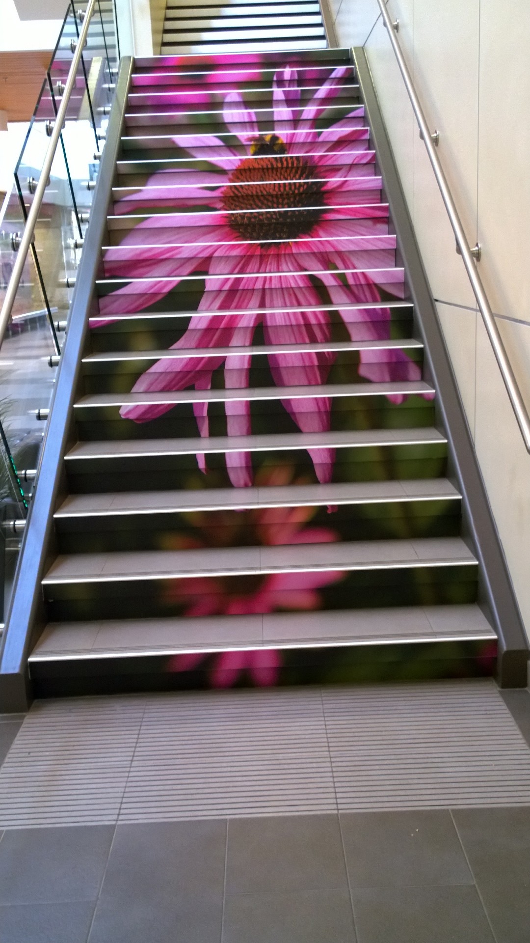
In the previous post we saw how arresting a colourful wall display in a stairwell can be. Allow your walls a chance to engage with the visitor , however caution must be taken when reading is concerned and one is climbing ! Do you have any wall space that could be refreshed and turned into a stimulating quote?

 
Photo credit: Bill Reynolds

Photo credit: Bill Reynolds

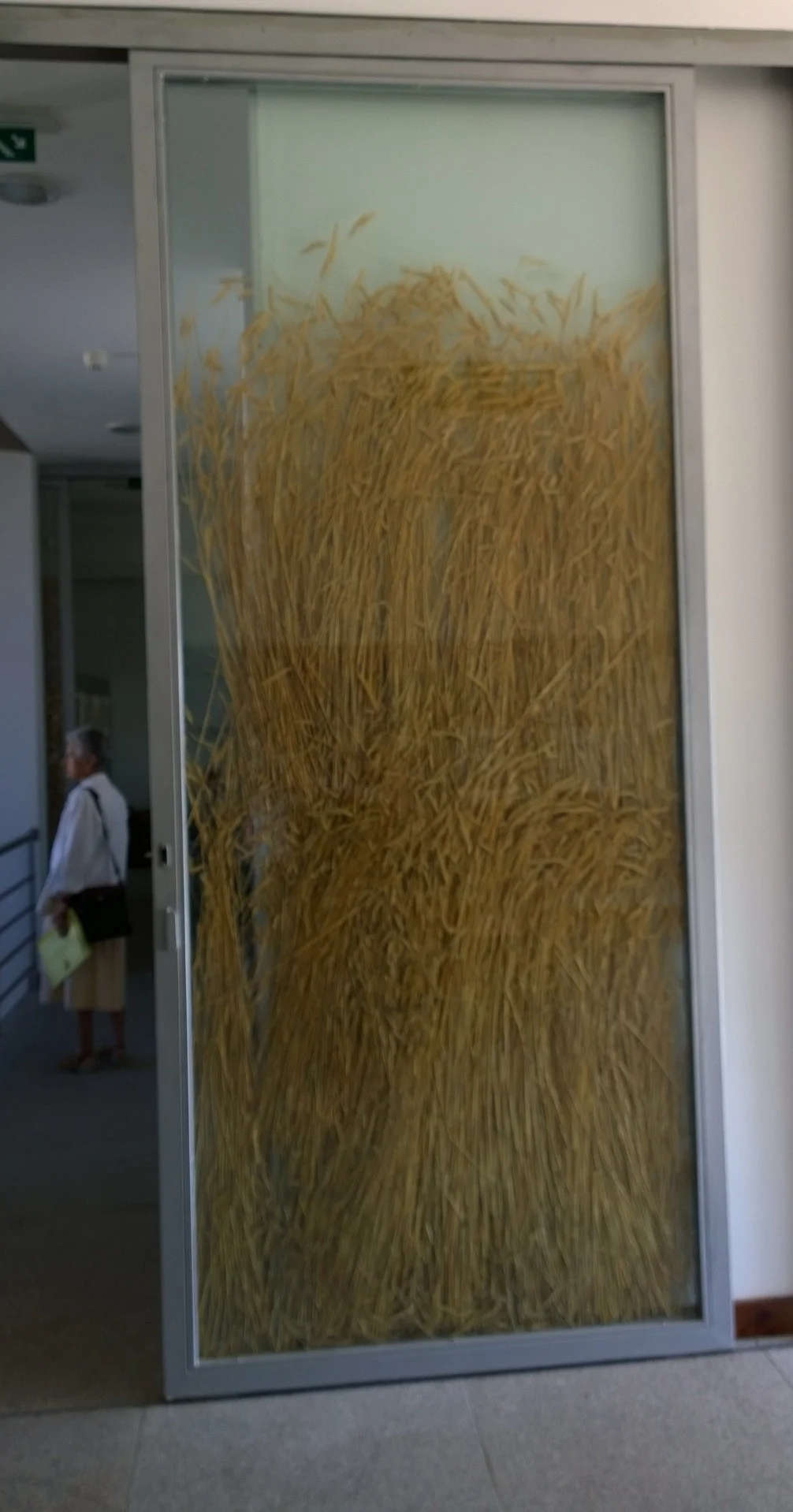
Sliding doors in a bread museum - why not fill them with wheat , as this interpretive centre did in Portugal, to reinforce in the visitors’ minds the connection to where bread comes from.

Photo credit: Bill Reynolds

Photo credit: Bill Reynolds

Elevator doors: let them provide a landscape for getting your message across. The corporate guys do it- why not not-for-profits?

Phto credit: Bill Reynolds

Phto credit: Bill Reynolds

Benches can do more than provide a rest amenity- they can be a conversation piece or an interpretive billboard for your visitor. Selfie anyone?

Send us your examples of double duty creative benches, walls and doors for sharing in the comments section.

Caught in the act of caring 2

You want to be recognized for going the extra mile on behalf of the visitor. Spend the extra time to design in features that add joy and elevate a visitor’s experience:

When dealing with “rules” sometimes simple is best - legible, neat and use of a natural tone for a natural heritage site, with an image that brings a smile to one’s face (instead of a frown). Please share any good examples with all of us in comments.

Photo credit: Bill Reynolds

Photo credit: Bill Reynolds

Photo credit: Bill Reynolds

Photo credit: Bill Reynolds

Sidewalks have potential to play a role in engaging the visitor and introducing them to your site’ s purpose. In the above sidewalk of a regional heritage museum, they chose to embed expendable artifacts into the concrete entryway allowing for inter-generational conversations and prompting a form of “what was this used for” type of guessing game.

Photo credits : Bill Reynolds

1) Blank wall space in a museum stairwell (on a landing) allows for creative display extension spaces. 2) Table surfaces can allow for creative applications, in this case, for local artists’ exposure while you enjoy a cuppa. 3) Stair risers are often underutilized real estate. Powerful images can raise awareness about what you want visitors to notice or simply act as an uplifting moment in one’s life.