Dancing: Better Than A Time Machine

A very happy 2024 to everyone and thanks for staying connected to EID. Jeanette Watts never stops dancing and has kindly provided us with the first post of 2024 focusing on utilizing dance in the interpretive space. Jeanette teaches dance and conducts balls covering the Renaissance to the 1960s. She has worked as an adjunct professor at Sinclair College in Ohio, as a guest lecturer at Wright State University, and leads workshops at museums and historic recognition sites throughout the United States. We hope you enjoy her perspective and now, put on your dancing shoes and take it away Jeanette.

******************************************************************************************************************

(Catch the first 30 seconds of the dancers entering the historic Kelton House in Columbus, Ohio. Video Courtesty of Jeanette Watts.)

Why do people come to museums, parks, gardens, and historical sites? I think they come to be connected, not to be educated. They are looking for clarity, inspiration or some other instinctive self-care, curiosity, and even mental health maintenance. We, as interpreters, are muses, sages, and care-givers. It is a lot of responsibility, but a task we relish, because providing inspiration and expressing joy, beauty, and understanding of a place is part of our job.

There are many tools in our tool chest to provoke greater understandings and deeper feelings of a site to visitors. But with all the different ways we can use the written and spoken word to connect to the lives of visitors, rarely do we offer the kinesthetic mode to engage with the site to create a more immersive and interactive experience. In short, we do not provoke them into dancing.

The author teaching fourth grade classes at Historic Latta, Huntersville, North Carolina. Photo Courtesy of Jeanette Watts.

First of all, let’s define the term “dance.” The vast majority of the people I talk to say “Oh, I can’t dance.” This is nothing short of tragic. Dancing is not complicated. It is simply moving rhythmically, usually to music. When you hold a baby, humming and swaying back and forth, you are, in effect, dancing. Small children jumping up and down while watching television or listening to Spotify are dancing. Wriggling in time to the music playing over the sound system while you are waiting in line at the grocery store is dancing.

The author at her local library. Photo Courtesy of Jeanette Watts.

Introducing dance at our sites is a powerful way to channel the visitors’ innate human responses. Visitors arrive already dancing inside their bodies with anticipation. Unleashing this energy of excitement by turning an unchanneled visceral response into movements intimately connected to this particular place bonds the visitors of the present to the experiences and people of the past.

Dance at Plantation, Trinidad, 1836 – Clourtesy of Slavery Images, slaveryimages.org

At a time before sports, dancing was America’s original favorite pastime and played a hugely important role in our history. While our founding fathers and mothers plowed and churned butter, they were thinking about what they would wear to the next dance and spent evenings practicing their dance moves. When enslaved peoples on American plantations were forbidden from making drums, they beat out the percussion on their own bodies and continued to dance.

Dance at the Plantation – Clourtesy of Slavery Images, slaveryimages.org

Every immigrant to reach the North American shores brought their dance forms with them. Every Native American already living on the continent practiced a dance form. In fact, the first Virginia colonists documented the similarities between the European hornpipes and Morris dances and the dances of the Indigenous Peoples. Connecting with each other while connecting with the people who forged who we are as a country creates an emotional bond with our past that can transcend the understanding we get from seeing and handling artifacts. (Check out the first 90 seconds of this lively event in Williamsburg, Virginia.)

Dancing means experiencing the past together. Engaging in this visceral, immersive experience allows visitors to truly feel the inner passions of the people who fought in the battle, lived in the home, or worked in the building. When we blend our bodies and lives together with the heritage site, we become part of it. Offering dances from the 16th & 17th century at a colonial site, 19th Century dances at an American Civil War site, popular dances from the year a state entered the Union or when a country gained its freedom connect the visitor and forebearer – perhaps a way to form a more perfect union.

An evening soiree after a day of classes turned the dancers into the honored guests of Kelton Housein Columbus, Ohio. Photo courtesy of Kelton House: Photographer James Novotny

Not all sites require dancing, and all sites where dancing is appropriate will have a different dance that is appropriate. Out west, Fort Laramie threw fort hops in the 1890s; in neighboring Little Big Horn it would be far more appropriate to have visitors dancing Lakota and Cheyenne dances - provided local Lakota and Cheyenne tribes deem it appropriate to share their dances with visitors.

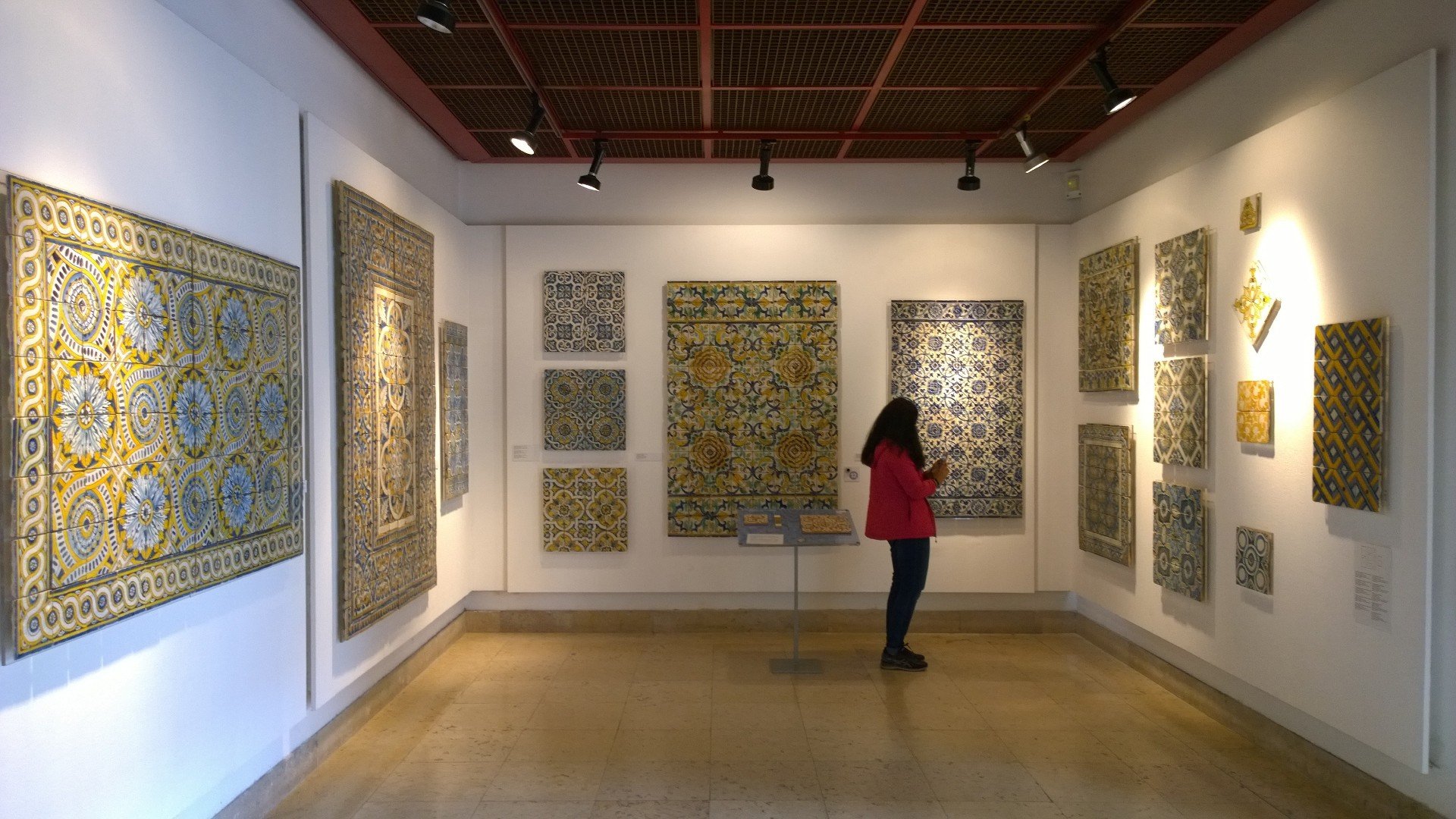
What about museums? Art museums are filled with galleries from our past, present, and future. In a portrait gallery, we look into the faces of people with funny clothes and hairdos. What did a person think and feel? Participating in the dances of their time gives us a clue. No doubt they too liked to dress up and bust a move just as much as any teenager today exchanging dance moves on TikTok. Galleries filled with modern art can just as easily be illuminated with modern music that echoes the emotions given form on the walls, and dances that flow with the music complete the understanding. After all, dance is music given form.

The author (in the bright blue dress) calling at the Cincinnati Art Museum. Photo Courtesyof Jeanette Watts.

When I visited Kilauea on the Big Island in Hawai’i, the most amazing part of the trip was going at night to the observation deck. After about an hour of watching the molten lava, a Native Hawai’ian joined us and began singing. I don’t know if it was a prayer to Pele or to another of the Hawai’ian pantheons, but that evening the spiritual enrichment of that moment transcended any language barrier. I had learned hulas in the past that were prayers to Pele and Hi’iaka, but until that moment under a starry sky, looking at the volcano in front of me, I never understood the close connection between dancing the hula and that prayer. Now, wherever I go, I take the volcano with me in my heart and in my body – we are connected.

Kilauea Volcano, Hawai’i Courtesy of USGS.

People need and seek out emotional connections. I strongly believe dancing helps create emotional connections with other people and with places. Strangers and family members create connections through the joy and beauty in movement and dance that connects to the site. When visitors feel connected to a site they become invested in it. When a site enters your heart, it changes you for the better…Forever.

Dancers in Nahant, Massachusetts find out what it’s like to enter the past. Photo Couresty of Jeanette Watts.

And that, in essence, is what every interpreter hopes to do – to change people’s lives for the better. Our heritage sites could excel at enriching a visitor’s experience through dancing. Interpretive heritage sites have the space, they have the means, and all that is left is to create the right dances for the site. When visitors dance there is connection with land, place, history, heritage, and with others. Most important, there’s a deeper connection with self. Is your site ready to point visitors to the dance floor? I, for one, can’t wait for the music to begin.

(Take a closer look at the amazing dress that Jeanette is wearing with a “behind the scenes” video of how it is constructed.)

If you would like to find out more about what Jeanette is doing with dance please visit her website and her YouTube Channel History is My Playground. You can also contact Jeanette at Jeanette@Wattses.com. As always, please send us any comments you might want to share about this blog post or any others…and thanks Jeanette for this inspiring post on dance.

Considering the Visitors' Needs

Novelties always bring me joy and sometimes include a twist of the head to confirm what I thought I saw I actually did see. This is how I felt when I encountered a self-serve café in the middle of a series of exhibit galleries - and I don’t mean off to the side in an adjunct space. One exited a gallery space ready to enter another gallery space ( what one had already done several times before) when one suddenly was faced with an area of tables and chairs along with a barista -café like long counter table. This was set up so one could fix oneself hot beverages before choosing a seat. Around the space, this city museum of Salzburg had a smattering of wall displays about the Taste of Salzburg to reinforce the universal human hunger connection with the sense of place.

Salzburg City Museum self-serve cafe Courtesy Bill Reynolds

Even better one could have it set up as a place to reflect on what had come before in the exhibits that the visitors had just travelled through. Question cards on the tables could stimulate conversation as in “What did you think about…” or could pose as stimulants for what one may have missed as in “Did you see the… (it was hiding in the corner hanging from the ceiling)”.

 If I recollect correctly, there was an option to go outside into a small courtyard. Using indoor/outdoor space juxtaposition can be effective to break up the instructional atmosphere and literally provide a breath of fresh air.  Can you see a way of doing that at your site?

Why do we often only have a cafeteria of a large scale sequestered away down a hallway or in a back corner? Why not offer in addition, a smaller space interspersed with the learning or experiential environment as this example demonstrates? Provide simply a place to gather over a beverage and maybe enjoy a self-dispensing snack from a vending machine, but make sure it is an attractive place and not in a corridor. You can use the existing traffic flow but you need to create a SPACE to linger as in stools at a counter. Check out new health clinics and recently built academic campus buildings and you should see this in action. I certainly have. Investigating places involved in the field of well being like we are, in the interpretive profession, are worth observing to see how they handle the visitor experience.

Lo and behold I experienced this rest stop concept in the midst of wandering through galleries again- this time at the Museum of Glass in Passau, Germany. It felt like a mini-exhibit all on its own in keeping with the era of time being represented. What a gorgeous space. It was devoid of any interpretation - pity. It did not include any glass replicas. Opportunities lost.

Period rest area, Passau Museum of Glass Courtesy : Bill Reynolds

Now a word from our self-serving sponsor -ourselves, as a matter of fact.  When we at EID review the visitor experience, we consider not only the mindset of the visitors but also their “bodyset” so that they are in an enjoyable state to fully absorb where they are at. Intellectual, physical, and social comfort is what we strive to capture. We want the visitor to maintain their entrance energy and enhance their dance when they visit heritage spaces.

This is why we emphasize the point that interpretive designers need to be involved upfront when interpretive spaces are being set up. It is not as easy when you have a space already, however we can coach you to reassess the existing situation and come up with ways to reconfigure for maximum impact. Contact us.

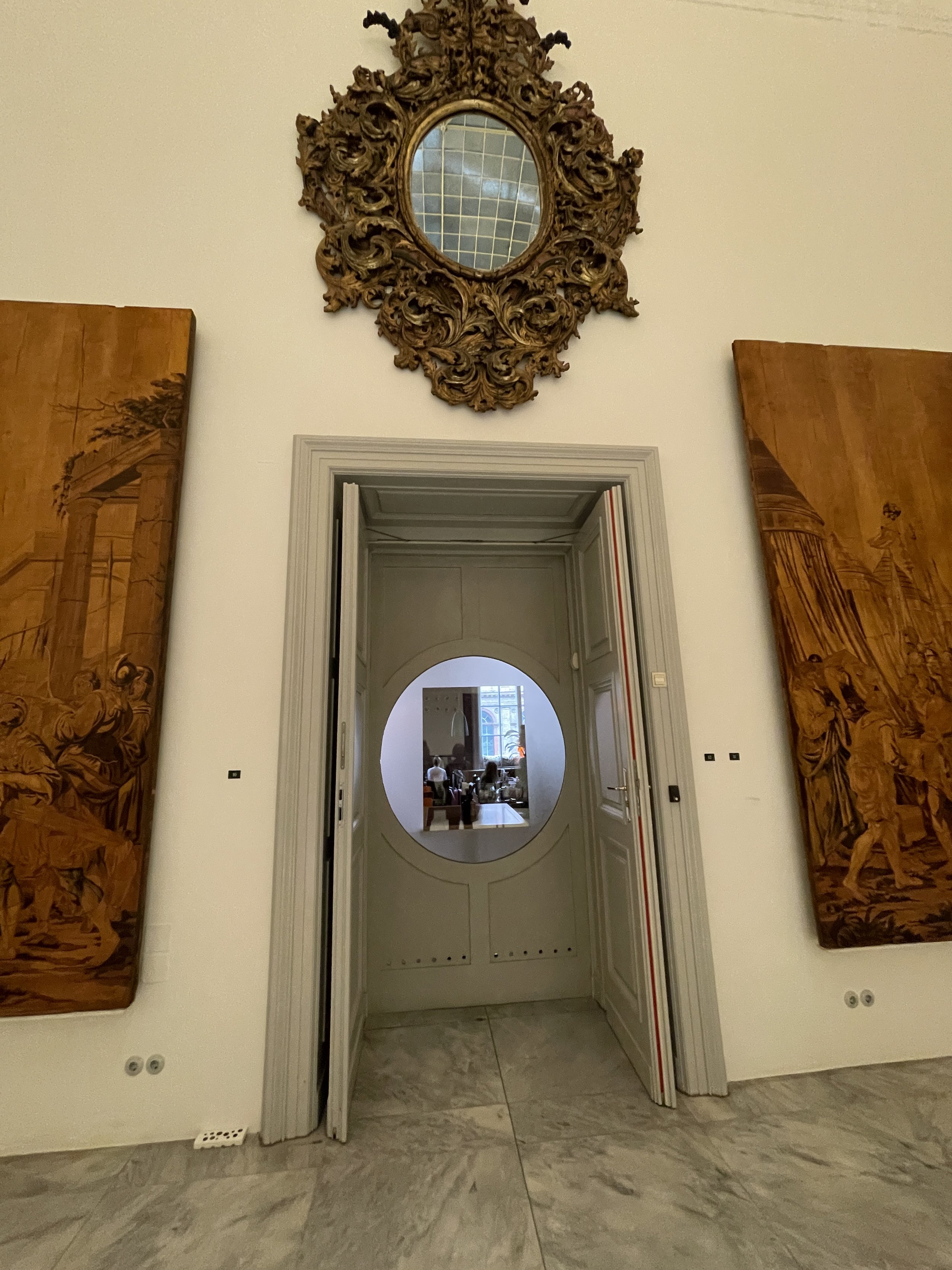
Cafe sneak peek Courtesy: Bill Reynolds

Although primarily acting as a marketing tool for a hidden away café, a “window’” technique can play multiple roles, firstly for example to provide an outlet for visitors to satisfy their physiological need of hunger and thirst. Have a viewing window right in the middle of the exhibit gallery wall (or as in the example shown, use a door in the middle of the wall) affording the visitor a sneak peek into the restaurant. Even better tantalize the visitors with a close-up of an array of delectable wares to stimulate the salivary glands.

Cafe pastry culture Courtesy: Bill Reynolds

This porthole preview concept can be applied In interpretive ways to stimulate visitor curiosity with a focused exhibit lookahead. Or in the case of a nature centre, portholes at different levels could provide views outside enticing exploration of specific concepts like interrelationships being spotlighted. Or in the case of an historic site visitor centre a glimpse of the start of a self-guiding trailhead could be the directed point of view. Or a multilayer building could make use of a periscope or subscope.  Literally, as interpreters, we offer “windows on the world,“ and we need to grab many more opportunities to “frame” the experiential invitations we are setting up for our visitors.

Children’s gallery floor level entrance Courtesy: Bill Reynolds

One more example of using portholes to discovery was a floor-level passageway in a gallery in order to access a children’s exhibit corner. Brilliant concept.

Food and beverage breaks are one avenue to counteract “museum fatigue.” We all know we could do better. Various after thought attempts at providing benches (often hard and uncomfortable with no back) or the odd chair are not proper solutions. A previous blog post, Antidotes for Visitor Fatigue Syndrome Part 1 and 2 Part 1: Antidotes for Visitor Fatigue Syndrome — EID Coaching showed some solutions.

Staying on the rest concept, I was struck this trip by the lobby in Vienna’s Museum of Applied Art & Design, upon seeing the large overstuffed sofas ringing the outer walls of the atrium.

MAK Museum of Applied Art and Design lobby Courtesy: Bill Reynolds

They were funky and well-utilized by patrons, appealing to all ages I had to wait awhile to capture the sofa image with only one individual-usually family or school group hangout). Let’s get over the fallback position to use “standard institutional issue” furniture. Unless we are trying to impart an interpretive message of austere incarceration or some such.

This museum was a treasure trove- one example that happens to blend well with sitting, exhibitry and applied design was their decision to display the evolution of chair design through silhouetting. My photos I hope illustrate what they achieved through white sheeting, lighting and the creation of three long parallel corridors. Subtleties of design were definitely enhanced by focusing on the shadow world !

Clever silhouetting, MAK Courtesy: Bill Reynolds

MAK front /back shadow catching technique Courtesy: Bill Reynolds

Transferring this idea into a natural heritage encounter, I was reminded of a wonderful sensory activity called Share a Shadow from the Earthwalks: an alternative nature experience book produced through the Institute for Earth Education.  Participants all have shadow catchers to capture immediate impressions that are delightful dimensions of a sunny day. Then they all create a gallery of sorts in the woods, prairie, desert -you name the habitat. It is a great way to reinforce how the earth is turning.

Do you see any applications for this technique at your site? Please let us know. If you desire a creative idea-bouncing zoom session on enhancing the visitor experience at your site, get in touch with us.

Relating to Visitors

Previously, I provided you with some Viennese interpretive highlights that I had experienced. This post will continue along that adventure and showcase some novel and effective interpretive design approaches I encountered primarily in Salzburg. For background listening find your favourite Mozart piece of music and a torte then continue reading. Hopefully one or more of these examples will stimulate you to try something different to refresh and improve on your visitor relatability.

I was impressed by a “Design your own Gallery” interactive exhibit that allowed you to choose which paintings of what size, in what kind of frame, in what order and position on what colour wall. Imagine the possibilities that could be concocted with this “interior designer” playtime. It did however seem like just play without too much purpose, which isn’t inherently a bad thing yet a little layered direction could turbo boost the impact.

If the objective was to provide a way to study a range of visitor preferences for how paintings could be displayed with the intent to evaluate and modify future exhibitions and they had built in a way to record these outputs then I would be really applauding the concept. It was just scratching the surface and this technique could lend itself to so many rich applications.

One’s objective could be to walk the visitor through a curator’s decision-making process behind what objects are chosen and why objects are displayed in the way they are, then open the gates for the visitor to make their own decisions. In combination with this framework, what could be really fun and impactful, would be to allow visitors opportunities for imagining completely different comparative pathways of expression.

Going beyond the traditional array so often based on style, artist, or time period for example would open up the creative display process that often seems lacking in “educational” art exhibits.

Providing the visitors the ability to choose different intents and purposes for the conceptual or emotional messages they might want to illustrate through their painting selection could be very enlightening. Or they could simply choose noses through the century or how about changing shoe designs.

The case -in-point utilized a digital screen approach however simpler analog versions could be employed to accomplish the same ends. For example, mini 3d models or boards with felt/magnetic pieces representing the type of object display decisions would allow the more tactile-oriented visitor type to participate.

On another analog tact altogether, the thought of mixing and matching exercises reminded me of the “imaginary animal” gamebook where each page representing one actual animal is split into three sections: head, body, and tail/feet. Their name is also split into three syllables on each 1/3 section. You flip the pages and create new creatures so an elephant head (el) plus the body of a crocodile (co) plus the tail end of a cockatoo (too) becomes a trunked scaly flat four legged white-tailed elcotoo. Do you know where I am going with this? What elements of your collection/artifacts/habitat types could you “cutup” in thirds and create new concoctions? I swear I was not experimenting with mushrooms - just cognitive remnants of my past exploration into lateral thinking.

Please don’t write this idea off because you are not an art gallery. This can work for natural or human history sites as well: decisions regarding diorama or exhibit case; models, drawings, photos, specimens, mannequins and their juxtaposition; etc.

The case-in-point used only paintings only on a wall. I recommend you take a peek at a previous blog post titled A Visitor’s Journey: One Innovative Approach (Feb , 2019). This Spanish museum in Bilbao presented a more rich nuance of creative expression through sculpture, ceramics, textiles, etc. and the display options included floors, ceilings, and tables in addition to walls.

Imagine if you gave the visitor these level options of display and choice of expression. This would have to be graduated in steps as it would be too complex if offered simultaneously. You could call it “Curator for a Day.”

The previous example opens a crack in the hidden door for non-museum people into the curators’ world of mystery. Making curators approachable can be employed as an element of improving relatability between visitors and what is often seen as formal institutions. How might you form the beginnings of a relationship between your visitors and your staff?

The City Museum of Salzburg created a film of interviews with their staff where they were asked what their favourite object from the collection was. “Name your Favourite …” is a classic ice-breaker conversation device in group settings and can be very effective at breaking communication barriers. In this case, these interviews were shown on gallery walls in a clockwise format with a central table of the mentioned favourite artifacts as the only link between the very disparate items (see image).

Salzburg City Museum Image: Courtesy Bill Reynolds

It worked ! It established a personal touch and a way for visitors to feel an initial relationship with staff. People talking to people and sharing something personal - with the bonus of exhibiting an element of passion for what they do and feel responsible for.

A final enticing little bit of exhibit mobility that allowed for display expansion was the use of tracks and sliding “pages” (see image). if you remember the old Kodak slide projector (pre-carousel) that used a cartridge -like mini-boxcar looking apparatus with a sliding arm that would place one slide at a time in front of the projection bulb and move progressively down the cartridge one-at-a time.

Well this set -up works something like that as the text “slides” are in the front slot with the six subject “slides” that pertain to the text are in slots behind the text. They can move back and forth based on the visitor’s choice. In this case, photos are being used to provide a representation of building and landscape architecture of a certain time period. Some may say this is just a glorified binder of plastic sheets a visitor could thumb through. I thought it was cool with changeability power and definitely more robust. Human curiosity is stimulated with the urge to find out what is hidden behind the slide curtain so to speak. It doesn’t take up wall space and I think it has lots of potential beyond the simple way it is being used. If you have any ideas on the adaptability of such a display table mechanism, jot us a line in the comments.

Desiring new visitors? Time-changer, anyone?

December is the month of gift-giving for many. I wanted to share some highlights from a recent trip as a series of gifts to you. I hope they will give you inspiration and trigger new thoughts about things you should try. I believe strongly in A.I. = Always Improving. As well, R&D should be a consistent part of your toolbox. When I say R&D I mean Rob & Duplicate. Learn from the best (EID) and steal from the rest.

This R&D post will be the start of several as a result of a recent trip to Austria that included the overenjoying of the coffee culture and stunning architecture of Vienna. With the weather being predominantly sunny museum visits were not as high on the agenda as originally planned. One stood out, however, and filled my heart with joy and satisfaction: witnessing an excited crowd forming incredibly long line-ups to buy simple admission tickets to Vienna museums. That evening there was a celebratory feeling in the air, especially in the area designated as the MQ - the Museums Quartier. Culture and heritage was on everybody’s mind -it was a happening!!

Lange Nacht ticket line-ups (Courtesy : Bill Reynolds)

Lange Nacht der Museen (Long Night of Museums) is a one-night, one-price admission blowout (15 euro), where over 100 venues collaborate and agree to be open from 6pm to1am one night of the year (slow October). The museums tend to put on special tours or events just for the occasion. So you might run into a concert at the historical instrument collection, be allowed to hold a gold bar at the National Bank’s Museum of Money, watch restoration work at the Furniture Museum, take a crash course in Esperanto at the National library, or join an Indonesian line dance at the Weltmuseum.

The city even provides all the public transit for free. What a grand idea - they have been doing this for several decades. This year they had 183,000 tickets sold. The numbers were stunning at least for the downtown venues we visited.

The two museums we choose to enter were jammed pack with visitors for the full 90 minutes we had dedicated for each of them. I have included a picture of one museum lobby to give you a sense of this. To say I was blown away- would be an understatement. There was no blockbuster event - no celebrity visit - just basic museum entry and the crowds responded.

Lange Nacht museum visitors (Courtesy: Bill Reynolds)

My few and short conversations with museum staff manning the information tables indicated they were thrilled with the interest level - one person actually said to me that the Lange Nacht concept was the best thing that could have happened to stimulate exposure.

One of the museums we visited had arranged for hot food vendors in the indoor hallways outside the galleries creating a festival atmosphere. Many of the venues had chosen to offer free tours or provide interactive stations manned by interpreter/researchers spread around the exhibition areas. I even heard about a sponsor providing chocolate snacks for people lined up in an exceptionally long queue.

Something that impressed me was the apparent age of the crowd from my cursory survey (check out my photos) documenting this : dominantly people in their late 20’s and thirties, either alone, in couples, or in groups - not the normal museum crowd. There was definitely a feeling of date night.

Courtesy: Bill Reynolds

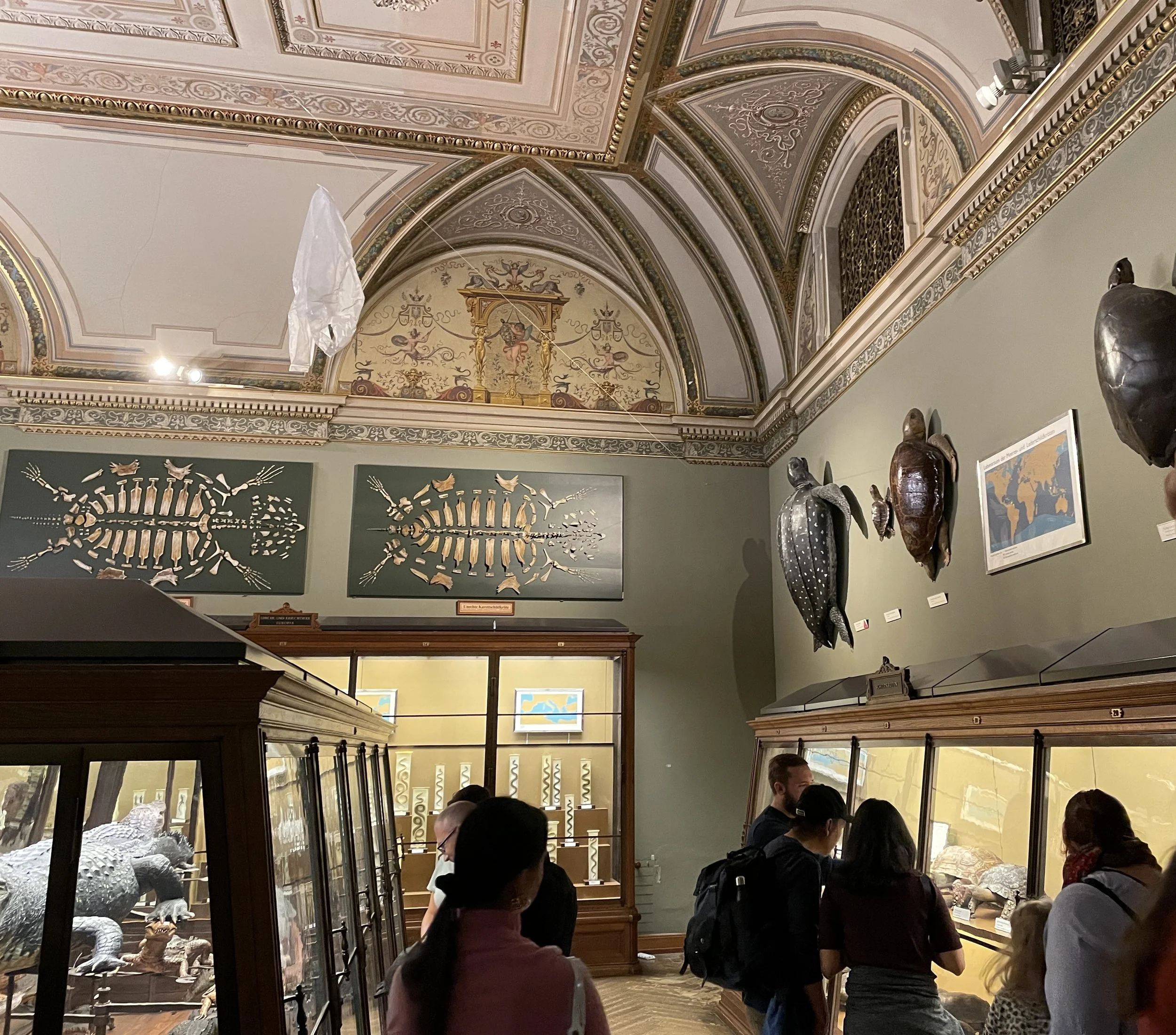
Even though the national Natural History Museum had primarily an archaic display style of research collection focusing on taxonomy, visitors were lingering, gesturing, in conversation with each other and seemed genuinely engaged. In the previous photo, you can observe that the museum had supplemented their glass case specimen displays with some giant magnified replicas on top of the cases along with embedded videos in the cabinet ends.

In other cases, they had rearranged specimens to create a simulated mini -diorama. Yet it seemed to me that the sheer diversity and oddity of life forms was what created the awe in the visitor. From a keen naturalist standpoint, this museum had an awesome collection from all over the world not just Austria, which allowed for a certain WOW factor.

Over popularity meant the gallery space often got so crowded it was interfering with the viewing quality, it was upsetting individual personal space and the internal building temperature was getting uncomfortable. I felt the carrying capacity was being exceeded.

Courtesy: Bill Reynolds (teaching display cases like this brought back memories of undergrad naturalist nerd biological science classes in the 70’s)

Many interpretive moments were being lost. It was obvious that interest was piqued at various points for different people yet there was a pressure to keep moving due to sheer numbers of people. Reinforcement of interest could not be capitalized on. Successful from a numbers through the door perspective but what does the visitor takeaway? How do you stay connected with them in the future?

With meteoric public exposure through Lange Nacht promotion to museum spaces, and with visitors realizing what was still to be experienced - would that stimulate people to come back? This is a very worthwhile question to have evaluated through a survey.

Note the 2-d turtle skeletons above the cabinets like works of art-also different forms of plastic are clothesline strung from the ceiling making a point about turtle ingestion issue (I think … perhaps an exhibit in progress)

Takeaways for me:

  • if you are in need of a rejuvenation of visitor numbers or change in your same-old visitor types try an admission time changer

  • sites should consider extending their hours on occasion definitely into the evening to draw a different crowd

  • sites should experiment more with one-occasion, non-normal time blocks like early morning for instance

  • a range of heritage sites in close proximity of each other could think about working together more often with same day joint admission opportunities, especially during slow times

  • facilities should incorporate a food fair of different types in their public spaces as inclusive promotion for their regional ethnic communities

  • big heritage sites need to work together with small sites to raise their profile in the community on specific days with joint shuttle availability

  • don’t forget to design a method to follow-up with the new visitor base you attracted (don’t let them slip through your fingers)

  • beware of overcrowding and have planned contingency visitor dispersion techniques

  • allow yourself time for occasional exhibit observation times to gauge visitor interest spots to guide your decision-making for future interaction stations

  • OK blogpost reader it is your turn to send in your spark of inspiration to us based on reading of this post.

Getting to Kinship

We believe that setting the stage for visitors and welcoming them to our sites is a critical part of the interpretive planning and design process. If we are striving to connect people to place and enhance their relationship with the earth -their ultimate home – then we need to embrace the concept of kinship and one big family of humans and other-than-humans.

credit: Bill Reynolds

Obviously, the concepts of diversity and inclusivity figure into this although the concept expands outward from just being human-centred. There was an article about human cultural welcoming and acceptance that had earth kinship philosophy woven all through it so it will act as a good kickstarter for us.

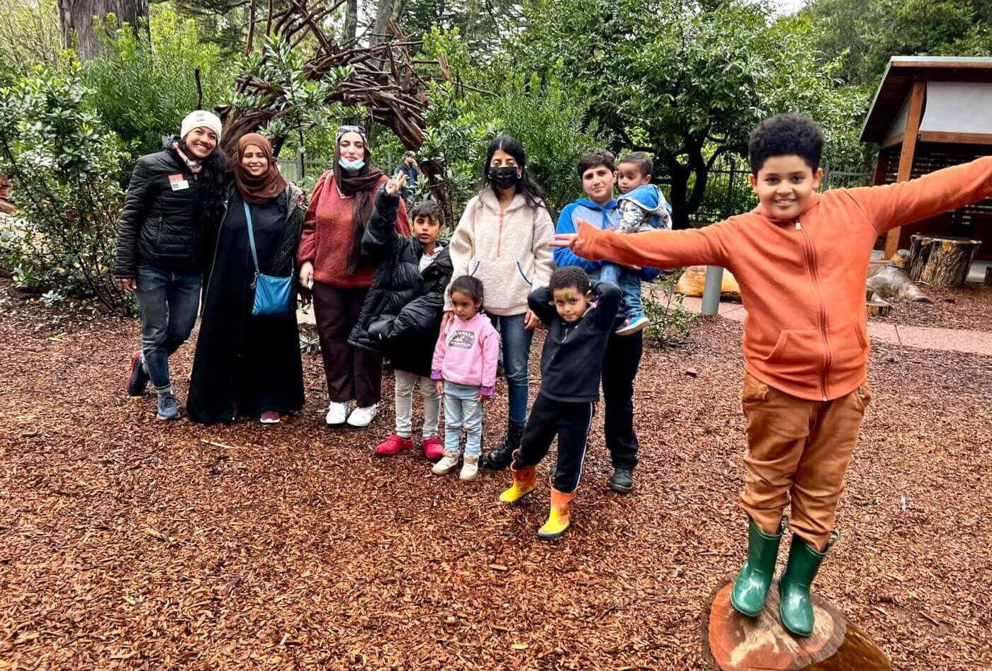
The childrenandnature blogpost titled Finding Nature News, presented a delightful story in their April 2023 edition about how a park got ready to host 50 women in hijabs that were celebrating the end of the annual fasting and prayer period of Muslim Ramadan. I rediscovered the piece just recently and it resonated on so many levels I knew it had to be shared.

You all know our website name captures the interpretive outcomes of Engage Inspire and Delight (EID) as well as being our company name Experiential Interpretive Design (EID). Well, that Muslim festival time period at the end of Ramadan is called Eid ul-Fitr. An odd coincidence…

Yakuta Poonawalla with the Golden Gate National Parks Conservancy explained how she facilitated the Eid in the Parks program in San Francisco’s Golden Gate National Recreation Area, by inviting a local Muslim community to a volunteer habitat restoration event. She has continued this invitation for six years now.

Yakuta really got the essence of a park when she stated that a park does not judge, restrict, or exclude like humans do.  She eloquently went on to state that the more-than-human world, our kin, is ready for us to reconnect respectfully. This was an outcome she wanted to accomplish with this series of group outings. When I read this my jaw dropped and I uttered, “wow.” Imagine if all our parks would aim for this.

She then went on to explain some lessons she learned along the way in order to be successful in welcoming new audiences.

credit: Finding Nature News

Yakuta mentioned about including time for the “breaking of bread” together and the importance of sharing food and drink in order to relax. Social barriers developed cracks and the ability to connect on different levels was enhanced. I learned very quickly when we did business coaching in tourism settings what the magic ingredient was if we wanted to have open conversations and successful collaborative outcomes. When eating together was designed into the process, then listening took place and joint agreements invariably happened more often.

“There is no better way to connect with the land than sitting on the floor.” Seems obvious but how often do we do this? Picnic tables were not used but blankets were spread on the ground to allow for a circular gathering- what was familiar to this culture.

The importance of a sense of welcoming was created through the simple setup of a welcome table — thoughtfully prepared with granola bars, maps of the park, kite art and craft supplies, a fresh flower vase, a bowlful of henna cones*, as well as a chalkboard informing passersbys about Eid and its importance.

*Henna cones are a cone-shaped packet of henna paste used to create temporary tattoos without the need for needling the skin.

credit: Finding Nature News

 Yakuta also pointed out something that struck me deeply that I will always keep in mind, moving forward, when creating conditions for relationship building. And I quote: “When a personal language or mother tongue surrounds us, there is a deep sense of comfort and belonging.” She provides a wonderful example of sensing the pervasive relaxation that descended on the hosted crowd when familiar music and lyrics were played.

If our visitors are not relaxed and have “a sense of comfort and belonging” when they come to the heritage places we are trying to assist them in connecting to - then we are engaging in an uphill battle.

However, the most impactful item that Yakuta mentioned related to how the word “kinship” had taken centre stage in her life during the COVID pandemic. She had learned life practices that helped her connect park visitors to the park by “becoming a better kin - a human who only feels pure love for all beings.”

credit Bill Reynolds

She talked about how the seeds of kinship had been planted early on in her life through an iconic, animated short film released in India in 1974, titled “ Hum Sab Ek Hain “ which translates to “We are One.”  Her memories centred around ideas of harmonious living, strength and power in unity, irrespective of diverse identities, cultural and religious backgrounds.

To read the entire article go to Park pilgrimages: Unearthing new ways of being in nature | C&NN (childrenandnature.org)

During COVID she discovered the Kinship book series “Kinship: Belonging in a World of Relationships.” She relates that this became a powerful healing balm and a compass for her.

It is worth expanding on this reference she made as I have been meaning for awhile to bring awareness of this literary series for our blog followers. This is a great resource.

credit: Center for Humans and Nature website

There are five Kinship volumes in the series—Planet, Place, Partners, Persons, Practice—using essays, interviews, and poetry to highlight the interdependence that exists between humans and nonhuman beings. Co-editors are Robin Wall Kimmerer, John Hausdoerffer, and Gavin Van Horn.

This book series is a guide and companion into the ways “we can deepen our care and respect for the family of plants, rivers, mountains, animals, and others who live with us in this exuberant, life-generating, planetary tangle of relations.”

·         Planet discusses the profound longing we have for kinship;

·         Place deals with bioregional kinship among communities and systems;

·         Partners talks about how cultural narratives shape relationships;

·         Persons detail how to respectfully engage a world of humans and other-than-humans;

·         Practice explores the everyday and lifelong ways we become kin.

One reviewer said:

“At a time when the human is no longer tenable as a category unto itself, we will need the prophetic voices of these poets, philosophers, mothers, fathers, scientists, thinkers, public intellectuals, artists, and awestruck fugitives to kindle a politics of humility, to help us fall down to earth from our gilded perches, to help us stray from the threatening familiarity of our own image.”

Another reviewer summarizes the intent of the series and captures some powerful perspective-changing values that, as interpreters, we need to invite our visitors to consider:

“Rather than controlling our environments using methods rooted in human exceptionalism (i.e., we know best), we are urged to learn from our kin. Rather than 'using' land, water, and wildlife as 'natural resources,' we are urged to be in reciprocity and right relationship with our kin. Rather than labeling birds, rocks, and rivers as 'it,' we are urged to think of them as persons who have their own rights. Rather than being static, we are urged to be kinetic (Kin-etic?). Decolonization begins with unlearning, and this is a good place to begin."

The book series are produced through the Center for Humans and Nature and their website has a link to book club discussions. The web site can be linked to here  Kinship | Center for Humans and Nature

At EID we see interpretive planning and design work as a perfect vehicle to create the experiences that allow for kinship practice and harmonious living at our natural heritage park settings. How does one build earth relationships as they need to be recognized, attended to and savoured?  Being outside in touch with the elements of life while nurturing empathy & discovery, sharpening senses and stilling oneself are core approaches to be employed.

Kinship building is a core element necessary for the needed harmonious living that all human life must embrace going forward. Kinship is a feeling of being similar, being related. We breathe the same air and we drink the same water. We share the same space (earth) and we are warmed by the same sun.

That feeling along with joy, reverence and love for the incredible planet we share have been designed into playfully serious experiences known as Earthwalks by the Institute for Earth Education.

credit: Institute for Earth Education

These carefully choreographed walking journeys are described in the book titled, “Earthwalks an alternative nature experience,“ authored by Steve Van Matre and associates of the Institute for Earth Education. EID co-founder, Mike Mayer, is such an associate and was a major contributor to the Earthwalk concept.

As Steve Van Matre says, “in reality, we are one family, a carbon-based family of life with many threads and a multitude of members.” “Each living thing on the earth is a spark of sunlight caught in a vast web of life.” “We should not speak of bloodlines but energy and material lines in the web of life.” 

The most powerful of human bonds is the feeling of family. Many of us are connected by shared experiences. For the park visitor, earthwalks can engender that feeling toward every other living thing that we are intimately connected with.

Earth kinship needs to be nurtured and our park heritage sites are wonderful settings where we can plan and design kinship building experiences. Earth kinship needs to be practiced now -there is no time to waste.

Earthkeepers Leadership Workshop...analyzing the details

We don’t usually post two items in one week, but we wanted to provide this workshop information to you as soon as possible. Please contact Mike Mayer at mike.mayer@eidcoaching.com if you have any questions.

The Earthkeepers Leadership Workshop  (EKLW) is a thorough analysis of the entire Earthkeepers program – from the pre-visit introduction to the 2 ½ days of Knowledge and Experience activities at the Earthkeepers Training Center to the completion of the program at home and school. This session will provide valuable program insights and key leadership guidelines for running a successful Earthkeepers program.

Follow this link to the registration page to sign up for this workshop: https://form.jotform.com/232775172082053  

Workshop Leaders

Bruce Johnson (Earthkeepers co-author, Accredited Earth Education Trainer, International Program Coordinator for The Institute for Earth Education, Emeritus Professor – University of Arizona)

Mike Mayer (Accredited Earth Education Trainer and Earthkeeper Program Leader)

During the workshop each activity will be experienced in detail -- set-up, leadership, application to student’s lives, etc. For instance, with the activity that focuses on the interrelationships, called Connection Inspection, we will first head to the activity site and look at the physical set-up. Next everyone participates in the activity introduction followed by processing and examining important aspects to make this part successful. Then each person receives either an animal or plant role card, connection belt and gets connected to the appropriate energy/food source, water, soil, and other living things it depends on. In the end a giant web is formed. Once again, there will be breaks to process the details of the activity and answer questions. Finally, the activity concludes with a place-based Application Page so the students can demonstrate how the concept relates to the natural area where the activity takes place. There will also be time to plant the seeds for actions participants can take to help the Earth and its life.

Earthkeepers Program: four keys for helping young people live in harmony with the earth 

The Earthkeepers program was designed by The Institute for Earth Education to help 9 to 11-year-olds increase their understandings of 4 ecological concepts (energy flow, cycling of materials, biological interrelationships, and change over time) and to deepen their feelings for the Earth and its life through Observations, Solitude, Discovery, and Immersion experiences in the natural world. As the participants complete the various components of the program for Knowledge-Experience-Yourself-Sharing they receive keys that unlock boxes to reveal the secrets to becoming an Earthkeeper.

An important part of the program takes place at home and school following the time at the Earthkeepers Training Center. The “Apprentice Earthkeepers” find ways to reduce their impact on the Earth in their own lives and continue to increase their positive feelings toward the natural world.


The Cooper Center for Environmental Learning (aka Camp Cooper) is a partnership between the University of Arizona’s College of Education and the Tucson Unified School District. It is nestled in the foothills of the Tucson Mountains 20 minutes west of downtown Tucson and borders Tucson Mountain Park – a large area of the Sonoran Desert protected by Pima County.

Part 2: A Tale of Two Trails...

don’t we all deserve the best?

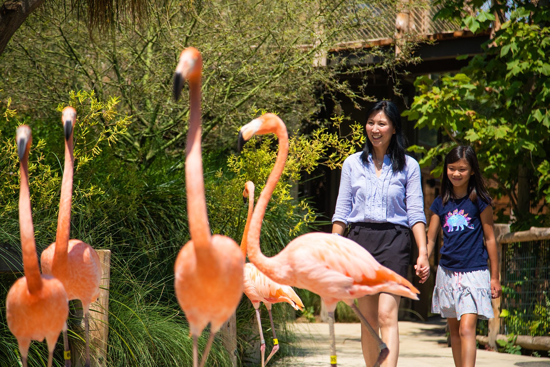
Image Courtesy of Palo Alto Junior Museum and Zoo

In Part 1 of “A Tale of Two Trails” I talked about some of the best practices observed on a self-guided trail (SGT) in Cloudcroft, New Mexico at the Sleepy Grass Campground. The SGT in this post is a bit different because it takes place at a zoo. You may not think of zoos in this way, but the reality is most zoos are a self-guided experience.

Image Courtesy of Palo Alto Junior Museum and Zoo

 Palo Alto Junior Museum & Zoo

Palo Alto, California, USA

My experience with the Junior Museum & Zoo (JMZ) took place when attending a webinar and examining its website. What impressed me about JMZ webinar session was their use of evaluation to assess the success of special events and regular experiences at the site by visitors.

A bit more background on the site…

·      Site Mission: “The Palo Alto JMZ is dedicated to providing quality science education, supporting wildlife conservation, and advocating for animal welfare. Our robust community outreach program serves approximately 184,000 children and their adults.”

·      It was founded in 1934 by a teacher and in November 2021 opened a new site location.

·      The new location incorporated accessibility in a variety of ways.

·      There are about 200 animals, mainly indigenous to California, and a wide variety of science experiences for youth.

·      Their visitation rate is approximately 14,000/year.

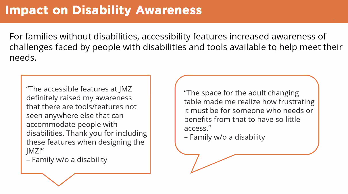
 I am going to let the slides from the webinar presentation, “Impacts of Accessibility Features in Zoo Experiences for Visitors With and Without Disabilities”, tell the story.

Image Courtesy of Palo Alto Junior Museum and Zoo

Image Courtesy of Palo Alto Junior Museum and Zoo

These pictures helped me get a sense of what might be available during the self-guided experience at JMZ: a place to rest and linger, meeting the needs of larger children with disabilities, many things to touch, nooks and crannies to discover, many visuals, and integration of technology.

Image Courtesy of Palo Alto Junior Museum and Zoo

My EID ears perked up when I saw Outcomes and Evaluation…

Image Courtesy of Palo Alto Junior Museum and Zoo

There was information on who participated in the evaluation(s)…

Image Courtesy of Palo Alto Junior Museum and Zoo

A series of charts showed how accessibility was viewed by the selected visitors…

Image Courtesy of Palo Alto Junior Museum and Zoo

Image Courtesy of Palo Alto Junior Museum and Zoo

Image Courtesy of Palo Alto Junior Museum and Zoo

Charts presented the usefulness of accessibility items, overall rating of the experience, and visitor impact…

Image Courtesy of Palo Alto Junior Museum and Zoo

Image Courtesy of Palo Alto Junior Museum and Zoo

Image Courtesy of Palo Alto Junior Museum and Zoo

Image Courtesy of Palo Alto Junior Museum and Zoo

There were a few feedback comments from families…

Image Courtesy of Palo Alto Junior Museum and Zoo

Image Courtesy of Palo Alto Junior Museum and Zoo

Image Courtesy of Palo Alto Junior Museum and Zoo

And a final slide with conclusions…

Image Courtesy of Palo Alto Junior Museum and Zoo

To capture and share this much information on the visitor experience was quite impressive and reminded me of the importance of evaluation during the process of interpretive planning for trails and exhibits.

Regarding how the site lined up with the 11 Best Practices points listed in “Part 1: Tale of Two Trails,” I can only make an educated guess from my experience at the webinar and examining the website. I did try to contact the JMZ staff for some comments and to answer some questions, but they did not respond to my efforts…so here goes:

Image Courtesy of Palo Alto Junior Museum and Zoo

I did get a sense there was something special about the place including a “whiff of mission; there were a variety of “doing” and sensory experiences available for the visitor; the Head & Heart were engaged nicely; there were places to linger and reflect; the place looked well maintained; and, of course, there was a strong evaluation component at the site.

Image Courtesy of Palo Alto Junior Museum and Zoo

 I have no idea if the maps were useful, how much information was on signs, if other places to visit were suggested, or if there were experiences to connect to everyday life or a larger context. Most zoos and museums have a gift shop so I assume JMZ has one for visitors to take home something in their Hands, but I am not sure how those items might connect to mission or reinforce memories of the visit. Same with Hunger – do not know what kind of food, if any, is offered.

Overall it is my impression that the Palo Alto Junior Museum & Zoo is a great self-guided experience, and their use of evaluation was quite impressive.

For more…our EID colleague Lars Wohlers has been involved in interpretive evaluation for years and recently developed a unique software tool for evaluations.

A recent post by Don Enright offers insights into evaluation in the interpretive setting that may be of interest.

Also Jon Veverka has a new publication available for planning and implementing interpretive trails that has a lot of useful information.

Well, time for me to move on down the interpretive trail, so please send us any comments on this or any of our other posts. Next up will be a guest blog post that is quite interesting – especially if you like to dance.

Image Courtesy of Palo Alto Junior Museum and Zoo

Part 1: A Tale of Two Trails…

don’t we all deserve the best?

Before Bill’s two posts on self-guided trails (SGT) become a distant memory, I want to share a couple of experiences I think exemplify best practices on a trail. One SGT is in Cloudcroft, New Mexico at the Sleepy Grass Campground, contains some typical trail designs, and is created to encourage use by visually impaired individuals. The other experience takes place at the Palo Alto Junior Museum & Zoo (JMZ) in California. You may think this latter experience an odd choice for a SGT, but recently I realized that all zoos are self-guided for most visitors.

 After experiencing the New Mexico trail in person, and attending a webinar describing what happens at the Palo Alto JMZ, I wondered why all SGTs don’t employ the best practices these two experiences offer? Do we interpreters think adults or “regular” folks don’t need or want the same kind of experiences on a trail offered to people with “disabilities” or for younger visitors? And perhaps the bigger question is…How can interpretive planners and frontline interpreters make everyone feel invited to experience what a trail can offer the visitor, especially if it offers interactions that deepen a sense of place and provide a whiff of mission?

 Before getting into the trail specifics, these are the eleven (11) best practices that I took away from Bill’s posts and used when reviewing both SGT experiences. Does the SGT…

·      convey something special about the place – a whiff of mission?

·      offer some “doing” for a variety of visitor types?

·      include sensory experiences?

·      engage the Head, Heart, Hands, Hunger?

·      have useful maps?

·      give “Goldilocks” information on signage – not too much and not too little?

·      provide places to linger?

·      suggest follow-up places to visit or other resources?

·      connect to everyday life or a larger context?

·      ask you to evaluate the effectiveness of the experience?

·      look and feel well maintained?

Sleepy Grass Campground SGT Cloudcroft, New Mexico, USA

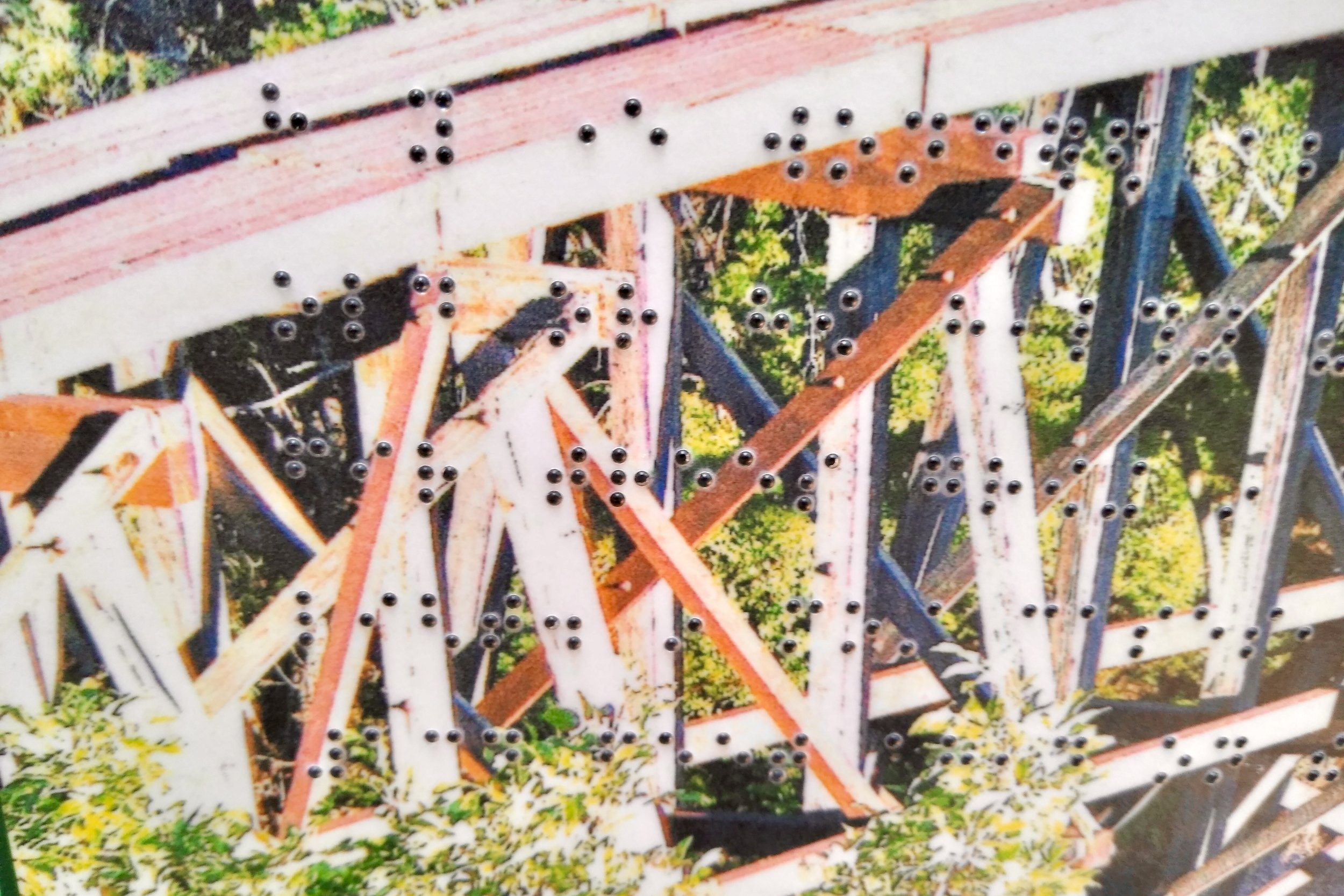
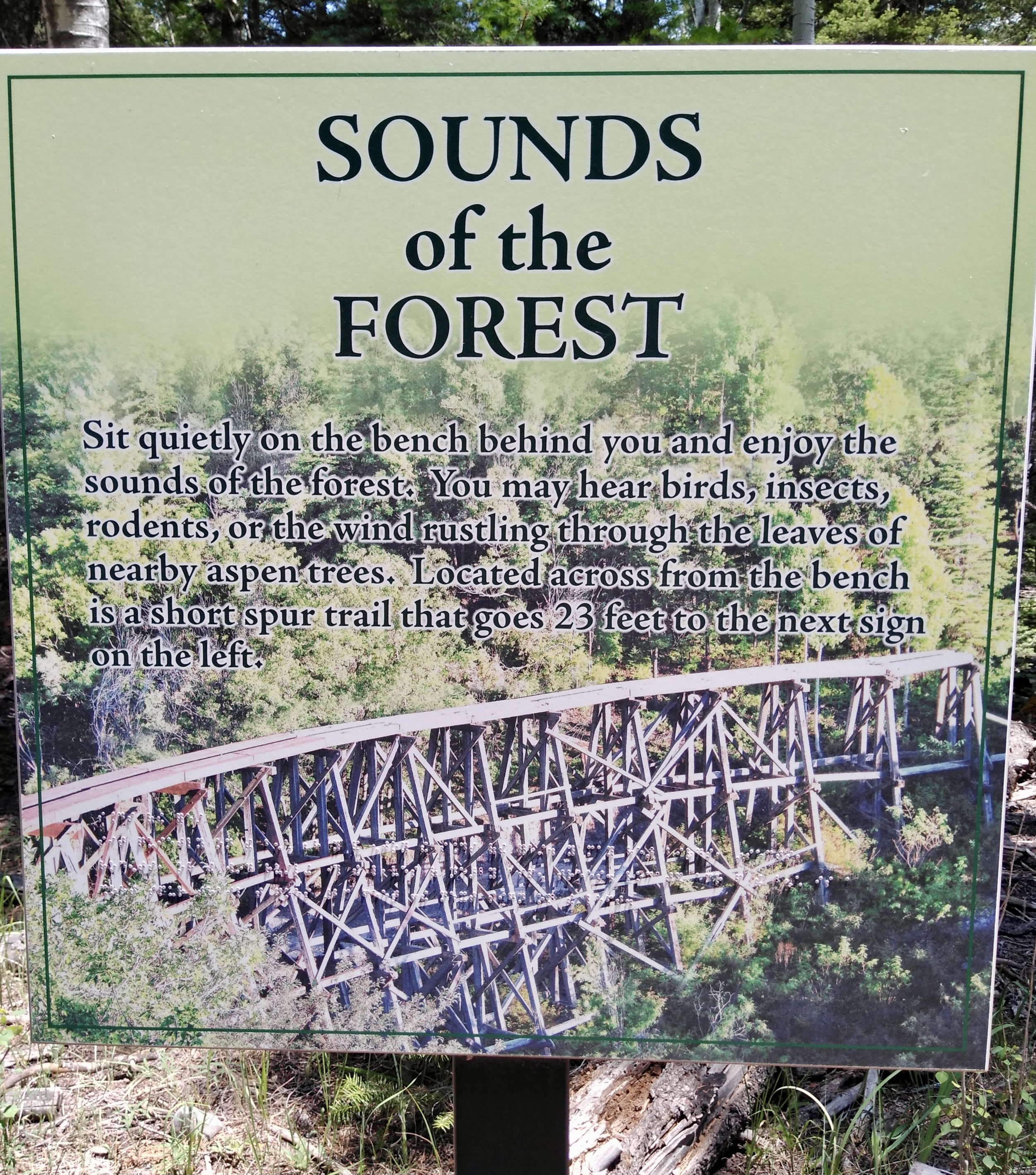
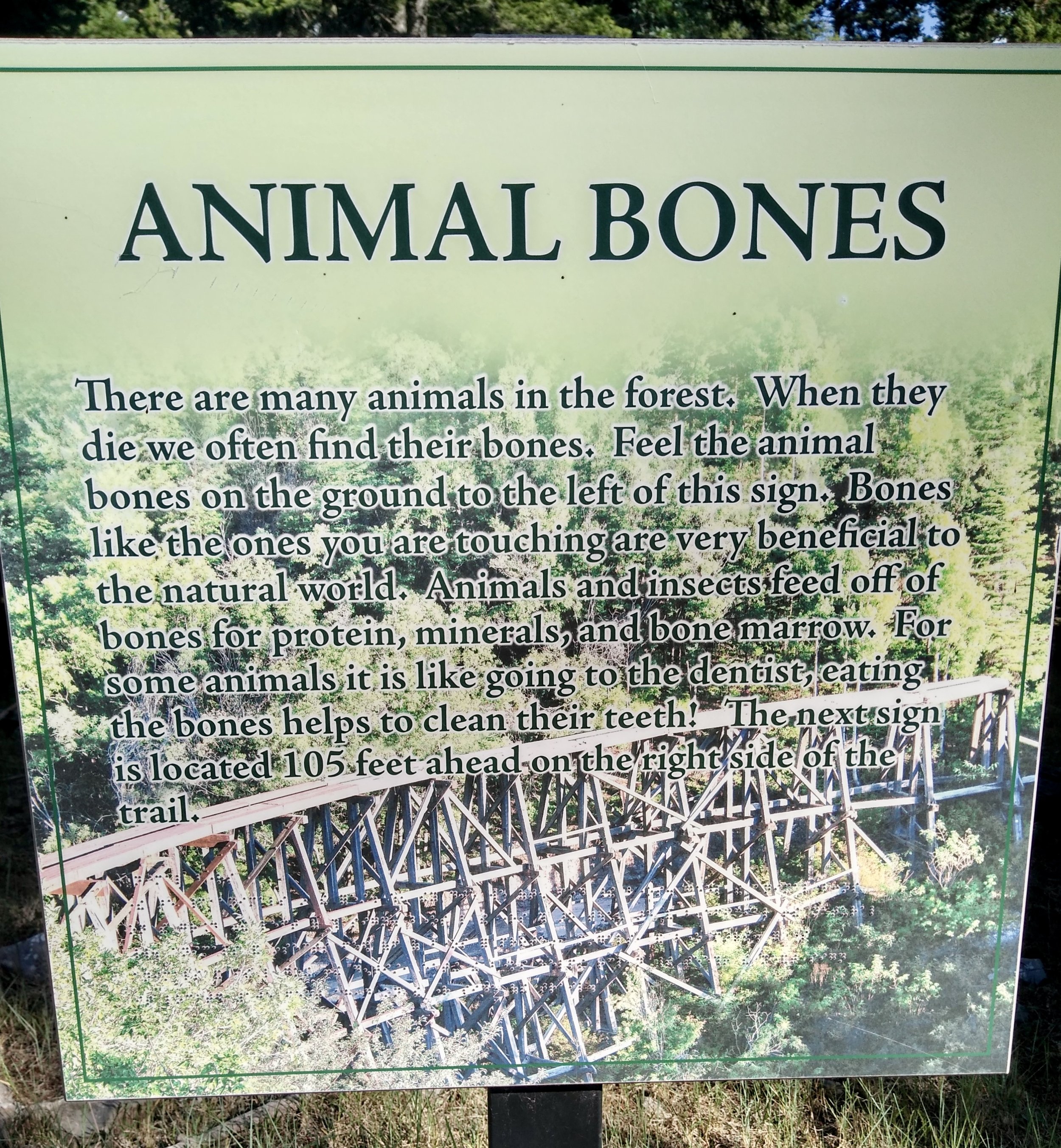
The focus for funding this trail is to provide an experience for the visually impaired. All the signs have raised printed lettering, braille, and raised symbols. Also embedded in the background of each sign is a picture of an iconic railroad trestle that is a popular nearby attraction. The iconic trestle connects to the community of Cloudcroft and the region because the trestle is part of an old rail system that removed logs from the area. The picture below is a detail of the trestle and the braille.

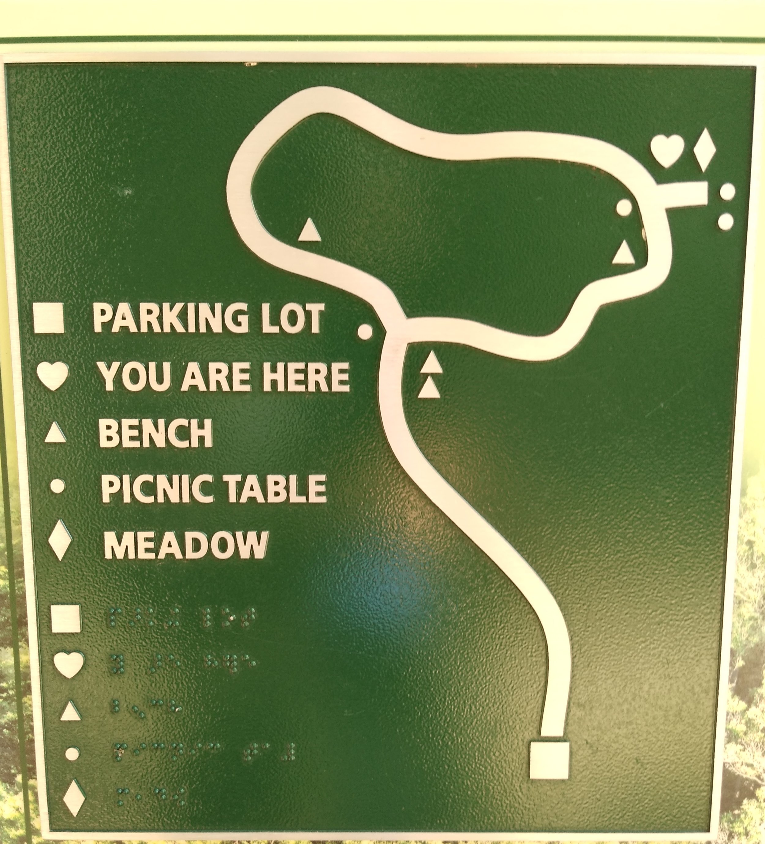
The maps are located at regular intervals along the trail and have raised icons. The map below shows the simplicity of the design. At each map location the raised “heart” symbol indicates where you are now. (Map picture)

The trail itself is well designed, not too long (1/2 mile) and wide enough for 2 or 3 people. The wooden railings on each side of the trail are a real plus for the visually impaired, are tastefully done, and add a “you are in a forest” feeling for everyone. 

I especially like the sensory experience for the feet – something often missing in SGTs. For the visually impaired it indicates a nearby sign. For others it is a good visual reminder that something is going on right here. The trail cover is finely ground rough wood and the sign indicators underfoot are medium-sized stone gravel slightly embedded over a layer of fine gravel.

I like the amount of information on the signs -- at least for my taste (and for Goldilocks). All the signs seem well maintained (though a few had a “dot” or two of braille missing). Each sign encouraged the visitor to participate in some “doing” and they indicate distances to the next information sign.

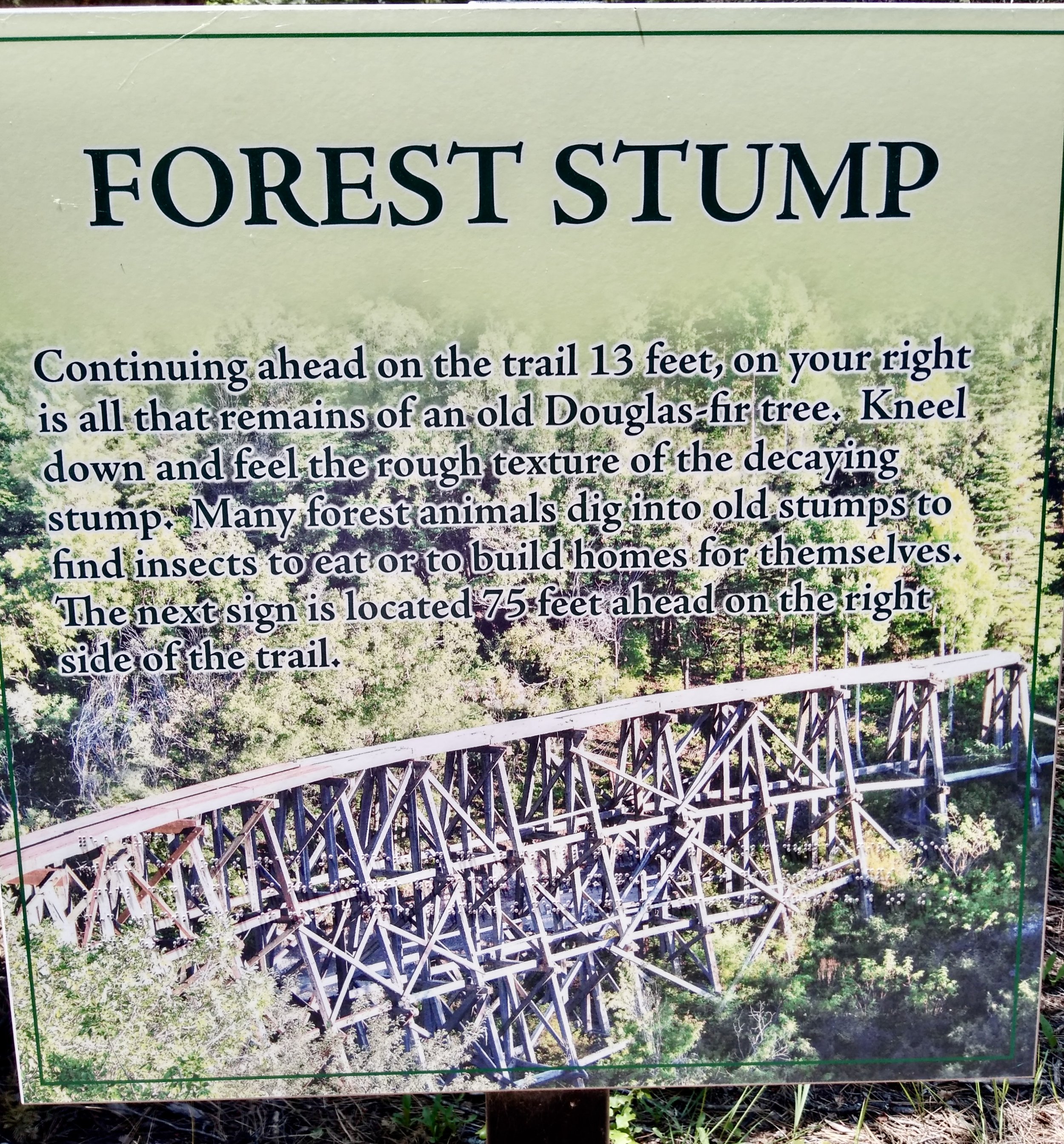
 Here is an example of one sign and the activity space very close to it…

 There is also a small off-shoot trail that encourages visitors to feel the bark on different trees and one tree has no bark…

 A bit further along the trail a sign and a bench encourage the visitor to linger for a while and listen to the sounds of the forest. In another location a sign and bench encourage more lingering while listening to and feeling the differences in sounds and temperature between the forest and a small meadow.

 The sign and activity at the Animal Bones stop is very engaging. A variety of bones are on the railing near the sign and no samples are too alarming – no skulls, animal skins, or a stuffed animal.

It appears someone makes sure the bones are in place on a regular basis since people or wild animals could easily knock them off the railing.

 I think this trail is a great example of what a self-guided trail could be and it contains most of the 11 best practices mentioned above. Here are a few things not included:

·      No “Hands” opportunities (something to take away in your hand as a memory) or “Hunger” experiences (no food), but good “Head” and “Heart” experiences

·      The trail does not provide other resources or suggest other places to visit

·      There is no suggestion of how to apply the sensory experiences to other places or how to connect this experience to other parts of the person’s life

·      I could not find any evaluation opportunities for the visitor or data on who uses the trail.

The only other concerns — a couple of signes with missing braille dots and some of the words are difficult to read against the trestle background. Otherwise, it’s a great SGT experience that pulls the visitor along without being boring.

Next time we will go to Trail #2 at the Palo Alto Junior Zoo, their strong use of evaluation and how they get visitors involved in the self-guided experience.

If you are interested in reviewing Bill’s two posts on SGTs here is the link to Part A and to Part B.

Is Your Visitorship Expanding ? Achieving Cut-Through

Being effective at what we do as interpretive professionals requires a foundation in marketing and public relations. We can create the best product/experience for our visitors but how do we ensure we continually grow & expand our visitorship and build the awareness of new and enhanced offerings. We cannot be satisfied with the same visitors returning again and again or to sit on our laurels and hope the visitors come flocking by.

No, we need to actively reach out in more targeted ways. If you have a “marketing person” on your staff, then you need to be working with them and talking to them about what you have found out about your present key publics. Tailoring a communication program to be effective for more “of those similar visitor types” is a first step to growing attendance and gaining support quickly (just one step but a critical one for success).

Photo credit : Bill Reynolds

When I was asked to grow a continuing education program at a nature centre, I decided to attend a three-day symposium at the New York Botanical Gardens titled “How to Run a Successful and Profitable Continuing Education Program in a Cultural Institution” and 40 years later I realize it was one of the best investments I made after I had completed my MSC in Interpretive Services.

Not only was this course chock full of learnings about the 7C’s of communication and the 6P’s of marketing, it also sent me down a new guerilla marketing learning path that expanded my horizons concerning the design of effective messages and images for people to help grab people’s attention. One course item that stood out was the tactical use of direct mail. It was key emphasis to getting your message into the hands and heads of your prospective visitor.

At that time, in the 80’s, we, of course, used letters in envelopes and the postal service with actual names (not “Occupant”) to targeted neighbourhoods. It worked! We doubled our registrants every season. Fast forward to present day: now we have e-mail which is free - bonus! However, direct mail can still work!

How many new prospective visitors is your park or centre talking to directly through a typed message delivered in front of their eyes in their inbox in a season or in a year? I am not talking about advertising or new web site contacts, I am talking about invitations you send to actual individuals. This can work for growing visitorship as well as for expanding that base.

Photo credit : Bill Reynolds

Expanding visitor types is topic for another time, although I have one tidbit to share from that course that is still relevant. If you have a symphony perform Vivaldi’s Four Seasons at your park then market through the symphony outlets not just through the park’s normal public relations department. That will accomplish market expansion.

Why this journey down memory lane? Well, it was triggered by an interview with a creative director, who had several mindshifting perspectives about branding that I wanted to share with you. I read this in a magazine about innovative businesses around the world, called “Fast Company.” It started with this line:

“How do you measure real impressions and create campaigns with cut-through?” Just ask Aurelia Rauch, creative director at Bergos, a Zurich-based bank. Two things immediately come to mind:

1) I believe interpreters should be called their site’s creative directors and because of that they should be called in whenever there is a design decision being made that impacts the visitor experience. Don’t discredit the information because it relates to a bank and you are a heritage institution. It is about raising awareness among a social media saturated audience and achieving cut-through.

Raising eyebrows and cut-through for a washroom sign (photo credit: Bill Reynolds)

In this case, Aurelia, the creative director, is responsible for shaping their branding, communications, marketing and advertising strategy. She is quoted as saying, “Brand campaigns that raise eyebrows can be a good thing!!” Knowing what is topical in your area and incorporating that into your messaging helps to make you relevant. Aurelia gave this example of a mini-storage company who explained, “What we do is in our name. We don’t need to explain it. You either need storage or you don’t.”

In another PR campaign hey wanted to do something good during the lead-up to the vote to legalize same-sex marriage. Renting space on a giant billboard they raised a few eyebrows by dislaying “If you don’t like gay marriage, don’t get gay married.” Interesting tactic of being seen or being known for doing something good, especially if your facility is in between blockbuster exhibits.

2) Now for something completely different: Aurelia says they focus completely on text ads and don’t use imagery. “Text has a magic to it as you just hear your own voice in your head.” She goes on to point out, “We also don’t have a physical product to sell, so the written word works best. A bold typeface gets the message across in such an immediate and resonant way.” Interesting countertake on “A picture is worth a thousand words.” Bottom line: consider your approach — is it time to try something a little different? Do you have a physical product or are we talking about an experience? Can it be conveyed best with an image, words or with both?

Credit: Bill Reynolds The power of bold text

Aurelia talked about admiring a painting by the Venetian Renaissance painter Titian that showed Mary being carried up to heaven. “The motivation behind it was that the Church wanted to inspire you to change your behaviour. When it came to motivating people to aspire to something, the Church did that extremely well. And that is what good branding does.”

Hadn’t thought about the church in that way before. Maybe we need to more observant and notice who does effective motivation and borrow those techniques for our heritage facilities. After all, isn’t our mission-related experiences really about changes in behaviour and attitudes and feelings. What changes are necessary to implement these new behaviours? In this case it is a strong image that accomplishes the targeted feeling that Aurelia expresses as “This is it – whatever it takes, I want that.”

Depending on the visitor type and the place image, words, or both should be considered. Effectiveness is in the eye and/or mind of the beholder. Make sure YOUR creative direction is being heard.

Part B SGT: One Size Does Not Fit All

Hey folks, we received a positive shout out from John Veverka after we sent you all the first half of this post about self-guided trails (SGT). He passed on an article he had written explaining his approach of mass customization to solve the issue of the “one size (story) does not fit all.” He nails it, in my opinion, when he laments the lazy approach he names the “Wikipedia on a Post.”  His article recommends a step-by-step process of resource inventorying, setting objectives (to understand and to feel), and choosing subtopics before deciding the best self-guided options available at a site using print or send to phone capability. Check out John’s article here: https://mail.google.com/mail/u/0/?tab=rm&ogbl#inbox/FMfcgzGtvsbNBjCbzmMKPlgzjgbVWgzk?projector=1&messagePartId=0.1

Pat A of this post left off with: When planning that SGT ensure there is real appeal and interest in any reading or listening the visitor does along the trail. Reflecting on John’s contribution we could easily start with a reminder about avoiding the compulsion to become Wikipedia on a Post. In the age of instant access to information the SGT should be performing tasks other than informing. It’s time to explore the act of directing our visitor into new perspectives and encouraging their act of doing and involving themselves with trail elements that tie to SGT objectives.  

Have you involved the reader?

One example jumped out at me from Elk Island National Park in Alberta, Canada where the first line on the trailhead sign said, “What are your first impressions?” The text continued with a conversational tone that instructed the trailwalker to “…focus on the background and pierce their way through the dense hazelnut and aspen foliage…” to try and read the landscape beyond.

The next stop was at the first bridge and the text went like this, “Since the first stop you have travelled down a slope to this depression-a site where an ‘iceberg’ melted.” It is like we are having a conversation right now and we are being asked to reflect abit on our walking.

“Kneel down on the bridge and sweep away the curtain of duckweed.” (Note: there is a drawing of duckweed included.) “Under the water a swimming, gyrating show proceeds, free for the watching. Spend a few minutes here, you’ll enjoy the show.” Several images are included of a few underwater denizens to spark interest. The brochure and signage text maintains its friendly chattiness and yet can be directive suggesting something to do.

Is there any magic or sparkle in your wording?

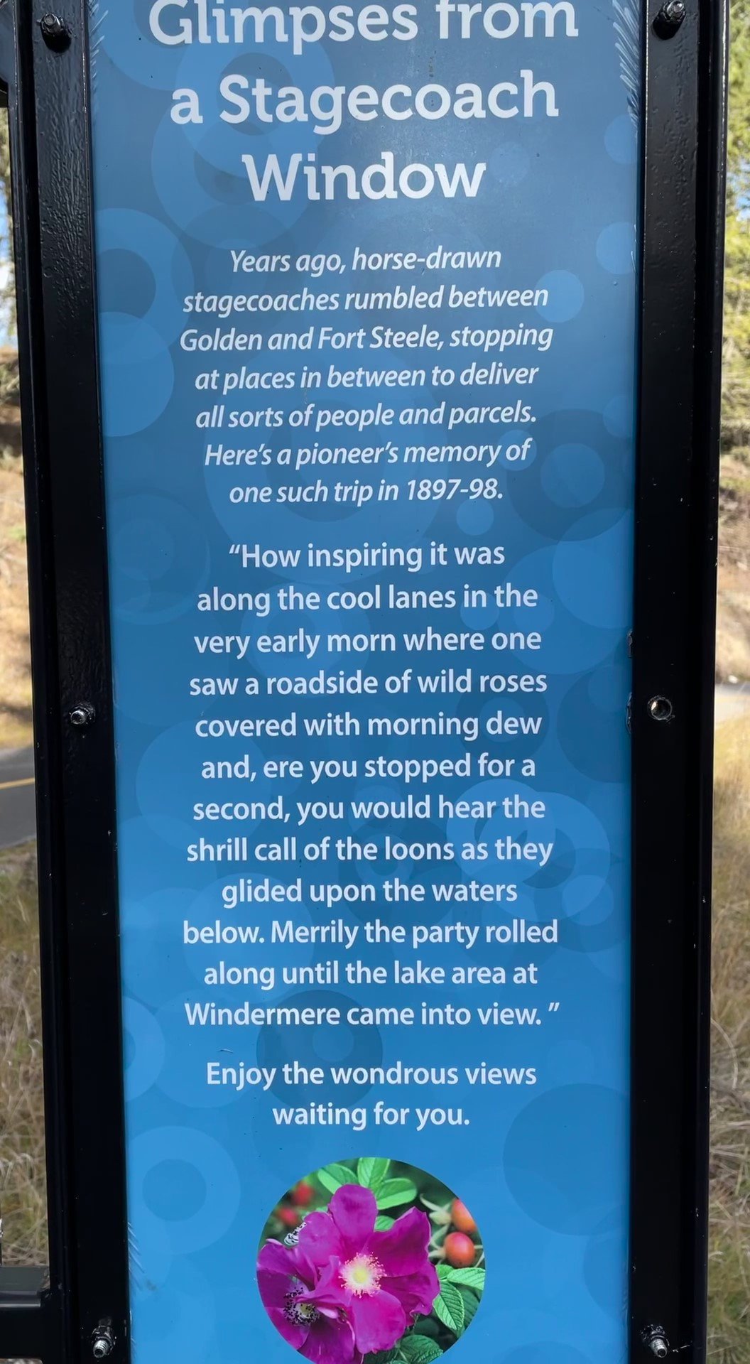
speak to the visitor when using archival quotes

Courtesy Bill Reynolds

Sparkle is especially important for the trail name and the individual stop titles. Continuing along the Elk Island NP SGT using the brochure mentioned previously, there is never a sense of formal instruction in the writing style - always a sense of awe and wonder is expressed. The author writes about the pond by saying, “…an ecosystem that rivals the great oceans…” - you can almost hear the circus barker’s call. “Wielding oversized jaws, the water tiger chases after prey and literally sucks the life out of it when captured.” (drawing of water tiger included).

Would it be better to draw not say?

One time I found this grid drawing of a British Columbian temperate rain forest as part of a self-guided trail brochure, reminiscent of a 2-D drawing laying out an indoor museum diorama exhibit. The grid allowed you to pick out objects in the picture and find their name by combining the horizontal-vertical alphanumeric code and then refer to the list. For example, the owl you see is at B-12, you look up under birds and you discover the creature is a spotted owl. You can also look up what alphanumeric code corresponds to certain herbs, mosses, fungi, mammals, etc. and find out where they “are hiding” in the drawing.

This had potential to be a good interactive tool but it needed to be connected directly back to certain areas along the trail. The accompanying text also did not match up to the items drawn. If they had reinforced each other and related to the actual trail this could have been neat. Choosing what went into the drawing based on the trail sightings would have been the preparation needed.  This would have been perfect as a placemat in the cafeteria and as a laminated take-home placemat gift, all acting as wonderful educational and marketing tools.

Clever use of graphics in a SGT trail pamphlet cover is seen below in Le Relais. They tried to pique curiosity about the trail, without words, by using a mosaic of images that you would eventually encounter from various trail stops. Some may call it a form of dramatic foreshadowing, others may call it previewing - in any case both techniques are effective when you attempting spark interest and to lure in a reader/viewer using a 2-D format.

Have you considered the interest level of your visitor?

McGillivray Falls Trail in Manitoba used trail stop descriptors on one side of the leaflet, thus avoiding the often overabundance of text dedicated to floral identification. Meanwhile the leaflet’s backside was used for a list of flower descriptions and accompanying drawings. Not a bad plan to concentrate on a topic like flowers in one section so it doesn’t dominate or dilute the SGT desired messages. Of course in this case the assumption has been made that there is a large visitor base who desire to know more about the common flowering plants along the trail. As an interpretive planner, or evena front line interpreter, have you checked whether this is the case or whether other topics might be of more interest?

This brochure dropped the ball as they concentrated on a litany of botanical descriptors as the way to describe different aspects of flowers like you were reading a condensed book on botany (Remember - ou are not Wikipedia and no condensing 10 years of knowledge into one brochure)

Here are some points to remember if you decide to focus on how to tell plants apart from each other:

·         Having a drawing with arrows alerting one’s attention to key visual differentiators on the plant.

·         Deciding what is it about the plants you are choosing that is importnat to highlight.

·         Having seasonal descriptions for each species and describing what time of year they bloom.

·         Indicating where on the trail you are likely to find certain species and their preferred habitat. (eg. dry, sunny or moist, shady)

·         Careful what vocabulary you use — in the case of the Falls Trail they referred to umbels, pinnately divided leaves, and inflorescence. Unless they are shown in a drawing or are a trained botanist then these technical terms should probably be substituted for more common words, or no name at all, just a description of the parts function. (Of course if it is the site’s objectives that visitors should learn these words before leaving, there would need to be some “doing” involved — but that is for another blog post.)

·         For the reader’s ease, determining how to arrange the plants you chose to place in the brochure is important. In this case with the Falls Trail the vertical ordered placement seemed quite random.

Courtesy Bill Reynolds

·         Being careful when using the term “flower” in your title when including a lichen and a fern.

·         Don’t always relying on flowers - they can be overrated. Why not have some fun with leaves and their varied shapes and arrangements, or checking out their undersides. Try using the word ”underbelly” as it’s guaranteed to crack kids up. 

·         Instead of focusing on simply describing the identifying characteristics for the visitor, why not turn it into a discovery for by directing them to check out hidden details. (e.g. look closely at the lower petal lip to see if it has a vein and describe its colour)

·         Highlight the secret and saucy life of plants and their reciprocal relationships with insects and their interdependency with us.

Have you drawn the connection to the visitor’s life?

McGillivray Falls Trail reminded me about the importance of context whenever we have an interpretive trail that follows close to a river. We should always mention where the water is flowing to and where it is flowing from. In addition, this is also a great opportunity to include a connection to the water cycle and how we humans are intricately tied to it – as in drinking from the water fountains in a local airport, or from the taps that provide the water for cleaning dishes at the local McDonalds or from the faucet in the bathtub at home.

 Have you built in a way to measure your SGT success?

If your hoped for takeaway message was, let’s say, “Insects that crawl in and around meadow plants are beautiful” are you checking after the walk to see if visitors are making comments like, “Gee, I didn’t know crawling insects were so beautiful.”  If you are not accomplishing what you set out to do then it is time to go back to the drawing board and decide if a self-guided trail is really the best vehicle to use. Prototyping your trail and doing dry runs with different test audiences can help you out before making an expensive mistake.

I do not run across a SGT leaflet with a built-in evaluation questionnaire very often but in my home province of Alberta, I did find one in the Marl Lake Trail brochure. The evaluation pages were perforated so it could be easily torn off and handed in. The brochure introduction stated “The booklet can lead you to new adventures…” and “The booklet can help you enjoy your walk…” among the delicate high mountain fens. The stated goal of the evaluation was “…to help park staff improve future Marl Lake Trail brochures.”

We should be seeing more evidence of this openness to seek improvement, and accept feedback from the visiting public so they feel more invested. It is also a great idea to evaluate, however, get the questions run by several different visitor types to ensure you are going to acquire helpful answers that you can act on.  In the case of this brochure it felt a bit more like a school test rather than a gathering of information.

Courtesy Bill Reynolds

All the evaluation questions were factual about fens using classic test set-ups with True or False statements, circling best answers and matching phrases. Is this type of test marking to see what visitor’s remembered the best way to improve the brochure? Do the visitors go away really knowing the top 5 things about fens and marl?

After I turned off the alarm bells going off in my head about this brochure, I started to re-assess the intent of the trail brochure and the takeaways desired. In my opinion, open ended questions to determine what the visitors felt about their time spent in this habitat would have been more helpful - like what they found most exciting about fens, or most intriguing about marl, or why we should protect this community? This would have begun to provide the park with better feedback.

If you ever desire to receive feedback on your interpretive resources, we at EID are always open to share our expertise from over a century of experience. Check out our blog page “What We do?” to get a sense of the types of capacity building we can help you with.

SGT: One Size Does Not Fit All

As I was sorting through my collection of self-guided trail (SGT) materials this week, I was reminded of the good and the bad examples I had collected over time and how I still see similar errors repeated when I visit trails today. So, the following helpful points are meant to assist interpretive planners with the 80% of their time spent on preparation before one launches into the 20% time spent on implementation/production for the SGT. These points are relevant whether one plans to use signs-in-place, brochure-numbered posts, QR codes with or without smartphones, or any other form of audio-enhancement.

Preparing a SGT at its most basic is joining a number of interesting places together along a path. Nature trails, historical trails, and sensory trails have been the norm in park settings. Linking together various artworks, zoo animals, botanical specimens or museum artifacts that create a journey for the visitor to follow is also applicable.

courtesy Lars Wohlers

Generally, SGT’s follow the same pattern.  What if we shook up the walking aspect and a microtrail was created that required a “hands and knees” position to focus on the small things in life? What about a trail that would engage the visitor, as in sketching, where your eyes are directed toward certain “scenes” of varying distances using, for example, sighting tubes and picture frames. Or journaling at a few spots along the trail using perspective changing quotes and passages.

Ah, but I get ahead of myself and head down a rabbit hole of sorts. First, some key questions need answering:

What will the trail do?

What are the specific 4H outcomes for the Head, Heart, Hands, and Hunger? (see our Putting Interpretive Ideas into Practice blog posts).  What is special about this place that you want visitors to know and feel? What is it you want them to take away? What do you want them to remember?

Is it about pointing out things?  Is it exclusively about explaining things?

Is it about finding meaning in what we see or experience?

 Is it about reinforcing old skills or learning new ones?

Who is it for?

This step is often forgotten in one’s enthusiasm or evaluated when considering the content and format. One size does not fit all. Would we expect the same story aimed at a grade one child to be interesting for an adolescent or university graduate? Have we included something of relevance for the elderly couple or a family with toddlers? Is there a sense of past, present, and future about the interpreted site?

Courtesy Bill Reynolds

Are they naturalists wanting to learn about plants or birds specifically? This audience seems to be the one that is often catered to. What level of knowledge are you assuming? How do you plan to “hook” and boost the level of engagement for the visitor who wants to stroll through the site?

How long are your visitors here for? Why do we design only short trail with densely packed signs along the trail? How about inserting interpretive enhancements at longer intervals on the longer trails? What about inserting viewpoints that are not dependent on long distance vistas but help the visitor to look up in the canopy or gaze at a nurse log? The stop designed with these kinds of stops might need special equipment like hammocks or kneeling pads.

Creating swollen trail nodes with interpretive stations could encourage visitors to linger and explore their individual senses or some neat site feature that will connect with the visitor. Maybe it will pose questions like:

Do they live in the area? Do you live in the same watershed, same country, same continent? Can we provide some comparisons, some similarities?

Some other visitor types to consider…Is it their first visit or do they come regularly? How do you counteract the “been there- read that” SGT experience? Do you provide options? Many heritage facilities are continually creating multiple background materials for changing exhibits. Why don’t parks and nature centres do the same and adapt to changing situations and multiple guest interests? Ever thought of a leveling system of booklets that lead to graduation? “Wow you have attained the gold level! Congratulations!” This consideration is as important as translating into different languages or the visitor’s spoken dialect.


Courtesy Bill Reynolds and his grandson Jakob

Where should it be?

This should be determined by answering what do you want your visitor to discover and then picking the best spots that demonstrate this.

When will this trail be used?

Is it meant to be taken more than once and at different seasons? Seasonality seems to get overlooked at times, especially with plants, as the text and drawings often represent only one season. This connects back to taking approaches necessary to counteract the “been there, read that” trail syndrome.

Mechanics Checklist:

The SGT intro should include how the trail is marked, estimated length of walking time, distance, change in altitude, washrooms, accessibility, safety concerns and expected behaviour.

Prospective trail walkers need an orientation. Maps should show the shape, distance and position of the trail, and its location in the park along with the location of the park in relation to the nearest population centre(s).

A SGT leaflet from Maine’s Acadia National Park notes that “Stops were selected for the purpose of introducing the visitor to a small slice of life {in this case} near the edge of Jordan Pond.”  It followed up at Station One by saying, “An evergreen corridor welcomes you - a balsam fir holds its branches out as though inviting you to slide your hand along its flat, soft, dark green needles.” All communication should have an element of welcoming and invitation for the visitor, especially to offset, at times, what can be perceived as onerous safety rules.

A summary should include where to get follow-up resources for enthusiasts, where to contact the relevant staff and where to locate the information centre and other nearby SGT’s. Shenandoah National Park’s interpretive trail booklet mentioned the other park SGT’s and how they each emphasized a different facet of the interwoven influencing factors in the Park’s story.

First cautionary note: Don’t try to tell people in one hour what it took you 10 years to learn.

This formula has been around for ever:

Total number of stops: 10-15

Total number of words per stop 30-75 (this was for written text; however, oral listening should not extend this by too much)

Yet I still find examples where the site has gone textual overboard and they wonder why general interest visitors walk by the designated stops along the “interpretive trail.”  Not only the length of each text but the content depth needs to be dialled back in many cases.

courtesy Bill Reynolds

Something I have never seen in trail brochures is levelling of text for one stop so that the layout shows a short, medium and longer paragraph version of text - each one building on what came before and each one using a smaller fontsize. This caters to the person who has either a small, medium or large interest in the topic at hand. Labels in museum exhibits often employ this strategy and I have noticed some signs- in-place doing this. Incorporating a QR code can accomplish this levelling aspect - note how the example below includes instructions.

Also in the example below, the voices of local indigenous youth are employed to share their knowledge about native plants. Different viewpoints and connections to our heritage need profiling and a scientific or naturalist perspective is just one lens.

courtesy : Bill Reynolds

Expanding out on the topic initially discussed also can be done with audio as the listener can choose more tracks after the base track.

Second cautionary note: Don’t try to explain thousands of years of change or a series of complex interrelationships in one stop.

Glaciation erosion, evolution, geologic time scales don’t lend themselves to a 30-75 word descriptor even with graphics. So why do we keep trying to include them in SGT signs and brochures?

On the complex interrelationship topic, here is one half of the text from the last station on a nature path: “Locked forever to the spot where germination takes place, all wild plants must be able to satisfy their needs there if they are to succeed.  Sunlight, amount and distribution of rainfall, soil content and structure, temperature range, and plant and animal competition pressures all help to determine which plants will thrive.”

If you want the visitor to have an inkling of plant need satisfaction when it is stuck in one spot, as this previous sentence lays out, then one would have needed to partition out each italicized and alternating bold determinant as its own stop. This could easily have been the concept for the whole trail and stops could be selected to demonstrate each element in action. Making this message relate to the human condition and need satisfaction would also strengthen the visitor connection.

Third cautionary note: Please, not another beaver or lichen stop!

I have travelled all over the globe and I have encountered the same type of introductory text as the primarily fact-driven text on signs about these two living entities no matter wherever I take a trail. Talk about “been there - read that.” We need to really search for elements that stand out as differentiators while noting the universal message that can tie many communities together. We don’t just have a stop about trees so why do we talk generically about lichens? Lichens vary alot and need more respect. What makes your site special? Let’s never forget to highlight this.

“Have a good look at the tree across the track because you won’t find it anywhere else but here on the buffalo plateau.” I really liked this line that drew attention to a special park feature from a gorge nature walk in Victoria, Australia. A great opener and a great reason for a stop!

Then it falls flat. “It is called Buffalo Sallee. The fine leaves distinguish it from the other gums in the park.” That’s it?   The only interesting thing about this gum tree is its name and leaf shape?? At least we should have a message about the mission of the park and protection values.

When planning that SGT ensure there is real appeal and interest in any reading or listening the visitor does along the trail.

We will pause for a week and take this up in our second segment. Please throw me a crumb and let me know if there was anything – even a morsel -- that got you thinking in a different way and was helpful to you in this post.

Action Now: Solarpunk to Generation Carbon

As smoke again enveloped the Edmonton, Alberta area where I live and another health advisory discouraged outdoor activities, a sense of frustration occurred. This combined with our county having had the first ever evacuation order due to spring grassland fires, I just felt a blog post relating to this ongoing human-caused tragedy was called for.

As citizens and individuals active in the natural and cultural interpretive profession we have a communication and facilitative role to keep the dialogue going and impact people’s lifestyles on behalf of the Earth - our home. This role is about repairing our relationship with the Earth’s communities and natural systems, striving for harmony with all living things, and putting clean air, water and soil above all else. People often say, “It’s the economy, stupid!” that’s the key to survival, BUT counter that with “You can’t breathe, drink or eat the economy, stupid.”

When EID started our blog posts we wanted to draw from different perspectives, form more interrelationships, and break down silo thinking -- not just draw from the interpretive, educational and museum fields. Here are a few relevant items that have crossed my desk that focus on our climate crisis and I think promote interrelationships between fields.


Solarpunk Shines a Light

Being exposed to the concept of Solarpunk is an example of this cross-fertilization of perspectives we need in order to keep our profession relevant. This group is offering a digital conference on June 24 and this YouTube link will tell you all about it: Solarpunk Conference: From Imagination to Action Kickstarter - YouTube

So what is Solarpunk? Solarpunk is a social movement that encourages all of us to ask: "What does a sustainable, equitable future look like?" and "How can we get there?" These are the questions our politicians, businesses and communities should be asking on a regular basis. Our visitor centres and museums should be playing a stronger role here to really engage our visitors in the future of their natural and cultural heritage. Truly, is there anything more vital than this? 

"Solarpunk is really the only solution to the existential corner of climate disaster we have backed ourselves into as a species," says Michelle Tulumello, a Solarpunk art teacher in New York state. "If we wish to survive and keep some of the things we care about on the earth with us, it involves a necessary fundamental alteration in our world view where we change our outlook completely from competitive to cooperative."  

I recommend you start with the following introduction to Solarpunk on YouTube: New to Solarpunk? Start Here. Advice when viewing – the narrator goes at a fast clip so be ready to pause during the 4 levels of action steps or slow down the speed of delivery. It can seem overwhelming, depending on where you are in your lifestyle, at the present moment.  However, the introduction is a comprehensive resource of strategies that potentially can be doled out in small doses to your site visitors…and for moving forward personally.

Rooted in Solarpunk’s philosophy, Canadian consumer brand Expedition Air employs upcycling technology to sell products like paintings and T-shirts made from carbon-captured material. Their consumer offerings de-risk the uptake of this novel material while helping to envision a future in which products and art, are carbon sinks. Are you able to support initiatives and brands like this at your centre?

Parent company to expedition Air is Carbon Upcycling Technologies, who have a reactor technology that allows material to be broken down and CO2 absorbed, creating enhanced concrete additives. Does your site have any future construction plans where you could use this upcycling approach?

Carbon Almanac - Where Kids Help Grown-ups Save the Planet

I am pleased to give a shoutout to the Carbon Almanac Network (CAN) who brought my attention to solarpunk through the daily email they send. I recommend subscribing to CAN’s daily carbon almanac email blast for ways to work carbon reduction into your lifestyle. dailydifference@thecarbonalmanac.org   All heritage sites should be raising visitor awareness of this free educational service. One can also listen to Episode 102 of the CarbonSessions podcast episode, to get exposed to this movement.

The Carbon Almanac Network, a team of +300 contributors from around the world, deserve a mini-profile expansion. They worked together under the guidance of marketing guru, Seth Godin, to create a book called Generation Carbon about climate change.  ”Now more than ever, we need established facts, a common understanding across generations, and collective action.”

Generation Carbon is a book of facts, not opinions and tackles the difficult questions kids have about climate change. In 3 days from April 29 to May 1,2022, when it launched, it was downloaded more than 10,000 times. Their aim is to get Generation Carbon to hundreds of thousands (if not millions) of kids as long as the ever- widening network continues to spread the word. To receive your free personal downloadable copy of Generation Carbon: It's Time to Start click Generation Carbon – A Carbon Almanac for Kids (thecarbonalmanac.org)

The educator’s guidebook followed the 69- page climate almanac for children. In addition, Generation Carbon is a companion podcast where kids age 6-10 help grownups save the planet. Young changemakers are challenged to finish the eBook’s mission — the game plan is based on the multiplier effect to teach five adults about climate change using a bedtime study challenge, almanac exercises, bathroom wall fast facts poster, etc

The Climate Test Kitchen of California

The second news item spotlights the State of California that continues to step up with market- based climate solutions.  As the fifth largest economy in the world, California continues to play a leadership role in policy making that deals with climate change and has been called a climate policy test kitchen.

In a previous job my colleagues and I were always being reminded that to be effective at successfully focusing effort and change agentry you needed to grasp - what gets measured gets done!  In California, a key part of lowering greenhouse gas emissions is accounting for them and this is exactly what the state is setting out to do.

The bill that cleared the California Senate on May 30, 2023 would require companies that operate in the state and generate more than a billion dollars a year to report greenhouse gas emissions across their supply chains using a standardized formula. Climate disclosure is a critically important step to reduction.

Our public facilities, as well as corporations, need to provide this information and model the way forward. As a customer, investor, or a regulator it is very hard to compare voluntary, non-standard disclosures and expose greenwashing if nothing is measured.

Is your site willing to examine the environmental and social effects of your supply chain in the exhibit areas, the gift shop, or the café? Would you be willing to share this information with the visitor along with what actions you are taking to have less impact?

It’s funny (sad, actually) how corporations are trying to prevent transparency and do not want to be held truly accountable , by spending money on greenwashing and anti-emission reduction lobbying efforts, so “business as usual” can continue. Putting shareholder’s profits above the environmental and social health of communities is a reality we have come to accept. Can we turn around profit before people, to people before profit?

Industry lobbyists stymied a similar proposal last year. How should this impact our role at a natural or cultural heritage site?  I believe it goes back to raising awareness of issues that all citizens need to be cognizant of, for their physical, mental and social well being.  Modeling new carbon reducing approaches is something we could champion.

Courtesy Booth Hansen architects web site. With 217 solar panels, the building is LEED Silver certified, the first in the USA for a new children’s museum. Kohl Children’s Museum in Glenview, Illinois.

Knowing that one’s visitors are in a leisure mood is an important consideration in how you approach critical topics but does not mean you shy away from them. Surveys continually demonstrate that our heritage sites have high credibility in the visitors’ minds so it behooves us to be that credible source of information. It is not about being a mouthpiece against certain industry practices but it is about being a mouthpiece for beneficial community well being.  We in the interpretive and heritage site field all have an important role - let’s jump in and prime the pump with information that increases awareness and models actions for others that will benefit all the human and non-human passengers on the planet.

<a name="comment"></a>

The Currency of Kindness

Our last email contact with you was dealing with the welcome aspect of the visitor experience and it was a whopping two webinars worth.  This item is short and sweet but still packs a wallop.

We believe that successful interpretive planning requires the design of the total visitor experience- pre, during and post visit.  It needs to:

·         reflect a holistic individual,

·         offer visitor interactions between place and visitor, and

·         be developed using the curation of mission-based, outcome- driven experiences. and

·         incorporate a sense of welcoming,

One element of welcoming is the need for inclusion, for feeling like family and for providing the sense of community, safety and kindness.

I follow British-based Positive News and want to share with you an article about the Kinder Shop in a Cumbrian town where the currency is kindness. This resonated with me on the concept of community, as I believe it has relevance to heritage sites that need to UP their connection status and level of caring within their local population.

You can accomplish more through more people by tapping into the wider community of resources available. You also can align quickly with more support by widening your net of people contacts and become less insular. Reaching out for assistance makes everyone stronger and builds relationships that are so so important these days.

Enter the Kinder Shop pop-up and the concept of exchanging goods for time. Here, all the goods were donated by local businesses and priced as volunteer time at nearby charities, with the suggested number of hours displayed on the ‘price tag.’ This concrete initiative was a way to promote kindness and understanding within the community.

They found a catalytic way of thinking about linking volunteerism, the time-starved person and everybody’s interest in getting a deal. The response was overwhelming, with 1,143 hours pledged to help local charities in just one day.

What about primarily promoting understanding in the neighbouring community about what you do at your site? Does your heritage site or does your neighbouring community have a space that could act as a pop-up, where you could display donated goods from local businesses Then the exchange for donated time could not only be for assisting your site but also your “community” of land trusts, archives and affiliated conservation organizations.

Do you have a wish list of projects that need to be done but no person power to do them –, exhibit upkeep, trail maintenance, wildlife cam viewing/recording, bench painting, planting flowers, researching artifacts, help in the bug room, etc.

In the case of a natural heritage site what about promoting earth kindness by exchanging local business free goods for donated time to undertake community projects that you co-ordinate?  Think of this as an extension/outreach project to build strong interrelationships and for being visible in your community… it is worth its weight in gold. How about building & mounting bat boxes, constructing bee hotels, or a native plant seeding day?

I have always been slightly perturbed when I would hear the lament from grumbling staff that they are being required to “do more with less.” My comeback was always so let’s do “more with more”. A bit like the glass half empty concept versus viewing it as half full. We may be given less money, and less staff but that doesn’t mean we can’t look for more. Yes, that takes time but can be a blessing in disguise.

Less budget does not have to mean less resources – it can just mean more partnerships. Having the money to buy what you need is the easy way. However, how might one find the resources to do the things that need doing without money exchange?

We need to start thinking of “exchanges” both in terms of what we and potential partners could offer, in addition to what we and others need in terms of time. The more co-ordinated mutual support, network we have built up - the stronger we all are from a social health, community spirit and desire to thrive perspective.

How DO you unearth a mountain of goodwill using the currency of kindness? How can you become a catalyst of people resource exchange and be a matchmaker in the process? And who DO you direct it to?

For more info on this great uplifting news source and this specific topic go to  The shop where the currency is kindness - Positive News

"Yes, Virginia, We Really Did Record Our Webinar Sessions on Welcoming the Guests."

At EID we think one of the most important interactions with the visitor is the Welcome. That is why we decided to focus on the Welcome Experience for our first two webinars. However, we need to apologize for the delay in getting these two sessions on “Sharing Great Ways to Greet the Guests” up and running. There were a few technical glitches that came up that you, as the viewer, should be aware of.

On the Part 1 webinar we discovered a “hole” in the upper right corner of the recording that revealed the Zoom code behind the screen. Our tech person, Nate Byerley, found a way to patch the hole with a picture of our EID logo. The audio is not affected but at times the PowerPoint slides do get obscured.

The focus of this first Welcome Webinar is the arrival sequence, the parking lot and entrances, with examples and analysis of first impressions, inclusivity, comfort, engagement, humor, and accessibility. In addition, staff from the Raven Run Nature Sanctuary in Lexington/Fayette County, Kentucky will present a mini-case study of their entrance with feedback from EID and participants.

If you prefer to view this first webinar in smaller segments at your leisure here is the link you can use: https://youtu.be/yLQxZFRi3FU

During the second webinar Bill and Mike take a deep dive into components of the Pre-Arrival, Arrival and Welcome sequence. There is emphasis on building anticipation, creating a mood, and setting the stage for visitors.  Different techniques to orient the visitors are discussed so they know where they are and where they can go. This session also responds to participants’ entrances and welcome concerns and presents examples on employing humor and a “whiff of mission” in the Welcome sequence to encourage greater focus on the site’s outcomes and mission.

A couple of times we forgot to just use the speaker view on the recording so the pictures of the participants may block some of the PowerPoint text. Sorry about that and we will do better next time. Here is the link if you would like to download the session: https://youtu.be/XcofjZZZAjk

If you would like to explore some new ideas about the Welcome Sequence at your preservation, collection or historic recognition site please contact us at contact@eidcoaching.com and we would be happy to set up a meeting with you. Or if you have questions or comments about the webinars please send those along in an email or in the comment section below.

Thanks again for your patience and for your continued support of our work at EID. We will keep you posted about future webinar sessions.

Pantry of Destruction and More Twittertalk

It’s time for the last in the series of three posts from the 2022 #InterpDesign twitter platform annual highlights. The previous post dealt with the power of graphics in playful interpretation which helps with serious learning. We also had fun with the effective use of infrastructure and who can’t forget the dog library. Now we delve into satisfying various visitor needs.

If you follow us already then this will be a tweet refresher/reminder with some added bonus expansion on the original limited commentary. If you don’t follow us yet (what are you waiting for!) as our aim is to inspire you with an eclectic range of thought -provoking material that you can apply to boost your visitors’ site experience. If your visitor experience team needs a spark of new perspectives on a specific issue or just general experience enhancement as a kick off to 2023, then get in touch with us at contact@eidcoaching.com A roundtable discussion is only a Zoom meeting away.

Design WITH Children! Take Curiosity Seriously!

How do you go about sparking a “lifelong love of heritage” in the youngster demographic? Perhaps by transforming an heritage property into a first-of-its-kind experience designed for AND with youngsters. What if rooms, in a richly decorated home, best known for its furnishings, became spaces that celebrated the escapades and challenges of childhood across the centuries, especially the realities of life for children who were employed? 

courtesy: National Trust

Certain spaces in the Children’s Country House Museum run by the National Trust in England have been redone to portray the child’s journey through the ages. Daring young ‘sweeps’ can take on the chimney climb and crawl into the darkness. Others can venture down a Victorian mine tunnel or get involved with activities to see what life was like for children working in domestic service.

Certain spaces in the museum basement have been transformed into interactive historic house interpretation like the World Below and the Pantry of Destruction. In the former, visitors can prepare toy food and make clay models inspired by the house’s plasterwork. In the latter Pantry of Destruction children are engaged in the basics of heritage conservation with an interactive display on heritage hazards such as floods, theft and pests, to counteract elements of ‘destruction’. The portrait photo booth allows visitors to pose for photos using symbolic props that echo the symbols found in historic portraiture associated with 17th century Jacobean interiors.

What about devising & testing ideas aimed at "serving the needs of children with families, not families with children?” The Children’s Country House Museum did just that -following a two-and-a-half-year renovation, by working with 100 ambassadors, up to age 12. They continue to work with children to further develop the Garden and decide what the future should look and feel like. 

They claim this is the world’s first stately home entirely reinterpreted for children. The property has removed almost all ropes and barriers, allowing visitors to explore the space freely, with colour coding used to signal which objects can be touched. A rotating mirror allows visitors to pick out details in the paintings and plasterwork that decorate the stairs.

In another twist, the National Trust created a second-hand shop selling children s’ pre-loved items including books, toys and clothing. This exemplifies the reuse principle as opposed to outright consumerism and reinforces a certain value system integral to conservation.

https://www.nationaltrust.org.uk/visit/peak-district-derbyshire/the-childrens-country-house-at-sudbury/creating-the-childrens-country-house

Fostering Connections

“Museums in general are places for community and dialogue, and are uniquely positioned to foster connections among people using art immersion as a stimulating factor.”

This was stated by Lucy Stewart, the Associate Curator of Education at Carnegie Museum of Art, after she led the launch of a Mindful Museum at her institution. Having read the Alliance of American Museums (AAM)’ Creative Aging report, that concluded the over 55 demographic was being ill served by museums, she responded with “a call to action.”

Courtesy : Carnegie Museum of Art

Their market research discovered: “There are more than 20,000 people aged 55+ within walking distance of Carnegie Museum of Art.” How many of you know the numbers of certain age groupings within a close distance of your centre that you could call “neighbours?” A new form of outreach, and forgotten target market, perhaps?

Two main thrusts from the report were apparent: the need for seniors to be able to express themselves and to be active in a safe, comfortable, and stimulating environment. A sense of comfort also meant sitting in chairs in the galleries, during a planned time slot with a reserved space that removed any feeling of being rushed.

Art Paths or tours of the museum’s gallery, were optimized for movement and meditation; art history and drawing classes tapping into art therapy; and in-person chair yoga instruction were offered.  For more on this check out https://jingculturecrypto.com/carnegie-museum-of-art-mindful-museum/

Lucy Stewart’s previous quote applies to more than art museums. It has universal appeal among the heritage sector, because if you replace the word museum with park or historic site and the word art with sense of place as in sense of place immersion, it still rings true.

However, while fostering connections only among people is a worthwhile goal, at this juncture in our earth’s demise, fostering connections with the earth must take precedence. A recent book called Earthwalks an alternative nature experience by Steve Van Matre and Associates addresses this connection outcome up front, with structure and purpose. Earthwalks are not simply another outdoor leisure pursuit. Their focus is on generating feelings of joy, kinship, reverence and love with the earth. Heritage sites need to be sponsoring these Earthwalks developed by The Institute for Earth Education (www.ieetree.org). EID can help you set up a training session for your staff so they can regularly lead this outdoor experience. See our blog post for more details https://eidcoaching.com/blog-main/2020/4/24/earthwalks-using-our-senses-to-deepen-our-feelings-for-the-earth

Courtesy Merrion Hotel website

Palette and Palate

While on the artistic flair bent, the Art Tea event is a feast for the eyes & stomach at Dublin hotel, the Merrion where hanging masterpieces inspired chefs to create pastries as mini art collection edibles. At the special event, visitors would get to consume them while contemplating the miniature artwork prints that accompanied the edibles so you knew what or who you were eating. Then you might be intrigued to see the real thing in the gallery. Have you encouraged any of your curated collections or natural heritage specimens to inspire your café menu? Any high- end pastry chef/restaurant partnerships coming to mind with waterfowl carvings perhaps? 

While attending a Salmon Arm, British Columbia Art Show featuring Indigenous artists we were treated to tea and cookies at the end of the opening that blew me away because it was so apropos to the gathering and the earth relationship being expressed in the artworks.  Just wanted to illustrate that it doesn’t have to be fancy just connected to the essence of the story and playing a reinforcing role

What’s your Narrative?

The Fort Worth Zoo in Texas wanted to inject their digital presence with a contemporary, playful look and feel that would reinforce the zoo as a destination for fun and excitement, while simultaneously presenting the animals in their charge with dignity, through captivating imagery and language that promotes exceptional care. Their commitment to species survival, conservation, animal welfare, and education is placed at the forefront of the digital guest experience. Here is the image that appears as part of their twitter handle:

Courtesy : Fort Worth Zoo Twitter

What is presently at the forefront of your guest experience and does it match to what you want it to be?  In maximizing this narrative, the Fort Worth Zoo reports that new website is already driving donations, animal adoption, and other forms of vital support and giving.  They are empowering visitors to join a movement toward wildlife and habitat protection by engaging in events, where donations are solicited for their vital projects and causes.

While reading this, I could not help but wonder how our national and state/provincial parks could benefit from a visitor building lesson, by reimagining their web presence to empower visitors effectively to join a movement toward wildlife and habitat protection. Visitors pay their admission but beyond that they are never (in my experience) ever asked to contribute towards any research or wildlife monitoring or conservation work in the park. Budgets are not overflowing for this type of work so why don’t we give visitors the chance to participate financially and provide them the feeling of benefiting their parks-their wild spaces. A dream worth pursuing…

Hopefully this 3-part twitter highlights that rambled down diverse pathways has provided you with some new approaches and perspectives. We at EID want to share what we have learned along the way as well as the ongoing flurry of innovative and engaging approaches we constantly search for. However, a solid plan tried to an outcome-driven mission is paramount. Having interpretive passion without direction is like being an octopus on roller skates. You can be sure there will be plenty of movement but you won't know where you are headed, making it difficult to measure success.

If you have problems or just need a boost of energy - we have ways to help you solve them or provide revitalization. Get in touch with us for a coaching session.

<a name="comment"></a>


Tales from the Twittersphere

Time for the second installment of the 2022 annual highlights from our #InterpDesign twitter platform. If you follow us already then this will be a refresher/reminder with some added bonus expansion on the original limited commentary. If you don’t follow us yet (what are you waiting for!) then this will be a tremendous treasure trove of titillating twitterings. Totally!  We aim to inspire by exposing you to an eclectic range of source material that is thought provoking and will contribute to visitor experience enhancement.

Playful Interpretation

Among all the tweets, deciding what to start with was a challenge.  It was decided by an avian visitor. Outside my window, on a snow laden branch, looking quite plump and happy in the minus 22C temperature was a robin. He seemed to be egging me on saying, “Just put on your down jacket, lined pants and join me -it’s balmy out here. The chokecherry berries have just the right bite of ice fermented tang to them.” Normally, the robin performs an uplifting sign of warmth and of new life’s explosion soon to come – both welcoming signs after a long, cold season, however this chap was heralding the opposite.

With this human to wildlife projection prelude, Rosemary Mosco’s spring robin comic strip came to mind.

Her great nature- based comical images illustrate what playful interpretation can mean. We periodically retweet her graphic strips on our tweet platform. Interpretive excellence is about viewing behaviour, creating images and stating language in relatable terms – why not in cartoon terms?

The Power of Cartoons

As you can see, Rosemary has a light- hearted, quirky way of communicating.  The following snippet from her Bird and Moon comics, exemplifies a different form of informative “teaching”:

Human: "I would do anything for my kids! I'd protect them with my life!"

Canada Goose: "I would do anything for my kids! I'd protect them with my life!"

Human (while strolling through the middle of a goose family on a park lawn): "Why is that goose being such an aggro jerk.”

This made me think that a graphic approach may be a better tool to use when it comes to raising awareness of inappropriate and dangerous human behaviour. I would wager that in many cases, this slant of humour, using anthropomorphism based on biological behaviour would be a far more effective warning for certain audiences in order to communicate why to avoid human wildlife interactions. 

We might try using this graphic approach more often as a way of delivering our messages and accomplishing our head and heart outcomes. Rosemary Mosco’s work demonstrates another way of building a connection with nature through better empathy, understanding, and a more inclusive planetary ego.

Canvases Worth Pursuing & Igniting

Graphics like innovative street art design often provokes my little brain cells to utter comments of… why don’t our parks and heritage sites spend time ensuring that their service infrastructure performs to its best ability and play a role in non-personal interpretation?

Upon seeing this stairway adorned with fish it spawned all sorts of ideas. An interpretive adornment does not have to be onsite.  Maybe search for a local venue in your neighbouring community and investigate a partnership as a part of outreach work that performs 24/7 and has constant reinforcement.

For example, what if a village situated near a river adorned a staircase with native fish to remind residents about caring for their watershed & thinking twice about what they flush from their home into other beings' homes. A wonderful message so germane to many natural area visitor centres and definitely worth hinting at to their visitors. What about your staircase? What would work for your site? What image would be worth replicating in a prominent spot that would remind visitors about developing a more caring relationship with whatever subject matter was chosen to support your mission and outcomes?

Double Duty Infrastructure

Resources for interpretive programming, self-guided trails and specific media are constantly being squeezed yet visitor service Infrastructure is a given. It not only has the capacity to be doing double duty, it NEEDS to be doing double duty both from a functional viewpoint and from a mission -related, message-reinforcing viewpoint (see our previous mini-blog post Double Duty Design Dream Dec 2018).

There are so many public canvases capable of sparking the flame of inspiration.  A staircase is just one “avenue” of possibility.  Another would be a sidewalk doing double duty as a giant “What am I ?” artifact display - conversation piece, acting as multiple mini-gateways to past worlds.

Do your walkways liven up the visitor experience? Do they play a role in drawing you in and engaging your senses?

Sit Up and Listen

On the subject of Infrastructure there was a great tweet from Copenhagen, Denmark which aimed to draw attention to climate change. This was not just an attempt at a fun selfie, like the giant Adirondack chairs at tourist resorts but it also acted as a message carrier.

Thought-provoking clever design, in this case a bench built a metre higher than the normal sidewalk rest bench, was situated at a practical height due to the projected raise in sea level by the year 2100. By avoiding facts and figures, infrastructure can play a very significant and impactful role bringing the abstract into the concrete.  This is a powerful illustration of how ignoring a behaviour can have dramatic outcomes.

Created as part of TV 2’s “Our Earth – our Responsibility” campaign, it certainly strikes a chord with pedestrians. Any working on a non-exhibit like this to drive home the point of Our Earth- Our Responsibility? Any partners you could approach?

Emphasis on Fun

Sometimes EID finds street art design examples worth sharing that combine subtle humour with an image that could have relevance to an heritage institution. The example chosen below blends this relevance with a humourous infrastructure example that gets infrastructure to pull its interpretive weight.  Our sites need to look for opportunities to add a little fun to help put a smile on the visitor’s face.

Not only the pipe but also the grate was screaming for some creative treatment and the artist combined both. This cartoony image would work well for a zoo in keeping with the nature of the site but there are numerous images and styles adaptable to fit whatever your subject matter is whether botanical garden, aquarium, historic site, or nature centre. We all possess these, shall I say ugly corners, that are underperforming. Let’s pay more attention to what we already have and get them working for us. Get out there and inventory those areas that need a makeover.  In this case we asked on our tweet: Do you have a pipe you want to spruce up for your visitor’s experience?

Satisfy the Playful Urge

Sometimes there can be the image-based tweets that trigger a deeper dive. In the case of the dog library, it sparked more than just light-hearted, canine compassionate humour. “Take a stick leave a stick” is a play on words for the concept of a  free neighbourhood lawn mini-library where cupboards on posts beside sidewalks cajole strollers to open them and “Take a book leave a book.”

Pets are frequent companions with visitors to our sites and courtesies are often offered to them in the form of water bowls, treats and shady spots to rest providing the basic of Maslow’s needs. Play for a dog takes it up a level as reading does for humans. Do we need to satisfy the playful urge in humans before we jump into interpretive messaging or can we combine them?

 This also got me thinking down another pathway – be on your guard. This outpouring of care and compassion for our pets says something about our need for companionship and relationship. We seem to understand that all living creatures require the same basic needs. We go the extra mile when it comes to providing the life needs of feeding wild birds and animals along with offering them some nesting shelter assistance. Are we compensating for feeling guilty because we have wiped out their home habitat? Is this not another form of creating a dependency on us rather than designing and “developing” human communities where we strive to live harmoniously and interdependently together with wildlife? Our natural heritage sites can do a better job of demonstrating this lopsided lifestyle, and question the kind of relationship being set up. Our urban parks can raise the awareness bar among visitors so they advocate for city, building and landscape planning that reflects more than human needs. Designing with nature in mind has to be the way going forward.

Play is Serious Learning

Getting back to the concept of play, is this particularly apt quote that popped up on Twitter that EID subsequently shared.  Fred Rogers of Mister Rogers Neighbourhood TV series understood children and we SHOULD remember his point that play is the work of childhood and involves serious learning. Although I might venture to say that play applies to all human ages. Playful interpretation is what we at EID always advocate for.

Lavatory Laboratory

Upon reviewing our tweets and retweets from the past year it was decided there were enough to fill two blog posts as well as spotlight one topic in a third (this one). The topic of lavatories was flushed out from the American Alliance of Museums (AAM) member survey tweet, about the best museum bathrooms, based on over 200 responses.  Laboratory because we feel there needs to be more playful experimentation in their presentation along with more purposeful use as an integral part of a site mission.

The AAM survey received an interesting proposal as part of the entries – pointing towards the consideration of a new position - a curator of bathrooms. This would place bathrooms as a key element of the guest experience reflecting their strategic welcoming importance.  This may have been tongue-in-cheek (how apropos) butt it does deserve some deliberation.

We were bowled over by the diverse design examples supplied.  Best Criteria seemed fairly loose if non-existent – in the eyes of the beholder kind of thing. Get prepared because urine for a wide range of entries – all with a different angle (I promise from now on no more droppings of silly scatological puns in the text).

Before we launch into a few select AAM entries, I must confess I am a bathroom design junkie with quite a collection of what I consider best practices. Yours truly cannot always avoid getting in the picture as the first image attests to.  Right off the bat, walls have the opportunity to reinforce a sense of place or culture as this iconographic tile design illustrates. This was used in the Squamish Lil’wat Cultural Centre, in Whistler, British Columbia. Hand in hand with a creative interior is the creative treatment of the rest room directional signage that presents an opportunity to avoid the generic cold institutional feel. Instead, you can have some fun and pick images that relate back to the site messaging as the Squamish Lil’wat Cultural Centre did.

Washrooms can often be among the first impressions that visitors get from your site. The majority of visitors will visit them at least once during their experience. For this reason, they can play a critical role in atmosphere building and reinforcing your mission yet they are often neglected. They provide way more potential than simply catering to people’s basic needs. In the following case of an outdoor facility the colourful facade clearly presents a fun, well maintained and clean exterior – giving the impression of a well-cared for interior- something outdoor washrooms don’t universally demonstrate. Additionally, the image reinforces the heritage of sternwheelers on the nearby lake as well as sand castle beach frivolity. What sort of impression do your restrooms project?
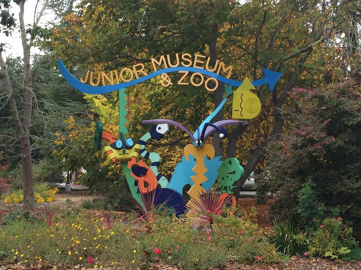
AAM blog post author Joseph O’Neill set the stage with this statement: “From the visitor perspective, bathrooms can be all-important, revealing just how carefully the designers of a public space considered their comfort and needs…for some people—including those who care for young children, who are transgender or gender-nonconforming, or who have disabilities—this importance can be heightened, and even a barrier to visiting a place altogether.” This summer I experienced my first-ever gender-neutral facility, featuring floor-to-ceiling stalls and a communal sink area at a local historical park. It felt strange initially then wonderful because of the feeling of equity rather than separateness.

We have to reassess our building facade and the service facilities within our sites to gauge whether they provide a sense of inclusion and belonging for all visitors. During the most recent EID participatory webinar we introduced this concept when discussing how comfortable we are all with the welcoming design aspect (or lack of) within our sites.  Email us to let us know if you missed that session and would like to have us offer it again. If several staff members  from your site and even neighbouring sites  would like to book a digital session over zoom, Mike and I would love to accommodate.

Let’s get to the examples chosen from the AAM article for this blog post.  From the standpoint of a bathroom-exclusive exhibition, the Mariners’ Museum and Park had great panels in its stalls that explained bathroom elements on ships and using the bathroom at sea.  A Head of Its Time: A Brief History of Going at Sea, discussed topics like why the facilities—or lack thereof—were called the head; “as well as the wisdom of keeping tabs on wind direction and how sailors improvised before toilet paper.”

Located at the site of a former psychiatric hospital, the Glore Psychiatric Museum keeps its bathrooms strikingly on theme, again through wall and stall panels, using them as an opportunity to teach about topics like optical illusions and phobias.

The walls of the bathrooms at Planet Word in Washington, DC feature euphemisms for going to the restroom (e.g. ‘seeing a man about a horse’) and wordplays on famous quotations (e.g. I stink, therefore I am.)

Beyond the 2- dimensional use of walls how about the Charleston Museum in South Carolina that created a wall mounted exhibit case featuring a chamber pot display.

chamber pot display courtesy AAM blogpost

At this juncture I need to insert a really novel “exhibit” example I discovered at a regional heritage site in Creston, British Columbia. A two- door closed cabinet was situated in the washroom with the label Do not peek Unmentionables for Ladies on the outside doors. The word “not” had a line strike through it egging you on to open them. Lo and behold -undergarments and period advertisements are on display. I am not sure what was in the ladies’ washroom – a parallel unmentionables for men??

Certainly, in the category of memorable washrooms is the Denver Museum of Art where, “The sinks sing ‘Row, Row, Row Your Boat’ as you wash your hands. A visitor called Melody commented that “You can get the sinks to sing in canon if you time it right.” This singing sink idea was created by Denver artist and designer Jim Green, who is also known for a Laughing Escalator at the Colorado Convention Center. This may be technologically too much for your budget, so if you desire to lighten your visitor’s mood try using images of smiles as To be more on pointthat can be very effective.  Another option would be installing a motion detector or pressure sensor that triggers a sound track of laughter when they enter (maybe not before you enter the restroom but before you enter your site’s main door).

Although the singing sinks is very catchy, it seems more appropriate as a mission driven experience for a children’s museum or the birthplace of a composer, songwriter or lyricist rather than an art museum. To be more on point, you could produce an audible track that has a connection to your mission and that changes over time depending on the season, temporary display, or exhibit.

What does an art gallery do with its restrooms? It uses them as a canvas! Commission artists to design the whole restroom as a functional piece of art.  Not only that but why not partner with the Kohler Trust for Arts and Education and Kohler Company, who manufactures bathroom fixtures? That’s exactly what the Smith College Museum of Art, in Massachusetts did when they instructed two artists to sink their teeth into projects that would tap their creativity to “blur the boundaries between form and function.” The result: glass panels that were “translucent optical windows or doors into the watery world beyond the architecture, along with water drop imagery continued in the sinks and other fixtures. The second restroom has tiles with narrative images of transformation and creation myths interspersed with drawings of large, tear-like droplets that enclose tiny human forms, a reference to a creation theme.

Guess what? There is a John Michael Kohler Arts Center, in Wisconsin, with six spectacular artist-designed bathrooms. These were produced through the centre’s artist-in-residence program that allows participants to experiment with the Kohler company’s manufacturing technologies and materials. Check out on Instagram to see their stunning ceramic masterpieces. If there was a beauty competition they would win “hands down” or should we say “pants down”.

If you want to explore more of the restroom entry images, then the source website is: https://www.aam-us.org/2022/07/29/the-best-museum-bathrooms-according-to-museum-people/

You don’t have to go overboard in a design sense but some thought should be given to spice up the industrial look and continue your connections to mission and outcomes, as these previous places demonstrate.

For your first enhancement, taking a foray down into an esoteric dream world is not our recommendation but choosing some more mission-driven practical approach would be. We have all seen the use of stalls for posting notices and ads over urinals in men’s bathrooms (not sure what happens in the women’s bathrooms) which are often hand written scrawls. However, I have also seen an effective and professional use of washrooms as a locus of information and marketing channel. Here is one example posted on the lower right corner of the washroom mirror at my local Valley Zoo. They are raising awareness about their fundraising project for four new “child’s eye view” immersive landscapes: Above, Between, On, and Under. To me, this works as an appropriate clean and clear information extension to be read when washing your hands and singing the popular song “going to the zoo, zoo, zoo…how about you, you, you…”

Stay tuned for the next post involving more Tales from the Twittersphere.

Sharing Great Ways to Greet the “Guests”

What Is Your Site’s Welcome Like?

Image by Amber Avalona from Pixabay

So maybe you’ve been thinking – “Our site approach, arrival and front desk needs a makeover! How can we improve the welcome and increase the comfort level for guests to our site?”

Please join us on Tuesday, September 27, 2022, via Zoom for this free interactive session with Bill Reynolds and Mike Mayer of Experiential Interpretive Design (EID). The webinar will begin at 9am (PDT)/10am(MDT)/11am(CDT)/Noon(EDT)/4pm(GMT) and last about 60 minutes.

The session will focus on the Welcome that takes place during the Arrival Sequence: entrance (gate, lobby, plaza), parking lot, and admission/front desk. You will get a chance to share what kind of Welcome you use and in addition hear some…

·       new ideas to solve existing arrival issues

·       practical ways to improve your site’s initial visitor experience

·       techniques to decrease “threshold fear,” stress, and anxiety in your guests

·       ways to “lay down a welcome mat”

Photo Credit: Mike Mayer

To register for this free session please send an email to contact@eidcoaching.com by Thursday, September 22 to receive the Zoom link. Please share this information with others you think may be interested in attending.

If you are interested in highlighting your site as a “mini-case study” for this webinar, please email Mike at mike.mayer@eidcoaching.com . All we would need from you is:

·       some pictures of your site’s Arrival Sequence

·       be prepared to share what you feel you do well, and

·       indicate where you would like some constructive input on your Welcome area(s)

For more information on EID visit our website at www.eidcoaching.com .

Photo Credit: Mike Mayer

Doin’ Design Right: Right Memories, Right People, Right Invitation

There was a time period during the 2000 decade that I was reading Landscape Architecture magazines to enhance my design concept of the visitor experience and better understand their professional mindset. Certain articles I kept, that spoke to me for different reasons, and I have chosen two examples from 2007 that continue to provide inspiration. The third item snuck in- what can I say.

Right Memories

The first article by Lisa Owens Viani was titled The Feel of a Watershed, yet even more provocative was her subtitle, The Cedar River Watershed Education Center teaches by sensory experience. Should it do more? Triple whammy of intrigue here!

Firstly, one does not normally plan to get visitors to feel a watershed- so I was immediately interested in HOW this was going to be accomplished as feeling type outcomes have always been an underpinning of our EID practice that we encourage sites to include when planning. Secondly, a center managed by a utility that had heavily incorporated exterior sensory experience rather than just interior traditional exhibits was also unexpected, yet something to be applauded. Thirdly, the “should it do more” question was abit of a cliffhanger that set me to wondering about this outcome challenge coming from a landscape architect – whether they should play a more direct interpretive role- but what did that mean exactly? Was an interpretive specialist involved as part of the design team? Probably not if they were posing this type of question. Read on.

watershed rain drums Courtesy Cedar River Watershed Center web site

Author Viani states that the design purpose was to educate Greater Seattle residents about the source of their drinking water. In addition, the architect was aiming for visitors to develop a new awareness of how to shape their own environments and behaviour in ways that could lead to healthier watersheds.

Evaluating Educational Effectiveness

A welcoming courtyard incorporated an artist installed sound- of- rain -falling -onto- drums recirculating irrigation system, computer programmed to the rhythms of different world cultures. They reported that visitors have a 3-stage reaction: they are “surprised, enchanted and inspired.” WOW. Imagine if you could design in and accomplish this level of staging for all your interpretive programs and exhibits? Guess what more visitors remembered most about the site? Read on.

What the architects were going for was a place-based experience “that creates a mental vessel to put information into.” Rain drums and the stream that circulated under the building and beside the pathway brought water awareness to the forefront. They evaluated the educational effectiveness of their design by asking the following questions over a year and a half:

·         Are there features that helped foster new appreciation of water? Or a new awareness?

·         What do you think the designers were trying to say with the way the buildings and landscape were designed?

·         From your experience here, what is your impression of the watershed?

·         What stands out in your memory that you’ll take from this place?

·         What home practices might you be willing to undertake after your visit today?

Remember the design purpose was to educate Greater Seattle residents about the source of their drinking water and how they impact a healthy watershed. Would these have been the questions you would have asked?

Follow a water drop Courtesy Cedar River Watershed Educational Center web site

Learning Assessment

Can you really assess new learnings without getting a sense, before the visit, of the base level of awareness of individual visitors? There is even a quote in the article from project co-manager, Nancy Rottle, stating, “Whenever you have a visitor, what they take away always depends on what they bring with them.” I rest my case. Remember this when you are involved with setting up a program/exhibit/trail evaluation.

Betcha landscape architects were most interested in the answers to question #2 and were happy to know that more than half of interviewees said the built design felt like it belonged and fit in with nature? If visitors were helped to reflect on how their own living and working spaces did or did not do the same, that would bring relevance back home.

More than 50% of those surveyed gave a high likelihood of creating habitat with native plantings, conserving water, designing buildings differently and using environmentally sustainable materials at home due to exhibit design. A third indicated they would collect and reuse rainwater or detain stormwater. In cases where concepts were not seemingly grasped it was felt that direct interpretation was “not compelling” enough or that call out features for visitors were missing, as in the green rooves -metal rooves situation.

Visitors were expected to make the connections between the water holding green rooves metaphor for healthy watersheds, and contrast that with the water shedding metal rooves metaphor for unhealthy watersheds, replicating the impervious urban streetscape. This did not happen as the features were not directly pointed out or commented on. With an absence of interpretive signage, the bioswale and the role of infiltration basins to prevent erosion by detaining water were similarly absent from visitors’ commentary. Also absent from commentary seen as a missed interpretive opportunity, was the daylighted creek that had been in a pipe before the project had been started (something close to home for urbanites) .

Courtesy Cedar River Watershed Educational Center web site

The design was summarized as doing the right thing in many ways:

·         Respected nature and cultural site aspects

·         Educated and delighted through interactive opportunities

·         Provided take-home ideas for visitors to use

·         Told the story of water beautifully through aesthetic design

This latter point is driven home by the following descriptor: “The elegant S curve of the runnel meander, languidly sighs ‘liquid’ in a captivating way. A veritable illustration of Hogarth’s * serpentine line of beauty.” How is that for landscapese? What this translates as, is the designer chose to use with cast iron grates that are perforated with lilting curves to reinforce the water theme.

*Trivia Note: Hogarth, William was an English painter, printmaker, pictorial satirist, social critic and editorial cartoonist.  His work ranges from realistic portraiture to comic -strip like series of pictures called "modern moral subjects." Not sure if the reference was apt – seems like she was referring to another painter by the name of William; in this case the English landscape painter-Mr.Turner. Anyone out there have an opinion? Am I off base?

Under Interpretation

Author Viani wonders towards the end of the article whether it is possible to under interpret something by avoiding being too didactic, as the project manager was concerned about.  Manager Nancy Rottle cautioned that you want to avoid “hitting [people] over the head with information.”  Was that a shot at poor interpretation?? That hammer approach should never happen, however many professionals still have that view of interpretation. At the same time subtle interpretive cues can solve the sole dependence on design that people walk by and do not “see.”  The pendulum can swing both ways, so I would agree that conceptual osmosis does not work for many intended outcomes if design is left to its own devices. You could easily under interpret if architects and interpretive specialists are not integrated into a team interpretive effort as the evaluative research indicates.

What stood out in visitor memories?  A third of interviewees stated it would be the multisensory rain drums. As Nancy Rottle, project co-manager says, ”memory is more about feeling than cognition. You have to be moved before something sticks with you.” Right on. It is not clear how they capitalized on this emotional draw however to accomplish their overall educational purpose driving home water’s preciousness, its value of being present and visible/audible, along with the visitors’ role in its conservation.

Courtesy Bill Reynolds

The majority of respondents overwhelmingly (author’s word not mine) felt the facility helped them understand the concept of watershed. It was not clear whether this was tested somehow and they really did understand or they just simply responded that way. The author pointed out that understanding where Seattle’s water comes from was accomplished, however what wasn’t clear was whether downtown Seattleites understood that they lived in the watershed also and could have a direct impact on its health. If they had been asked to draw a picture starting and ending with clouds of where their tap water came from and drain water went to -and they were correct- OK mission accomplished.

This is especially important as the dying of Puget Sound is being attributed to urban runoff from Seattle. The author felt a more encompassing view of the total watershed would ramp up the motivation for visitors to change behaviour to benefit water quality. Author Lisa Viani suggested that the topographic model of the watershed could be expanded to include urban Seattle or a separate model be placed “downstream” of the upper watershed model.

This is something she shares with Erin Frost, a member of the Friends of the Cedar River Watershed as they have observed a major disconnect with the holistic understanding of the Puget Sound as the final resting place. Specific streams have friends groups but they lack the big picture understanding she said. This begs the question if there was a discussion with stakeholder groups prior to setting the purpose of the centre?

A thorough analysis of the post-occupancy evaluation is included in the 2005 Proceedings of the Council of Educators in Landscape Architecture.

Right People

Stakeholder group discussions are so vital and they act as the segue to the second article. According to my estimation, this is the first (and perhaps the last) example of this interpretive landscape project. Another west coast facility situated in Ashland, Oregon this time, the Fish and Wildlife Forensics Laboratory were in need of an anti-attack buffer. But not any old anti-attack buffer – one that would be designed as an appealing garden that told the story of the unusual lab operations.

Courtesy Biomimicry Institute web site

This article was authored by Michael and Laura Murphy, and titled CSI: Wildlife with the subheading: A most unusual federal laboratory calls on students to help design an interpretive landscape.  It was a classic case of Fish and Wildlife partnership between their project engineer, their landscape architect, and their interpretive specialist, mixed in with a University class of landscape architecture students. Happens all the time, right. Wrong! Yet why don’t these alliances come to pass more often. Probably because they don’t all have a Professor Helphand involved- I kid you not that is his actual name. Actually, because it takes co-ordination and requires more time. And in the case with students, you need a partner who realizes the beneficial enthusiasm that can be unearthed at a university. The collaborative process undertaken and described next is instructive.

The F&W trio from regional HQ travelled to Ashland to pitch the idea to the city planning officials and the forensic lab professionals. Having the concept supported upfront by involving stakeholders upfront is key. Then the trio plus the lab director travelled to the University to pitch the need for a people-friendly yet vehicular- free secure garden involving hillocks, seat walls, berms, reinforced interpretive bollards, etc.

A comprehensive visit to the lab and a dozen international science garden case studies, were supplied to the students, for conceptual design approach ideas, including the Garden of Cosmic Speculation in Scotland (guaranteed to be a rabbit hole for those curious sorts out there). This culminated at the end of term with a rare lab open house for the community of Ashland including many children and the garden club.

Ideas included a spiral path addressed issues of species extinction, another used typical forensic puzzle pieces as wayfinders, and another used a whale skeleton rib structure as a defining pathway feature. The winning overall design used the three symmetrically intersecting circles of forensic science as the garden layout basis. The suspect, the victim, and the crime scene link together forming the triangular intersection being the solution(s)-a recurring diagrammatic structure found in many disciplines.

Right Invitation

Caught among these landscape architecture articles was a single piece of paper that fluttered to the floor garnering my sideways glance. From an old Parks Canada Fundy National Park publication (sorry, couldn’t find a date-probably 30ish years ago), I was struck by a simple yet arresting image of a park naturalist standing with an outstretched hand in front of the visitor centre. The accompanying article by Superintendent Jackie Olsen was titled, “We’re Glad You’re Here” and it invited you to spend some time there, watch a video and observe some marine life in the aquaria. WOW again. When does that happen anymore – receiving a “welcoming booklet” and being greeted in front of the visitor centre with such an expression along with a detailed invitation.

Inviting? Image Courtesy Bill Reynolds

Aside: I visited one of our provincial parks this month and you would never had known there was an existing visitor centre because the one insignificant street like sign directing you there was all that we encountered car-wise and bike-wise as we travelled around the park for 4 days. Yes it was indicated on park maps and it was a small font size similar to the beach changehouse, laundry spot and campground registration booth. I sure hope your visitor centre commands more real estate, markets itself to the visiting public, and invites them to come on in and receive assistance in planning their visit.

Then I was hit with a follow up quotation from James Harkin, former Commissioner of National Parks from 1911-1936. It encapsulated the hoped- for visitor rejuvenation all staff desire. It is true now as it was back in the early 20th century:

National parks are maintained for all the people – for the ill that they may be restored; for the well that they may be fortified and inspired by the sunshine, the fresh air, the beauty, and all the other healing, ennobling agencies of Nature. They exist in order that every citizen of Canada may satisfy his craving for Nature and Nature’s Beauty; that he may absorb the poise and restfulness of the forest; that he may fill his soul with the brilliance of the wildflowers and the sublimity of the mountain peaks; that he may develop the buoyancy, the joy, and the activity he sees in the wild animals; that he may stock his brain and mind with great thought, and noble ideas; that he may be made better, be healthier, and happier” (and this was written by a bureaucrat??).
— James Harkin

Superintendent Jackie summarized by saying how all staff were proud and dedicated to doing their part to make the Commissioner’s wish come true for all visitors. Not a bad series of outcomes for staff to aspire to make happen. Not a bad set of expectations for visitors to try to achieve either. How would you measure them?

Image courtesy Bill Reynolds

As visitors depart the park should we ask - On a scale of 1-10 how fortified and inspired by the various ennobling agencies of nature have you been? Imagine if we could tap into how much more productive or innovative visitors felt during and after a park visit…

Actually, I am only being slightly facetious-primarily with the wording. Would our parks be offered more protection and have a higher economic value if regional directors, deputy ministers and politicians were to receive such evaluative feedback on a regular basis beyond simply attendance and revenue? (I know, I know, I am just an old-fashioned idealistic romanticare there any others of you out there?)