Double duty design dream

Go for multitasking not just in your personnel, but from your building shell. Demand double duty from your support furniture, walls, and doors. The essence of your site needs to emanate from as many visitor interaction points as possible.

Photo credit: Bill Reynolds

Photo credit: Bill Reynolds

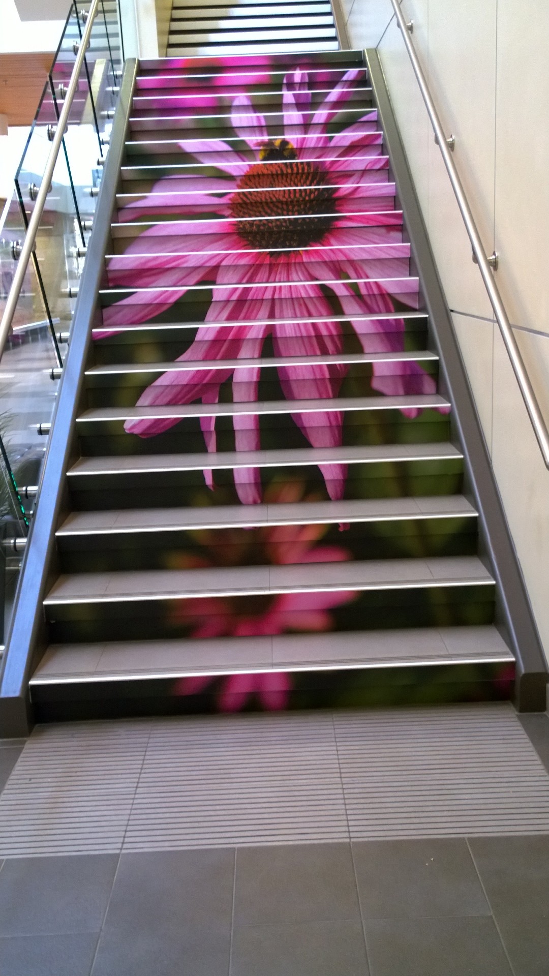
In the previous post we saw how arresting a colourful wall display in a stairwell can be. Allow your walls a chance to engage with the visitor , however caution must be taken when reading is concerned and one is climbing ! Do you have any wall space that could be refreshed and turned into a stimulating quote?

 
Photo credit: Bill Reynolds

Photo credit: Bill Reynolds

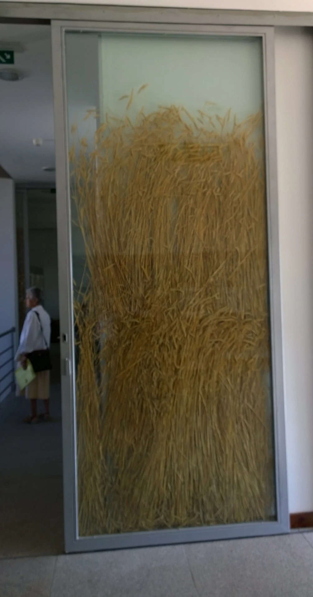
Sliding doors in a bread museum - why not fill them with wheat , as this interpretive centre did in Portugal, to reinforce in the visitors’ minds the connection to where bread comes from.

Photo credit: Bill Reynolds

Photo credit: Bill Reynolds

Elevator doors: let them provide a landscape for getting your message across. The corporate guys do it- why not not-for-profits?

Phto credit: Bill Reynolds

Phto credit: Bill Reynolds

Benches can do more than provide a rest amenity- they can be a conversation piece or an interpretive billboard for your visitor. Selfie anyone?

Send us your examples of double duty creative benches, walls and doors for sharing in the comments section.

Caught in the act of caring 2

You want to be recognized for going the extra mile on behalf of the visitor. Spend the extra time to design in features that add joy and elevate a visitor’s experience:

When dealing with “rules” sometimes simple is best - legible, neat and use of a natural tone for a natural heritage site, with an image that brings a smile to one’s face (instead of a frown). Please share any good examples with all of us in comments.

Photo credit: Bill Reynolds

Photo credit: Bill Reynolds

Photo credit: Bill Reynolds

Photo credit: Bill Reynolds

Sidewalks have potential to play a role in engaging the visitor and introducing them to your site’ s purpose. In the above sidewalk of a regional heritage museum, they chose to embed expendable artifacts into the concrete entryway allowing for inter-generational conversations and prompting a form of “what was this used for” type of guessing game.

Photo credits : Bill Reynolds

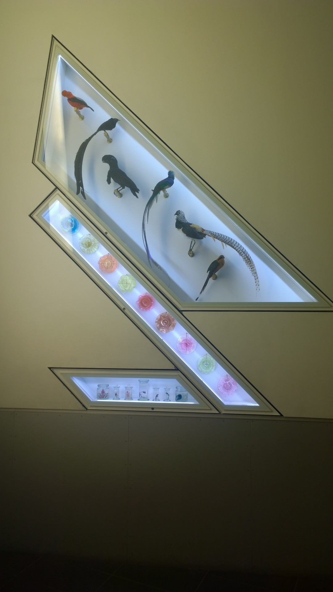
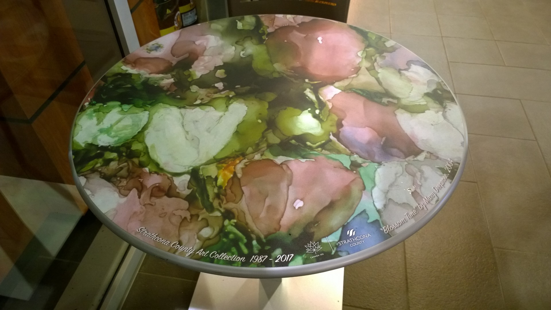
1) Blank wall space in a museum stairwell (on a landing) allows for creative display extension spaces. 2) Table surfaces can allow for creative applications, in this case, for local artists’ exposure while you enjoy a cuppa. 3) Stair risers are often underutilized real estate. Powerful images can raise awareness about what you want visitors to notice or simply act as an uplifting moment in one’s life.

Caught in the act of caring

This is the last week of insightful gifts and we have chosen a few images,captured in our travels, as the impetus for a more detailed look at design impact. The choices we make for operational fixtures, furniture and equipment like benches, chairs, washroom doors, doorknobs, lighting, flooring, refuse receptacles, etc. may seem inconsequential yet can add that little extra touch of humour, beauty, and concern. Ensure that as many of these supportive “amenities” connect with and reinforce the key “reason for being” messages of your site.

Ultimately what you convey to the visitor is: we care about you. We chose items to make your visit special and to surprise you in a comforting way. We have added elements to raise the bar on enjoyment.

The door handle that allows you entry into a rose garden resembles a rose flower.

The door handle that allows you entry into a rose garden resembles a rose flower.

Benches have the potential to be evocative about their surroundings.

Benches have the potential to be evocative about their surroundings.

View Behind the Porthole

Yesterday we were looking at the German Port Museum and how they may be falling in the trap of designing the building before producing a clear experiential interpretive design. Today we briefly look at the positive aspects of their approach to concept development and how this needs to inform building design.

The new German Port Museum has a vision of open and transparent premises, where they can show large, high and heavy exhibits, along with a viewing platform to “provide visitors with a view behind the porthole.” Proponents want to portray the “incredibly large dimension of the goods handling, the port as a place of work and the further processing of products.” This is clearly direction-setting.

They want to address the omission that the fundamental technical change in ports and port cities is rarely analyzed and represented in its current and historical complexity. There is a desire for the museum to depend on strong socio-historical and socio-political perspectives to enhance the traditional maritime museums’ seafaring focus usually on ships, nautical instruments, engines and machinery.

As a result, they hosted an International Congress of Maritime Museums conference with a very clear goal. They selected papers from current port-related and world trade research in cultural anthropology, social and economic history, and industrial archaeology as well as contributions on innovative approaches in collection policies, exhibitions and educational programs of maritime museums. Bravo ! When was the last time (even on a small scale), you cast the net inviting a group with diverse knowledge around a topic to help you focus your interpretive content?

This broadening of topics around globalization and world trade will be relevant to a wider range of visitor. We hope this “view behind the porthole” translates into an experiential spotlight on the web of people involved and impacted. Sharing their stories will be pivotal for engaging visitors. Mike will be sharing Part 2 of Dancing with Bourbon on Thursday and we are giving everyone a “long weekend” to savour that blogpost before we commence on Tuesday with the remainder of December’s gifts.

Building design before experience design -why??

We have been talking about big issues in December, during our gifts of insight series and today is no exception from both a design perspective and a concept perspective. Let’s tackle design first !

What about a museum that plans to deal with questions of globalization and worldwide trade, in other words the big concept of exchange of goods, knowledge and people. Where better than a new museum covering the development of a major port city like Hamburg, Germany and its harbour. https://www.deutsches-hafenmuseum.de/de/home The German Federal Parliament’s budget committee approved 120 million Euros of funding to establish the German Port Museum. Except Hamburg already has five museums dealing with maritime topics, so some naturally questioned the need for a new museum, rather than enhancement of the existing infrastructure.

However, a recent architect competition has been struck in typical fashion, to create a museum structure without an interpretive design plan. Our July 18, 2018 EID blog post reported on the Abraham Lincoln Presidential Museum that broke from the tradition of first designing the architecture of the building and THEN the contents within. Instead the visitor experience was designed first then the building was commissioned to house the immersive “experience” exhibits.

Design the experiences first and then design the building is EID’s mantra. Deciding whether you need a new facility or a rejuvenation of all or some of what you already have, depends on solid visitor outcomes and a clear interpretive picture of the desired visitor experience. Multiple buildings with differentiated stories that link together and support an overall visitor experience could be powerful.

Tomorrow’s post will continue by exploring the intriguing “view behind the porthole” content envisioned by the new German Port Museum.

Embrace controversy

Are you afraid to confront difficult subjects? Do you desire to be a facility that is considered current, necessary and moving? Maybe you need to tackle topical subjects where there are varying opinions. Relevance in the community may require you to embrace controversy .

A museum opened in Hong Kong last week that is clearly unafraid to confront difficult past events. Dedicated to showcasing the media industry this is the first museum of its kind in Asia. Called News-Expo, they do not shy away from politically sensitive news, with articles on the Chinese 1967 riots, the Tiananmen Square crackdown of 1989, and the Occupy movement of 2014. One intent is to to prompt discussion and show how major news events were covered by different Hong Kong media,. One clear outcome is the demonstration of the importance of the free flow of information as a cornerstone of Hong Kong’s success.

Hopefully, they will cultivate the same popularity that the Newseum has done since 2008 in Washington, D.C. Considered one of the most interactive museums in the world and the “must-see” attraction in Washington, D.C., it has positioned itself as a leading champion of free expression in the world today.

Two aspirational things jumped out at me when I looked over the Newseum website that would be positive for all heritage facilities. They claim that a visit to the Newseum is a conversation-inspiring experience you won’t find anywhere else. They claim that the Newseum’s unique approach to history, civics and media literacy helps students cultivate the skills needed to make informed decisions in a divided and demanding world.

These two laudatory goals should be part of your interpretive strategy. Cultivating worthwhile people skills and stimulating conversation through experiential interpretive design is something all facilities should be aiming to attain.

Their free online learning platform reaches more than 11 million teachers and students around the world. How do they accomplish this? Why not investigate NewseumED ?

Hong Kong P.S. To piggyback on last week’s climate topic, Hong Kong does not shy away from controversy as it also happens to be home to the world’s first Museum of Climate Change in 2003 that helps citizens engage themselves in (http://www.mocc.cuhk.edu.hk/en-gb/about-us) :

  • carbon-reducing action through an online self-monitoring platform.

  • competitive multimedia games allowing them to become green lifestyle winners.

  • student ambassador recruitment and green leader training that advocates for climate action  

Admission- Opportunity Missed?

Our fourth in the holiday series of insights.

Every visitor point of interaction plays a reinforcing part. Do you use tickets or some form of confirmation of entry payment ? Have you thought about what additional purpose that item could play?

When visiting the Museo Maya de Cancun, Mexico I was struck by their use of beautiful quality colour photographs on their ticket stub. They portrayed other heritage sites within the management responsibility of the Mexico Instituto Nacional de Antropologia Historia. For me as a visitor I was made aware of another heritage site I had previously not known about. This acted as an excellent way to cross promote visits to their partner sites. This ticket stub photograph idea could be used in many ways -what if you wanted to highlight items at your own place like various out-of-the-way artifacts or trail viewpoints or… With a little imagination this first contact with the visitor could really be employed as a site enticement, a curiosity stimulator or conversation starter.

The Robert Bateman Art Gallery in Victoria , Canada uses the back of their ticket stub as a personal message from the Robert Bateman Foundation. They also used a colour image of one of Robert Bateman’s paintings to catch your attention. The opening remark "Robert Bateman sincerely hopes you enjoy this exhibition," was powerful for me and to tell you the truth shocking-in a very pleasant way.  This was an attempt to have the artist speak directly to the visitor.

The message continued with this as its core : " All proceeds go to the Bateman Foundation which operates this gallery as well as other programs, which recognize that a deep and abiding relationship with nature is central to the human experience." Another way for me the visitor to feel good about supporting this cause as well as getting an inside picture of the ongoing mission. of the place.

The closing sentence "On behalf of all of us at The Bateman Foundation-thank you so much for coming." Simple, impressive and effective. By the way i highly recommend a visit, as the gallery employs a variety of presentation methods not commonly seen in art galleries.

We’ll chat again Monday.

PS. Truth be told I have used both of the above tickets as mini-keepsake bookmarks.

Curating attractive solutions

Our third in the December gift short series is a continuation about the Climate Change Museum.

In a time of social issues and upheaval, a place that focuses on curating attractive solutions has to be seen as capturing a relevant position in the civic engagement dialogue. Museum executive director Miranda Massie claims that italicized phrase as a guiding purpose of her work. Those solutions need to be aimed at the appropriate groups. The Climate Change Museum has an interesting approach when they look at goals and their target audiences:

  • captivate the distant  by illustrating unexpected links between climate and society, and facilitating climate conversations within and beyond our walls.

  • animate the demoralized by providing hope with solutions-focused content, climate success stories, and opportunities for collective action.

  • bring the experts together to help develop the next generation of innovative climate solutions and inspire new leaders.

Find out more when you click on <http://climatemuseum.org/>  

Ensuring you have a place in the public conscience means your institution becomes involved in important public conversations and avoids being left on the sidelines and forgotten about?

How well are you seen in your wider community of providing attractive solutions to relevant social and environmental issues? Are there any audiences you need to captivate and re-energize? Any demoralized audiences you need to animate? Any experts you need to bring together for inspiration?

Do you need a youth advisory council?

Our second mini insight in the December series:

The Climate Museum’s mission is to employ the sciences, art, and design to inspire dialogue and innovation that address the challenges of climate change, moving solutions to the center of our shared public life and catalyzing broad community engagement.

This mission is exciting on so many levels, however we will focus on the strategy to form a youth advisory council to help them design the what and how to accomplish their mission. How do you bring young voices to the conversation? The museum had hosted a climate change media creation workshop for high school students. After the students wrote and performed spoken word, designed subway ads, and created plans for a climate-themed music festival, museum staff realized they needed to tap into the students’ energy level. The youth advisory council was formed.

The museum’s vision is to be curated in part by and for young people to enable the public drawing together around the social justice, public health, and urban design challenges and opportunities presented by climate change.

Read more at <https://grist.org/article/teens-help-reimagine-americas-first-climate-change-museum/?utm_medium=email&utm_source=newsletter&utm_campaign=daily>

Do you have a youth engagement strategy?

Tomorrow we will highlight the idea of curating attractive solutions -something Miranda Massie, the museum executive director sees as her job.

How do you keep an exhibit up to date when data is continually rushing in?

This is the first of many short and sweet holiday season thought-provoking snippets coming your way this December. We, at EID, hope they provide continual insight and not regular annoyance. Expect a daily weekday dose, except after our part 2 Dancing with Bourbon full feature blog post coming mid month. We will give you a long weekend to digest and recover then start-up again on the Tuesday. Nibble on this:

The American Museum of Natural History (AMNH) in New York city has tried to tackle the unfolding story so you remain up-to-date. Visitors to most spaces in the museum meander through space and time, however one hall was given a makeover with the purpose of having people think deeply about our current moment—and the dynamic processes that brought us here. Guess what the topic is - climate change.

Guess who they turned to, to design the change? Interpreters of course - well no. The collaboration that created and prototyped new hall features involved scientists, user experience engineers, and educators under the leadership of the director of science visualization, and the vice president of exhibition (Of course some of those people may have been trained as interpreters but that is not how they refer to themselves).

Find out more about how AMNH went about this.

How have you solved this issue of staying topical regarding the subject matter you deal with? Are you staying relevant in your visitors’ eyes by keeping them in the loop with new advances ?

>> More on climate change tomorrow.

Need a Challenging Perspective?

Need a Challenging Perspective? Haven’t had your boat rocked enough lately? We have a book guaranteed to do this and is the motivation for EID’s mission, principles and coaching outcomes. It reimagines the interpretive role to incorporate hosting, inviting, and motivating visitors to explore their special heritage places, become storymakers and uncover universal cultural and natural processes. 

Read more

What’s ESSENCEtial?

In the blog, Operation: Success Critical we began exploring the EID principle - to clarify your site’s reason for being - by looking at the importance of defining your site’s distinguishing characteristics.  We provided a series of questions for your team to grapple with. We left off on a marketing note of brand values and differentiation – concepts the interpretive profession doesn’t always embrace. We need to. Along with determining the essence of the collection or site.

Read more

Excommunication by Font

We wish you a Happy New Year and hope you have a joyous and fruitful 2018. Thanks for the comments and emails you sent us in 2017. Two of the emails were quite direct and are worth sharing. The first comment took us to task for the font on Bill’s email, but it made us think about the use of the words “Interpretive Design.” The second comment, by Jon Kohl, was full of constructive commentary and asked what we had to offer in the field of interpretation.

Read more